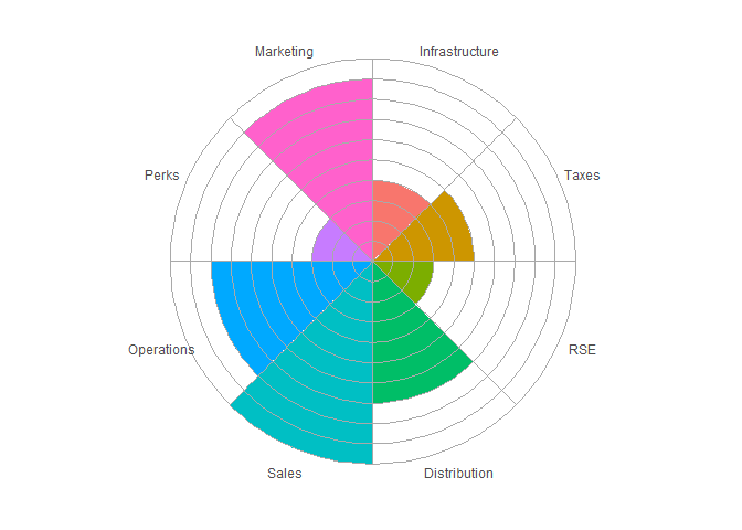
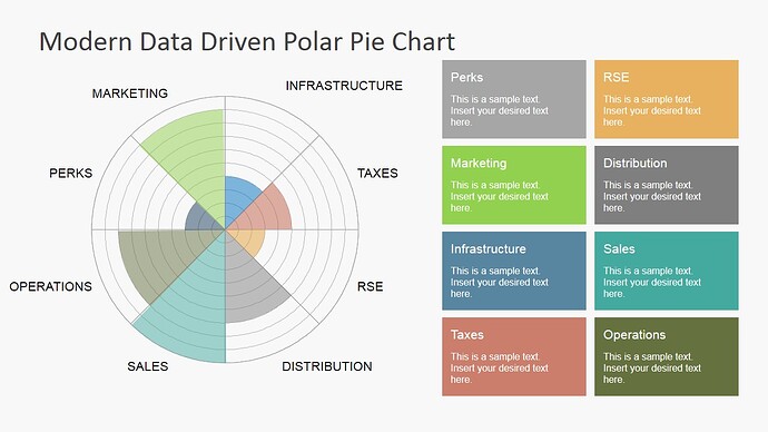
I have an answer for you, because I know that sometimes we have to make things that are not right, because it's not worth the fight to do it the right way. But I still feel it's necessary to point out that using a polar plot like this is extremely hard to visually interpret. Assuming that the lines indicate 10% marks, then something at 100% has 100 times the area of something at 10%.
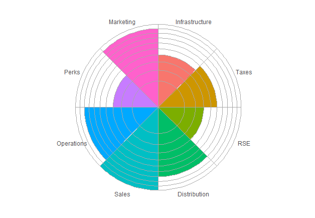
With that aside, here's what I came up with. Getting the "grid" on top of the graph required making it manually (per this SO answer). The image will work best with some kind of vector output (such as PDF or SVG) to prevent the bits of whitespace that crop up in the version below.
dat <- structure(
  list(
    Category = structure(
      1:8,
      .Label = c(
        "Infrastructure",
        "Taxes",
        "RSE",
        "Distribution",
        "Sales",
        "Operations",
        "Perks",
        "Marketing"
      ),
      class = "factor"
    ),
    Percentage = c(0.4, 0.5, 0.3,
                   0.7, 1, 0.8, 0.3, 0.9)
  ),
  .Names = c("Category", "Percentage"),
  row.names = c(NA,
                8L),
  class = "data.frame"
)

library(ggplot2)

ggplot(data = dat) +
  geom_col(aes(x = Category, fill = Category, y = Percentage),
           width = 1) +
  geom_hline(yintercept = seq(0, 1, by = .1),
             color = "darkgrey",
             size = .5) +
  geom_vline(xintercept = seq(.5, 8.5, by = 1),
             color = "darkgrey",
             size = .5) +
  coord_polar() +
  theme_minimal() +
  labs(x = NULL, y = NULL) +
  theme(axis.text.y = element_blank(),
        legend.position = "none",
        panel.grid = element_blank())
