Hello,
It is a diagram on tree motion characteristics when view from above by using accelerometry.
Can R Studio make this kind of chart?
Thank you.
Hello,
It is a diagram on tree motion characteristics when view from above by using accelerometry.
Can R Studio make this kind of chart?
Thank you.
I haven't seen this done in ggplot2, which is not to say that it doesn't exist (or that you can't do it using another charting package in R). I have seen lots of G-G diagrams, though (mainly for motorcycle performance stuff ![]() ). So, I thought it might be helpful to give a bit more context for how the chart works for others who come along:
). So, I thought it might be helpful to give a bit more context for how the chart works for others who come along:
http://hpwizard.com/gg-diagram.html
https://www.trailbrake.net/featured-articles/the-g-g-diagram
Couple things you might want to look at, this deck on casting spells with Shiny (plotting accelerometer data in R, it's a linear layout, but it could get you started):
http://nickstrayer.me/dataDayTexas/#9
The ggradar package:
The circlize package:
Thank you very much for your input. I am running a tree motion experiment using H2-02 accrualmeters attach on tree trunk at 1m and 3m from ground. I am trying to explore how the tree would move at over 70km/h wind in typhoons. The G-G Diagram is for plotting trunk movement at Y & Z axis when view from top.
Can you tell me the which package is used to create the GG Diagram in http://hpwizard.com/gg-diagram.html?
Many thanks!
I don't think that one was done in R! Sorry for the confusion. 
I was just adding that so that people who aren't familiar with G-G diagrams could better understand how they work.
Hi Mara,
Wouldn't geom_path provide the basic functionality needed?
Although the graphs would look a bit jagged unless there were a lot of data points describing the path.
Ron.
It's definitely possible! I haven't run it, so I'm not sure. I think the aspect missing by default (which could certainly be done with some playing around) would be the third "axis" of time/colour.
Definitely would be the starting point I'd explore!
I've assumed you have a data.frame with columns x, y, t (for time) and h (for height), so it might look something like:
head(DFF)
    x         y t  h
1 -10 -0.382941 1 1m
2  -9  4.740437 2 1m
3  -8  6.211133 3 1m
4  -7  8.029227 4 1m
5  -6  6.125644 5 1m
6  -5  8.627401 6 1m
and at the bottom
tail(DFF)
     x         y   t  h
395 -4 -9.150131 195 3m
396 -5 -8.092843 196 3m
397 -6 -9.272673 197 3m
398 -7 -7.431228 198 3m
399 -8 -7.172846 199 3m
400 -9 -3.425820 200 3m
So observations of x and y are sorted by time within height.
I've then plotted it with:
ggplot(DFF) +
  geom_path(aes(x = x, y = y, colour = t), size = 0.75, alpha = 0.8) +
  facet_wrap(~ h) + coord_fixed() + theme_bw()
To get:
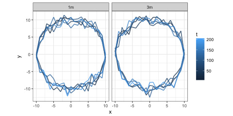
If you can let us know how far that is from what you are hoping for, maybe somebody can help.
From the example image you provided, I'm guessing the joins between points should be smoother, but that isn't the case in all the examples @mara supplied.
Oops! I made a mess of creating t originally, I've updated it now.
Ron.
Thanks but X, Y & Z represents ;
X = movement in g along trunk axis, which in reality does not move much in wind
Y = movement east west
Z = movement south north
The diagrams show how the trunk is moving in wind continuously when viewed vertically down.
How do I get it with the data from X2-02 accelerometers?
So your X, Y, Z come from the accelerometers? Or are you asking how to get to X, Y, Z from accelerometer data?
If you have X,Y and Z you can use them in some combination as the x, y, t in my example (I'd have thought north-south would be y, west-east x and the trunk axis t, or whatever suits).
Thanks Ron.
Yes, X, Y, Z come from the accelerometers. Please see the 4 example diagrams of plotting Y against Z in the beginning of this dialogue. I do have a set of data (approx. 9600 lines) after running X2-02 at 32 Hz for 5 minutes. How can I get these 4 diagrams from my data (i.e. how can I use the data from accelerometers to generate a GG Diagram in R Studio)?
Thank you very much.
Part of my problem is I don't know the relationship between the four graphs you present and the question you have asked. What are A, B, C and D? I've assumed before that they are just replicates/treatments/experiments, equivalent to your 1m and 3m heights (so you are actually after two graphs rather than four).
The graphs appear to me to be of accelerations with units g, but I might be misreading/misunderstanding the axis labels. You are talking about positions of a tree, or some point on/in that tree over time.
Do you want to plot the accelerations, or the positions (or are they equivalent?). I think converting from accelerations to positions is beyond my knowledge (I'm not an engineer or physicist).
Are the data you have in g units? I cannot find a X2-02 accelerometer by web searching (there is a Nokia mobile phone with that model designation, which might be swamping the search results). I did find a X2-2 accelerometer here with a manual suggesting a simple conversion to g units depending on the gain setting.
So assuming the accelerometer is the X2-2 and that you want to plot the acceleration in g units, you can do the simple conversion (division by a constant) and then follow my example code from the earlier posts. Then maybe that will be what you want. But I still feel like I'm guessing what you actually want.
You might find it useful to look at some of the R packages that handle accelerometry (there seem to be a few: acc, pawacc, accelerometry, GGIR and maybe others - but some of them might be specific to a model/make of accelerometer).
Thanks Ron,
X2-02 & X2-2 are the same thing. I bought these accelerometers from GCDC & have read their example uses. I am trying to follow that of the 'car tyres' by using R.
The four diagrams I showed were copied from a published article in Arboricultural Association of UK. The author did an experiment on branches in strong wind, & he got those diagrams. The horizontal axis is the acceleration in g in the north-south plane, & the vertical axis is the acceleration in g in the east-west plane. When the branch shaked about in wind, the two axis drew a line of movement when viewed from above.
My question is: how to draw this diagram?
I asked the author, he did not respond.
Would you know?
The simple answer is that @ron's example code will draw the same type of diagram. The challenge comes in tweaking the details. It's a little hard to make out what's going on in the original plot due to the resolution of the screenshot being low (can you possibly get a higher-res screenshot?), but what I see:
I found some accelerometer data to play with, and so far this is the best I've got. Here, the colors just indicate the order in which the readings were taken (earliest = gray, mid = blue, latest = black).
library(tidyverse)

# Data downloaded from:
#   https://archive.ics.uci.edu/ml/machine-learning-databases/00287/Activity%20Recognition%20from%20Single%20Chest-Mounted%20Accelerometer.zip
# Metadata:
#   https://archive.ics.uci.edu/ml/datasets/Activity+Recognition+from+Single+Chest-Mounted+Accelerometer

file_list <- list.files(
  "Activity Recognition from Single Chest-Mounted Accelerometer/",
  pattern = "\\.csv$",
  full.names = TRUE
)

accel <- map_dfr(
  file_list,
  read_csv,
  col_names = c("id", "x", "y", "z", "activity"),
  col_types = "nnnnn",
  .id = "participant"
) %>%
  mutate(
    activity = factor(
      activity,
      labels = c(
        "Working at Computer",
        "Standing Up, Walking and Going Up/Down Stairs",
        "Standing",
        "Walking",
        "Going Up/Down Stairs",
        "Walking and Talking with Someone",
        "Talking while Standing"
      ),
      exclude = "0"
    ),
    participant = factor(participant, levels = as.character(1:15))
  ) %>%
  filter(!is.na(activity))

hz <- 52 # frequency of readings
three_mins <- (3 * 60) * hz

# Filter data to manageable subset and prep for plotting
accel_3min <- accel %>%
  filter(participant %in% c(1:4), activity == "Standing") %>%
  group_by(participant) %>%
  slice(1:three_mins) %>%
  mutate(
    x = scales::rescale(x, to = c(-1, 1)),
    y = scales::rescale(y, to = c(-1, 1)),
    z = scales::rescale(z, to = c(-1, 1)),
    id = row_number()
  )

# Color first third of readings lightest color, second third mid color,
# last third darkest color
accel_3min %>%
  ggplot() +
  geom_path(aes(x = y, y = z, colour = cut(id, 3)), alpha = 0.8, size = 0.5) +
  facet_wrap( ~ participant, labeller = label_both) +
  coord_fixed() +
  scale_color_manual(
    values = c("gray80", "dodgerblue", "black"),
    guide = "none"
  ) +
  theme_bw() +
  labs(x = expression(a[y]), y = expression(a[z]))
If anybody else wants to play with this, I put my attempt in a shared RStudio Cloud project:
Looking at the example data file and manual provided by GCDC, I think the code below should get you going. It's a bit different to the code @jcblum posted, but more specific to your data format.
As pointed out by @jcblum , the colour dimension is not defined and the axes are unclear in the original example image, so I may have those wrong, and we don't know whether there has been some smoothing done in those graphs, and if so how it has been done.
library(tidyverse)
#
# Example data file from a X2-2 accelerometer
file_loc <- 'http://www.gcdataconcepts.com/DATA-100.CSV'
#
# Function to load
load_accel <- function(fn, label = NA){
  # Read header lines from the file
  fc <- file(fn)
  hh <- readLines(fc, n = 9)
  close(fc)
  # edit and split the header lines lines
  hhl <- gsub(", ", ",", hh) %>% str_split(",")
  # extract the gain amnd header names
  gain  <- hhl[[grep(";Gain", hhl)]][2]
  heads <- hhl[[grep(";Headers", hhl)]][2:5]
  #
  # Read full data from the file:
  atbl <- read_csv(fn, col_names = heads, comment = ";")
  #
  if( gain == "low" ){ conv_fac <- 1/6554 } else { conv_fac <- 1/13108 }
  atbl %>% mutate( Axg = Ax * conv_fac,
                   Ayg = Ay * conv_fac,
                   Azg = Az * conv_fac, expt =label ) %>%
           # drops expt if all NA, assumes other columns contain values
           select_if(function(x){!all(is.na(x))})
}
#
# As you have two experiments/treatments, at 1m and 3m, I've plotted
# the same file twice, once for each. Clearly you would have
# two different file locations here.
acc_1m_and_3m <- bind_rows( load_accel( file_loc, "1m" ),
                            load_accel( file_loc, "3m" ) )
#> Parsed with column specification:
#> cols(
#>   time = col_double(),
#>   Ax = col_integer(),
#>   Ay = col_integer(),
#>   Az = col_integer()
#> )
#> Parsed with column specification:
#> cols(
#>   time = col_double(),
#>   Ax = col_integer(),
#>   Ay = col_integer(),
#>   Az = col_integer()
#> )
# Now we're ready to plot the data
library(ggplot2)
ggplot(acc_1m_and_3m) +
  # I think I've read the axes of your graph right, and also assumed
  # that the colour dimension is the remaining acceleration...
  geom_path(aes(x = Azg, y = Ayg, colour = Axg), size = 0.75, alpha = 0.8) +
  # facetted on experiment
  facet_wrap(~ expt) + coord_fixed() + theme_bw() +
  scale_x_continuous(name = expression(A[z] (g))) +
  scale_y_continuous(name = expression(A[y] (g))) +
  scale_colour_continuous(name = expression(A[x] (g)))
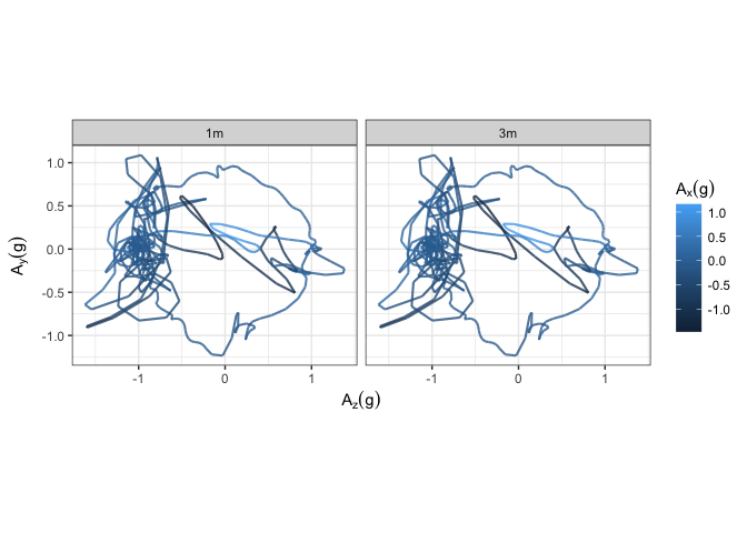
Created on 2018-07-31 by the reprex
package (v0.2.0).
Hello Ron & jcblum,
I am switching account & thank you both for the reply. I shall try them out in time.
On the other hand, I am trying to insert again the original 6 diagrams (it was 4 before) in the best resolution.
I'll put up the explanatory notes of the 6 diagrams in another message.
Thanks again for your input.
Thanks for that. But I don't think I'm much better informed now.
Does it imply that there are two traces on each graph, one for each branch of a bifurcation? If so, that would be a tweak to the code I provided above, in that you would have two accelerometer output files, one for each branch, which you would concatenate after loading (as in my example) with the branches labelled (as I've labelled 1m and 3m in my previous example). Then the plotting would group and colour by branch (expt) rather than facet by it.
Something like, and this code has not been run so please excuse any errors:
ggplot(acc_1m_and_3m) +
  geom_path(aes(x = Azg, y = Ayg, colour = expt), size = 0.75, alpha = 0.8) +
  + coord_fixed() + theme_bw() +
  scale_x_continuous(name = expression(A[z] (g))) +
  scale_y_continuous(name = expression(A[y] (g))) +
  scale_colour_continuous(name = "Height")
Ax is not used now, but I think you said that wasn't expected to be varying much so maybe that's ok.
Of course, you may be talking of bifurcating branches at levels 1m and 3m, in which case you'll have both colour by branch and facetting by height (and four files to read and pool). But how would we know, since you don't seem able/willing to actually describe what you have/will have or want?
I think that's been covered by myself and @jcblum as much as possible with the information supplied.
Thanks for Ron & Jcblum,
The bifurcation test was placing the X2-2 at the same level, whereas my tree run was placing the loggers at 1m & 3m from ground.
The bifurcation test was showing the movement of each of the branches in the Y & Z axis for several branches with bifurcation, & a separate test was run to study the breaking strength of each sample to reach a discussion.
My trial was to study the trunk movement in a typhoon by attaching a X2-2 at 1m & 3m from ground, & I was trying to get the diagrams of the bifurcation test for some conclusion. I am not sure whether R can do it? I do not know which statistical program the author of the bifurcation test used.
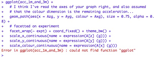
Incidentally, while trying to copy the input of Ron, I am getting a result of below:
As for Jcblum, i could only get this:
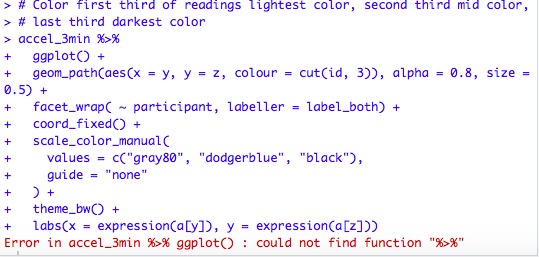
I could not get any diagram. What have I done wrong?
It seems that you haven't loaded the libraries. Part of the beauty of the reprex is that the library calls, etc. are all in there for you.
See @jcblum's here:
If you could try to put your code into a reprex, it'll be easier to troubleshoot!
For pointers specific to the community site, check out the reprex FAQ, linked to below.
Hi,
@mara's post gives advice on creating a reprex and what had gone wrong with your attempts to recreate my and @jcblum's examples.
Thanks for the explanation of your experiment, I have re-worked my previous example in line with this. As I used the same example data file from the accelerometer suppliers to represent data recorded at both 1m and 3m high, I scaled the data at 1m to make it less variable. You wouldn't want to copy that piece of code when plotting your experimental data.
I hope this helps.
library(tidyverse)
library(ggplot2)
#
# Example data file from a X2-2 accelerometer
file_loc <- 'http://www.gcdataconcepts.com/DATA-100.CSV'
#
# Function to load
load_accel <- function(fn, label = NA){
  # Read header lines from the file
  fc <- file(fn)
  hh <- readLines(fc, n = 9)
  close(fc)
  # edit and split the header lines lines
  hhl <- gsub(", ", ",", hh) %>% str_split(",")
  # extract the gain amnd header names
  gain  <- hhl[[grep(";Gain", hhl)]][2]
  heads <- hhl[[grep(";Headers", hhl)]][2:5]
  #
  # Read full data from the file:
  atbl <- read_csv(fn, col_names = heads, comment = ";")
  #
  if( gain == "low" ){ conv_fac <- 1/6554 } else { conv_fac <- 1/13108 }
  atbl %>% mutate( Axg = Ax * conv_fac,
                   Ayg = Ay * conv_fac,
                   Azg = Az * conv_fac, expt =label ) %>%
           # drops expt if all NA, assumes other columns contain values
           select_if(function(x){!all(is.na(x))})
}
#
# As you have two experiments/treatments, at 1m and 3m, I've plotted
# the same file twice, once for each. You would have two different file
# locations here.
#
# Assuming you have accelerometer data files at 1m and 3m, this
# code is what you need (with the file names modified to yours):
# acc_1m_and_3m <- bind_rows( load_accel( "my_1m_accel_data.csv", "1m" ),
#                             load_accel( "my_3m_accel_data.csv", "3m" ) )
#
# Because I am re-plotting the same data file twice in this example, I'm
# going to scale the 1m height data to make it less variable:
#
d_1m <- load_accel( file_loc, "1m" ) %>%
        mutate( Axg = Axg*0.5,
                Ayg = Ayg*0.5,
                Azg = Azg*0.5 )
#> Parsed with column specification:
#> cols(
#>   time = col_double(),
#>   Ax = col_integer(),
#>   Ay = col_integer(),
#>   Az = col_integer()
#> )
# and then combine it with the 3m height data:
d_3m <- load_accel( file_loc, "3m" )
#> Parsed with column specification:
#> cols(
#>   time = col_double(),
#>   Ax = col_integer(),
#>   Ay = col_integer(),
#>   Az = col_integer()
#> )
acc_1m_and_3m <- bind_rows( d_1m, d_3m )
#
# Now we're ready to plot the data in acc_1m_and_3m
#
ggplot(acc_1m_and_3m) +
   geom_path(aes(x = Azg, y = Ayg,
                 # I'm generating a factor from expt with the levels in
                 # a specific order so that the more variable 3m data will
                 # be plotted beneath the 1m data, as in the examples
                 colour = factor(expt,levels=c("3m","1m"))), size = 0.5) +
   coord_fixed() + theme_bw() +
   scale_x_continuous(name = expression(A[z] (g))) +
   scale_y_continuous(name = expression(A[y] (g))) +
   scale_colour_manual(name = "Height", values=c("dodgerblue","black"))
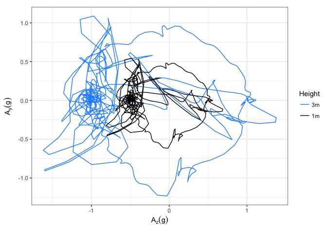
Created on 2018-08-06 by the reprex
package (v0.2.0).