Hi Umare,
Teacher? Should I be doing your homework?
Never mind, I've started now so here's a little reprex to help you:
library(ggplot2)
#
# Let's start with a little example data, approximating the top left 3x3 of your matrix
correlation.coef <- matrix(c(1, -0.17, 0.04,
                             -0.17, 1, -0.05,
                             0.04,-0.05, 1),
                           dimnames = list(c('cg225', 'cg271', 'cg215'),
                                           c('cg225', 'cg271', 'cg215')),
                           nrow = 3)
#
# locations of upper triangle
ut <- upper.tri(correlation.coef, diag = FALSE)
#
# make a data.frame with the upper triangle only
utdf <- data.frame(row = rownames(correlation.coef)[row(correlation.coef)[ut]],
                   col = colnames(correlation.coef)[col(correlation.coef)[ut]],
                   corr = correlation.coef[ut],
                   stringsAsFactors = FALSE)
#
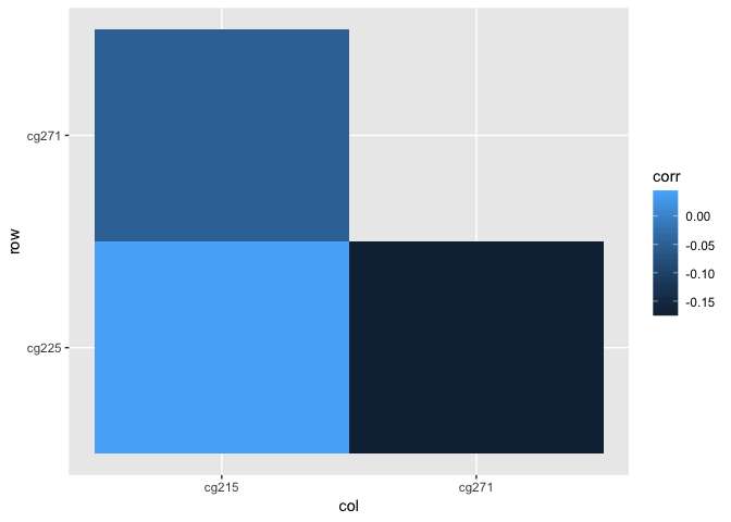
# If we make a heatmap using this then we will see that ggplot has
# will have plotted the rows in order (cg225, cg271) and the columns
# in order c(cg215, cg271) - whereas they were in order (cg271, cg215)
# in correlation.coef, so the output doesn't look like the upper triangle
# of our matrix. This is because, by default, factors are created in
# alphanumeric order.
ggplot(utdf) + geom_tile(aes(x=col,y=row,fill=corr))

#
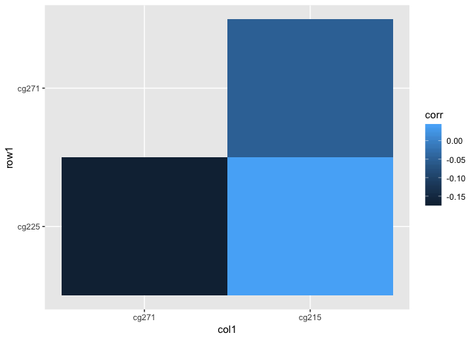
# so let's create the factors retaining the correlation.coef ordering,
# remembering that we've dropped the diagonals:
rows_in_utdf <- rownames(correlation.coef)[1:(nrow(correlation.coef)-1)]
cols_in_utdf <- colnames(correlation.coef)[2:ncol(correlation.coef)]
utdf$row1 <- factor(utdf$row, levels = rows_in_utdf)
utdf$col1 <- factor(utdf$col, levels = cols_in_utdf)
ggplot(utdf) + geom_tile(aes(x=col1,y=row1,fill=corr))

#
# the output looks better, but because our correlation.coef is displayed
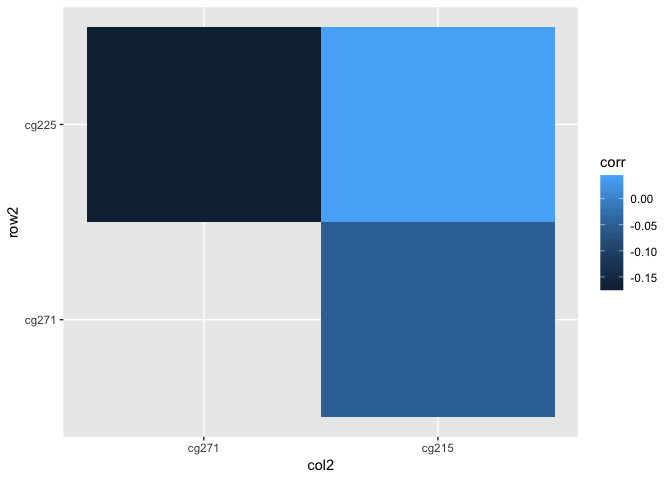
# with row 1 at the top, and the y-axis on our heatmap has row 1 (level 1
# of our factor) at the bottom, we might want to modify that:
rows_in_utdf <- rev(rownames(correlation.coef)[1:(nrow(correlation.coef)-1)])
cols_in_utdf <- colnames(correlation.coef)[2:ncol(correlation.coef)]
utdf$row2 <- factor(utdf$row, levels = rows_in_utdf)
utdf$col2 <- factor(utdf$col, levels = cols_in_utdf)
ggplot(utdf) + geom_tile(aes(x=col2,y=row2,fill=corr))

Created on 2019-06-07 by the reprex package (v0.2.1)
You can make the heatmap prettier yourself by playing with scale_* and the theme etc.
I'd suggest that, as it looks like homework, you should go through this line by line so you understand what each step is doing, eg look at the output of each step (what does ut look like, what does correlation.coef[ut] produce), rather than just copy and paste the desired code chunk.
Ron.
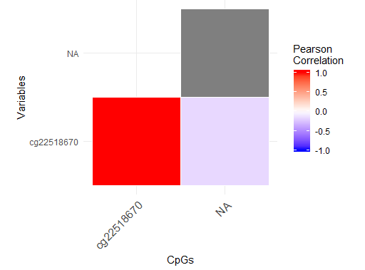
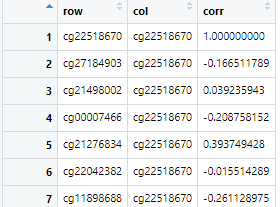 and they gave us a code like this to create it: data.frame(row=rownames(correlation.coef)[row(correlation.coef)], col=colnames(correlation.coef)[col(correlation.coef)], corr=c(correlation.coef))->total
