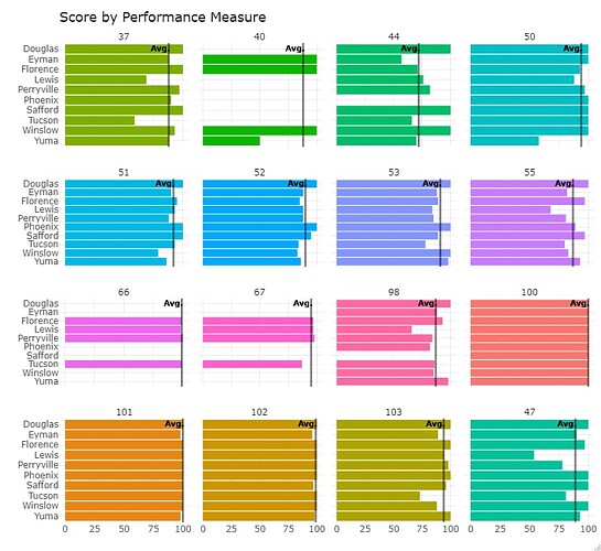
I need to add the average value to this graph. I can add the label, but when I don't know how to add the actual average value. What am I missing?
This is the plot:
generated from the following code:
july_p <- ggplot(july_selected, aes(x=Score, y=sites, fill=PM))+ geom_bar(stat="identity")+ facet_wrap("PM")+theme_minimal()+theme(legend.position="top")+ scale_y_discrete(limits=rev)+
facet_wrap(~fct_relevel(PM,"37","40","44","50", "51", "52", "53", "55", "66", "67", "98", "100", "101", "102", "103"))+
theme(legend.position = "none")+
labs(
x="",
y="")+
ggtitle('Score by Performance Measure', subtitle = "Vertical line = Monthly Average")
july_p <- july_p + geom_vline(july_selected, mapping = aes(xintercept=Avg.), color="black", alpha=.5, size=.7) + geom_text(mapping = aes(x=Avg.-7), color="black", label='Avg.', y=10, size=3, )
The source data is as follows:
| PM | Avg. | m | sites | Score |
|---|---|---|---|---|
| 100 | 100 | 100 | Douglas | 100 |
| 100 | 100 | 100 | Eyman | 100 |
| 100 | 100 | 100 | Florence | 100 |
| 100 | 100 | 100 | Lewis | 100 |
| 100 | 100 | 100 | Perryville | 100 |
| 100 | 100 | 100 | Phoenix | 100 |
| 100 | 100 | 100 | Safford | 100 |
| 100 | 100 | 100 | Tucson | 100 |
| 100 | 100 | 100 | Winslow | 100 |
| 100 | 100 | 100 | Yuma | 100 |
| 101 | 100 | 99.6 | Douglas | 100 |
| 101 | 100 | 99.6 | Eyman | 98 |
| 101 | 100 | 99.6 | Florence | 100 |
| 101 | 100 | 99.6 | Lewis | 100 |
| 101 | 100 | 99.6 | Perryville | 100 |
| 101 | 100 | 99.6 | Phoenix | 100 |
| 101 | 100 | 99.6 | Safford | 100 |
| 101 | 100 | 99.6 | Tucson | 100 |
| 101 | 100 | 99.6 | Winslow | 100 |
| 101 | 100 | 99.6 | Yuma | 98 |
| 102 | 99 | 99.1 | Douglas | 100 |
| 102 | 99 | 99.1 | Eyman | 96 |
| 102 | 99 | 99.1 | Florence | 100 |
| 102 | 99 | 99.1 | Lewis | 100 |
| 102 | 99 | 99.1 | Perryville | 100 |
| 102 | 99 | 99.1 | Phoenix | 100 |
| 102 | 99 | 99.1 | Safford | 97 |
| etc. |
