
I created Quarto book. This is my _quarto.yml file:
format:
  html:
    theme:
      light: white
      dark: darkly
Is there a way to add text to the switch UI/UX or customise it in some way? Add some icon like sun/contrast icons, etc.?
I created Quarto book. This is my _quarto.yml file:
format:
html:
theme:
light: white
dark: darkly
Is there a way to add text to the switch UI/UX or customise it in some way? Add some icon like sun/contrast icons, etc.?
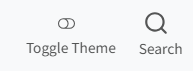
Hi, I just recently had the same question. Here's how I solved it in a very simple way.
I added the following to a css file that I included in my _quarto.yml (for example, the styles.css that gets created by default in the template website project):
.navbar .quarto-color-scheme-toggle::after {
  content: " Toggle Theme";
  margin-left: 0.5rem;
  font-size: 0.9rem;
}
If you want to change the appearance so it sits below the toggle, you can add something like this (I also removed the underline):
.navbar .quarto-color-scheme-toggle {
  display: flex;
  flex-direction: column;
  align-items: center;
  text-align: center;
  text-decoration: none;
}
I also added a label to my search icon in the bar too for better accessibility (I had to set the colour here as it wasn't getting picked up as a link for styling purposes):
.navbar .aa-DetachedSearchButton::after {
  content: " Search";
  margin-left: 0.5rem;
  font-size: 0.9rem;
  color: #545555;
}
A really important thing to do for accessibility!
I didn't add any icons/fancy stuff that switches depending on the colour scheme (e.g. swapping from a moon to sun emoji), but hopefully this basic implementation will be a good jumping-off point!
This topic was automatically closed 90 days after the last reply. New replies are no longer allowed.
If you have a query related to it or one of the replies, start a new topic and refer back with a link.