How can I add a logo to the header of R shiny app created using {bslib}?

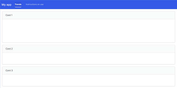
I am trying to add my company's logo to an R shiny app, made using {bslib}. I tried different ways of adding this image to the 'title' argument of 'page_navbar'. While the image gets added, it looks wonky and changes the position of the other items in the header. An example image and the logo attached.

Please find below, a demo code illustrating the issue:

library(shiny)
library(bslib)
ui <- page_navbar(
  title = div("My app",
              img(src = "WCTMainLogoWhite_edited.png", height = "57.5px", width = "auto", 
                  style = "position: absolute;
                           top: 1px;
                           right: 2%;")),
  theme = bs_theme(version = 5, bootswatch = "zephyr")|> ##setting the primary color of "zephyr" bootswatch theme manually
    bslib::bs_add_rules(
      rules = "
                    .navbar.navbar-default {
                        background-color: $primary !important;
                    }
                    "
    ),
  nav_panel(title = "Trends",
            layout_columns(
              card(
                full_screen = TRUE,
                card_header(
                  "Card 1")
                )),
              layout_columns(
                card(
                  full_screen = TRUE,
                  card_header("Card 2")),
                card(
                  full_screen = TRUE,
                  card_header("Card 3")),
                col_widths = c(12, 12) 
              )
            ),
  nav_panel(title = "Instructions on use", p("Content to be added"))
)

server <- function(input, output, session) {}

shinyApp(ui, server)

Can anyone please suggest how else I could go about adding the logo?
Thank you very much in advance!

WCTMainLogoWhite_edited

Please be as precise as you can in identifying the problem that you wish to solve.
Here is a direct comparison of your code with and without the image.


It's not obvious that the position of any other item in the header has changed ...
Also I'm not sure what 'looks wonky' means... perhaps if you were more descriptive about it we could suggest code to address the issue?

Hi Nir. Thanks for your response, sorry for not being descriptive enough. Please find attached screenshots of the example app with and without the logo.

  1. In terms of positions, you can see that with the logo the 'My app' title has moved a little upwards and is not aligned with the 'Trends' and 'Instructions on use' tabs anymore.
  2. Position-wise, the logo also does not sit well within the header ribbon. For some reason, extra space has appeared beneath the logo, WITHIN the header ribbon.
    Whereas, I would like the logo to fit snugly within the header ribbon, such as in the case of another app I've created: FLOWIDER: River Flood Tracking, Gangetic Plains.

Hope my query is clear now. Please let me know of suggestions if any. Thanks!

Please see the answer on Stack Overflow

This topic was automatically closed 7 days after the last reply. New replies are no longer allowed.

If you have a query related to it or one of the replies, start a new topic and refer back with a link.