how can fit s curve to data?

i have a tibble and i want to fit s curve to it . how can do it?

tb <- tt <- tibble::tribble(
    ~ value,
    2,
    5,
    18,
    28,
    43,
    61,
    95,
    139,
    245,
    388,
    593,
    978,
    1501,
    2336,
    2922,
    3513,
    4747,
    5823,
    6566,
    7161,
    8042,
    9000,
    10075,
    11364,
    12729,
    13938,
    14991,
    16169
)

tb2 <- mutate(tb,
              rownum = row_number(),
              value2 = value/max(value))

model <- glm(value2 ~ rownum,family=binomial(link='logit'),data=tb2)

summary(model)

fitted.results <- predict(model,
                          newdata=tb2,type='response')

tb3 <- cbind(tb2,fitted.results)

tb4 <- mutate(tb3,
              rescaled_prediction = fitted.results * max(value))

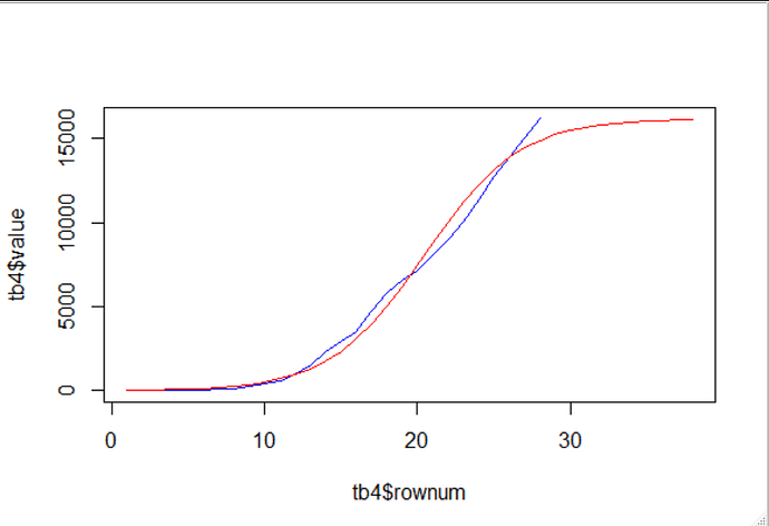
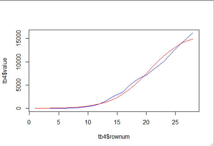
plot(tb4$rownum,tb4$value,type="l",col="blue")
lines(tb4$rownum,tb4$rescaled_prediction,col="red")

1 Like

thanks @nirgrahamuk
I mean it's , the data set is first section of S curve and how can continue line S curve to fit that.(continue blue line)

Thanks for the partial reprex, it's missing tt however. The best way to get the data would be

dput(tb)

and cut and paste the output, so folk don't have to extract ~value manually.

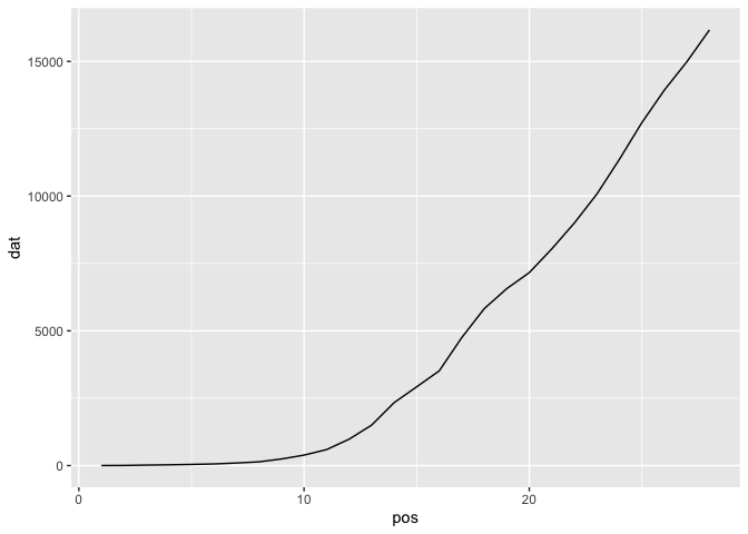
suppressPackageStartupMessages(library(ggplot2)) 
dat <- c(2,5,18,28,43,61,95,139,245,388,593,978,1501,2336,2922,3513,4747,5823,6566,7161,8042,9000,10075,11364,12729,13938,14991,16169)
pos <- seq(1:28)
df <- as.data.frame(cbind(pos,dat))
p <- ggplot(df,aes(pos,dat))
p + geom_line()

Created on 2020-03-18 by the reprex package (v0.3.0)

gives a line plot of the data against sequence number.

Good on @nirgrahamuk for the log likelihood enhancement

Hi Saso, not sure I understand your question.
The blue line is your actual data, and can''t be extended in a non-trivial way per say. (you could record more samples ? you could use the red line after the blue line stops ?)
The red line is the fitted line, and so can be extended by giving it more row_numbers... like this.


tb2 <- mutate(tb,
              rownum = row_number(),
              value2 = value/max(value))

model <- glm(value2 ~ rownum,family=binomial(link='logit'),data=tb2)

summary(model)

mtr <- max(tb2$rownum) + 1
tb2_extended <- union_all(tb2,
                          data.frame(value=rep(NA_real_,10),
                                     rownum=mtr:(mtr+9),
                                     value2=rep(NA_real_,10)))
fitted.results <- predict(model,
                          newdata=tb2_extended,type='response')

tb3 <- cbind(tb2_extended,fitted.results)

tb4 <- mutate(tb3,
              rescaled_prediction = fitted.results * max(value,na.rm = TRUE))

plot(tb4$rownum,tb4$value,type="l",col="blue")
lines(tb4$rownum,tb4$rescaled_prediction,col="red")

1 Like

it true, I haven't any other data but if we change the limit y to (0, 30000), can draw continue blue line the same S curve?

Could you give any background to the context, what does the data represent, what would the s curve then be used for ?
It might be that understanding this informs a modeling decision regarding how best to proceed

my data is confirmed corona and this data have S shape. know i want to drawing it according to this data.

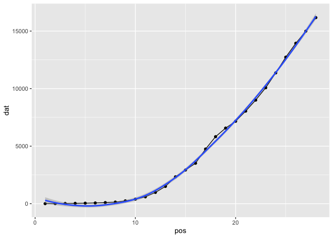
Local polynomial regression fitting appears to work well

library(ggplot2)
suppressPackageStartupMessages(library(ggplot2)) 
dat <- c(2,5,18,28,43,61,95,139,245,388,593,978,1501,2336,2922,3513,4747,5823,6566,7161,8042,9000,10075,11364,12729,13938,14991,16169)
pos <- seq(1:28)
df <- as.data.frame(cbind(pos,dat))
p <- ggplot(df,aes(pos,dat))
p + geom_line() + geom_point() + geom_smooth(method = "loess")
#> `geom_smooth()` using formula 'y ~ x'

Created on 2020-03-18 by the reprex package (v0.3.0)

You can also look at ARIMA models with the forecast package

thanks @technocrat but i want continue line and no until fitting model to data.

Continuing the line requires a choice of model to fit the existing data and project it as a function of time. What model will you use?

@technocrat i use negative binomial to fit data and i know my data in future tend to S shape

OK, so have you tried @nirgrahamuk's suggestion of using the predict() function to extrapolate further data points?

Yes, @technocrat but i use glm.nb function for modeling data and also spline function to get s curve and don't get result. Because we fit glm.nb for fitting model to data and dats after the time change to s curve

Can you reprex your code?

@technocrat how can do it?

To do a reprex, please see the FAQ: What's a reproducible example (`reprex`) and how do I do one?

You need to provide the code you are using to predict the future values in the series.

I think that the data is insufficient to do more than simulate very vague predictions of possible s-curves.
a lot more data would be required to pick curves of best fit.

What I'm about to present, is probably flawed, and I'd appreciate help with corrections. I figure that the data presented is very very early in any possible s curve. i.e. theres no sight yet of the inflexion point, so a huge range of possible s-curves can be fit. It seems to me that the fact that only the early portion of an s - curve has been provided can be achieved by dividing linearly the sample values, by some factor that represents how small of a portion of an s-curve has been presented. Then we can try to fit scurves on the early data points, and see the sorts of curves that can fit well for that.

library(tidyverse)
library(purrr) 
tb <- tibble::tribble(
  ~ value,
  2,
  5,
  18,
  28,
  43,
  61,
  95,
  139,
  245,
  388,
  593,
  978,
  1501,
  2336,
  2922,
  3513,
  4747,
  5823,
  6566,
  7161,
  8042,
  9000,
  10075,
  11364,
  12729,
  13938,
  14991,
  16169
) %>% mutate(
  rownum = row_number()
)


opt_func <- function(param_to_opt) {
  tb2 <- mutate(tb,
    value2 = value / (param_to_opt * max(value))
  )

  model <- glm(value2 ~ rownum, family = binomial(link = "logit"),weights=log(tb2$rownum), data = tb2)
  
 
  return( sqrt(mean(model$residuals^2)))
}

ser <- 1:1000 * 10000
rmse <- map_dbl(ser , ~opt_func(.))
min_index <- which(rmse==min(rmse))
ser[[min_index]]

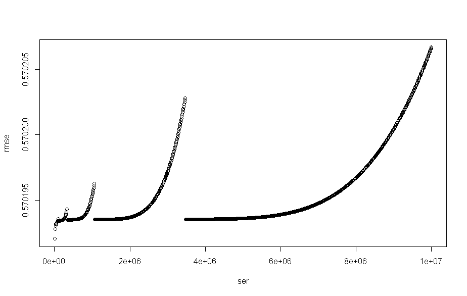
plot(x = ser,y=rmse)


rmse[rmse> 0.570192 -0.000001 & rmse <0.570192 +0.000001]
#only 2 values
rmse[rmse> 0.570192 -0.000002 & rmse <0.570192 +0.000002]
#477 values
rmse[rmse> 0.570192 -0.0000015 & rmse <0.570192 +0.0000015]
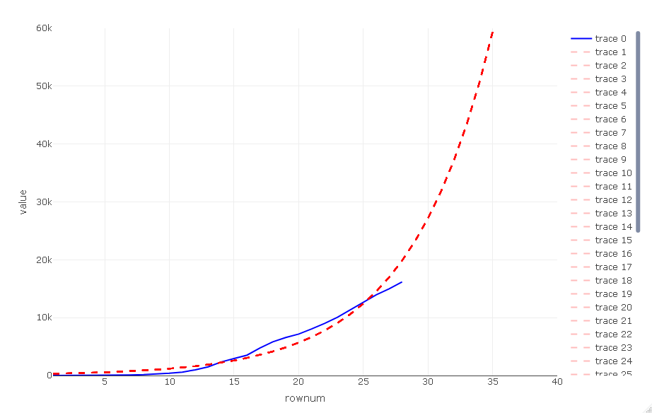
#43 values ' so will plot 43 'most likey' s curves from the 1000 trialled.


parms_to_plot <- which(rmse> 0.570192 -0.0000015 & rmse <0.570192 +0.0000015)

extrude_length <- 150

new_prediction <- function(chosen_parm)
{
tb2 <- mutate(tb,
              rownum = row_number(),
              value2 = value / (chosen_parm * max(value))
)


model <- glm(value2 ~ rownum, family = binomial(link = "logit"),weights = log(tb2$rownum), data = tb2)
mtr <- max(tb2$rownum) + 1


tb2_extended <- union_all(tb2,
                          data.frame(value=rep(NA_real_,extrude_length),
                                     rownum=mtr:(mtr+extrude_length -1),
                                     value2=rep(NA_real_,extrude_length)))
fitted.results <- predict(model,
                          newdata=tb2_extended,type='response')

tb3 <- cbind(tb2_extended,fitted.results)

tb4 <- mutate(tb3,
              rescaled_prediction = fitted.results * chosen_parm *max(value,na.rm = TRUE))

select(tb4,
       rescaled_prediction)
}

extruded_plots <- map_dfc(ser[parms_to_plot],
        ~new_prediction(.))

mtr <- max(tb$rownum) + 1
tb2_extended <- union_all(tb,
                          data.frame(value=rep(NA_real_,extrude_length),
                                     rownum=mtr:(mtr+extrude_length -1)))
                                     
data_to_plot<-bind_cols(tb2_extended,extruded_plots)

library(plotly)

p<- plot_ly(data=data_to_plot,
            type="scatter",
            mode="lines",
            x=~rownum,
            y=~value,
            line= list(
              color="#0000FFFF"))

additional_line_names <- setdiff(names(data_to_plot),
                                 c("value","rownum")) 

add_next_trace <- function(name)
{
  p<<-p %>% add_trace(y=as.formula(paste0("~",name)),
               line= list(
                 color="#FF000044",
                 dash = 'dash')
             ) 
}
walk(additional_line_names,
     add_next_trace
     )


p_close <- p %>% layout(xaxis = list(range = c(1, 40)),
                        yaxis = list(range = c(0,60000)))
pfull <- p

in the above i have plot() of the root mean square error , rmse that looks like


I then try to find some number of values that are towards the minima of that.
I settle on bounds which represent the 43 smallest values.
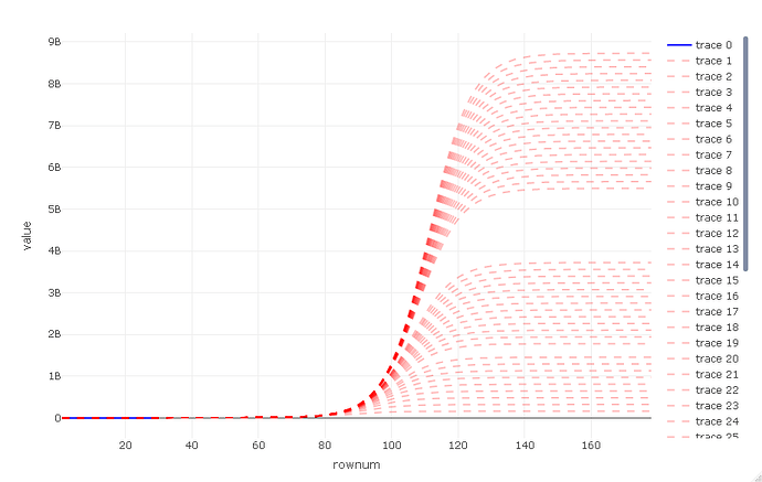
and I plot them.
there is a zoomed in view p_close

and a zoomed out view p_full

As can be seen here, there is a range from about 2% of earth population to over 100% , worrying :-/

I wouldn't trust these results to give any insight... but it was interesting to think about abstractly.
3 Likes

@nirgrahamuk Thank you for the virtuosity: it's exactly what is called for in place of the convergence to a predetermined curve asked for. I learned a lot.