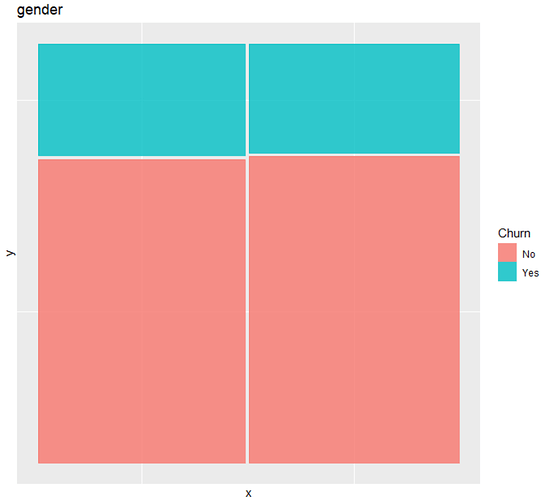
I don't know why there's no labels in my mosaic plots while the all charts in blogs have them , even though I used the same codes.
data source: Telco Customer Churn | Kaggle
my code
#DAta import
tel<- read.csv("WA_Fn_UseC_Telco_Customer_Churn.csv", stringsAsFactors=T)
attach(tel)
SeniorCitizen NUMERIC => FACTOR
tel$SeniorCitizen <- factor(tel$SeniorCitizen)
REMOVE NA ROWs => 11 out of 7043 : 0.16%
tel_com <- tel[complete.cases(tel),]
library(ggpubr)
ggplot(data = tel_com)+geom_mosaic(aes(x=product(Churn,PhoneService),fill=Churn)) +labs(x= "PhoneService", title ='PhoneService')
Chart: There should be 'femail' and 'male' in the bottom.
