library(circlize)
Read data
data <- read.csv("circos2.csv", row.names = 1)
data1 <- as.matrix(data)
Assign color to each group
col <- c(Core = "green", Accessory = "red", Exclusive = "blue")
Set the DPI (dots per inch)
dpi <- 600
Calculate the width and height for a 600 DPI image
width_inches <- 8
height_inches <- 8
width_pixels <- dpi * width_inches
height_pixels <- dpi * height_inches
Create a chord diagram without ticks
chordDiagram(data1, grid.col = col, annotationTrack = "grid", preAllocateTracks = 1, link.border = 1.5)
Add the labels and axis without ticks
circos.trackPlotRegion(track.index = 2, panel.fun = function(x, y) {
xlim <- get.cell.meta.data("xlim")
ylim <- get.cell.meta.data("ylim")
sector.name <- get.cell.meta.data("sector.index")
Print labels with small gap
circos.text(mean(xlim), ylim[1] + 2.0, sector.name,
facing = "clockwise", niceFacing = TRUE, adj = c(0, 0.5), cex = 0.7, small.gap = 0.02)
Print axis without ticks
circos.axis(h = "top", labels.cex = 0.1, major.tick = 1e-10, minor.tick = 1e-10,
sector.index = sector.name, track.index = 2)
}, bg.border = NA)
png('circle1.png', width = width_pixels, height = height_pixels, res = dpi)
Close the PNG device
dev.off()
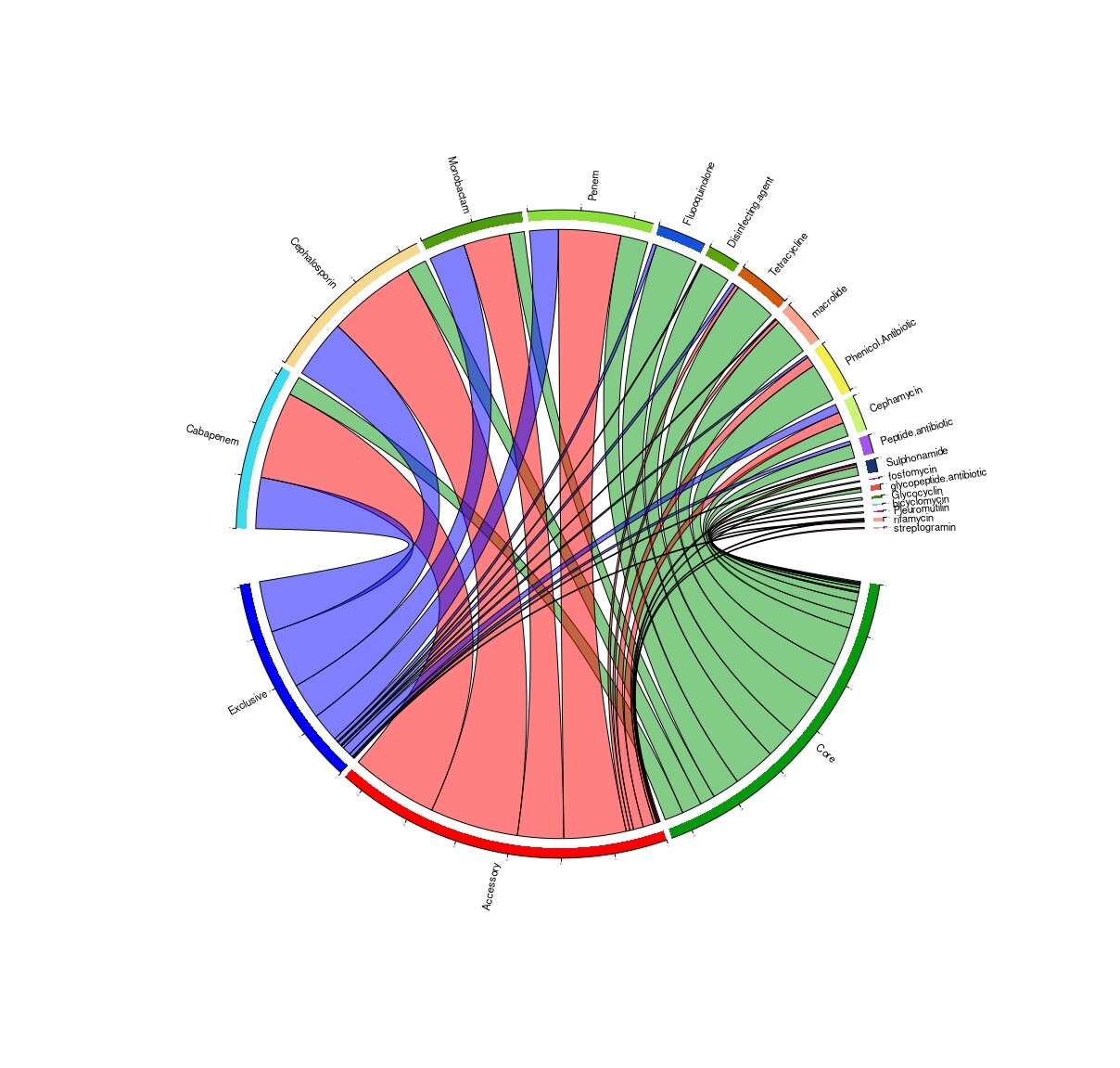
Plz have look in picture of chord diagram ...i want to increase font without overlapping in label and I want to remove ticks . i also tried ```
chordDiagram(mat, grid.col = grid.col, annotationTrack = c("name", "grid"),
annotationTrackHeight = c(0.03, 0.01))
this from this link Chapter 15 Advanced usage of chordDiagram() | Circular Visualization in R but still unable to solve it. Please help me .