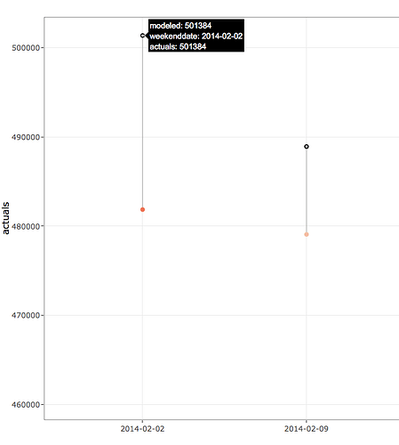
So I have a plot which show the actual value, modeled value and the error.Below is the code for the same.
library(plotly)
library(ggplot2)

ab <-tibble::tribble(
  ~modeled, ~actuals, ~weekenddate,  ~err,
    501384,   481864, "2014-02-02", 19519,
    488933,   479078, "2014-02-09",  9856,
    484191,   464026, "2014-02-16", 20165,
    480443,   460339, "2014-02-23", 20104,
    482512,   464021, "2014-03-02", 18491,
    488843,   462458, "2014-03-09", 26385
  )


test_bottom <- ggplot(ab, aes(x = weekenddate, y = actuals)) +
  geom_smooth(method = "lm", se = FALSE, color = "lightgrey") +  # Plot regression slope
  geom_segment(aes(xend = weekenddate, yend = modeled), alpha = .2) +  # alpha to fade lines
  # > Alpha adjustments made here...
  geom_point(aes(color = err)) +  # Alpha mapped to abs(residuals)
  scale_color_gradient2(low = "blue", mid = "white", high = "red") +
  guides(color = FALSE) +  # Alpha legend removed
  geom_point(aes(y = modeled), shape = 1) +
  theme_bw()

ggplotly(test_bottom)
Created on 2018-10-12 by the reprex package (v0.2.1)
If you see the hover it shows modeled and actual value both the same. The hover should just show modeled value and red dot when hovered should show only the actual value along with the error.
How can this be done.
