Horizontal line with individual Mean value in GGplot

Hi,

I have longitudinal data of the subjective drug craving of 19 subjects on a continuous scale between 0 and 100.
I have made Panel Plots for each subject with up to 24 measuring points for each subject (range 2-24).

I have problem getting a horizontal line for each plot for the subject specific mean(Craving).
My data is already in the long format.

Any suggestions?

Thank you in advance!

Hello Anders,

Welcome to RStudio Community. It is most useful if you can provide a reproducible example of your data and code. Please read the below link carefully as to how to produce one:

FAQ: What's a reproducible example (reprex) and how do I create one?

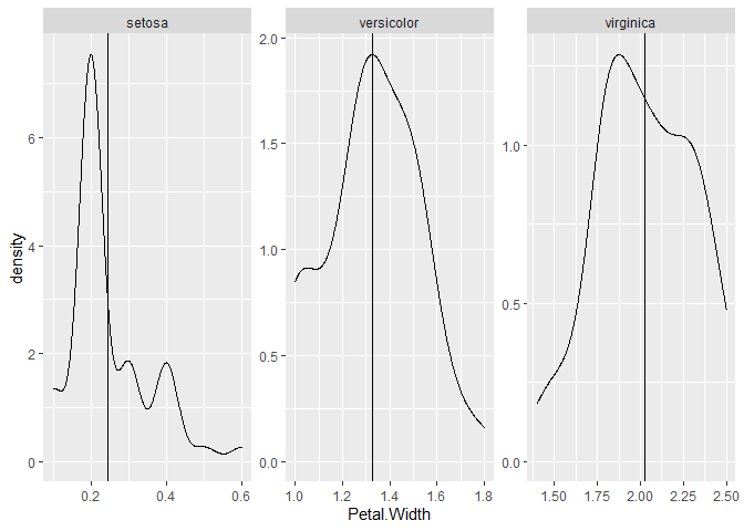
A generic example of something similar is below:

library(tidyverse)

tibble(iris) |> 
  group_by(Species) |> 
  mutate(mean = mean(Petal.Width)) |> 
  ggplot(aes(x = Petal.Width)) +
  geom_density() +
  geom_vline(aes(xintercept = mean)) +
  facet_wrap(~Species, scales = "free")

Created on 2022-01-25 by the reprex package (v2.0.1)

Thank you Jack for getting back to me, I have included a short script and the long format example data file.
It seems to me that this code should include a horizontal mean line in the plots, intercepting at the individual means, but it does not work.

Example data:

PID session Craving_value Measurement
1 1 2 Craving1
1 2 100 Craving2
1 3 62 Craving3
1 4 46 Craving4
1 5 61 Craving5
1 6 98 Craving6
1 7 50 Craving7
2 1 41 Craving1
2 2 85 Craving2
2 3 28 Craving3
2 4 99 Craving4
2 5 23 Craving5
2 6 92 Craving6
2 7 72 Craving7
3 1 34 Craving1
3 2 43 Craving2
3 3 73 Craving3
3 4 48 Craving4
3 5 40 Craving5
3 6 Craving6
3 7 Craving7
4 1 22 Craving1
4 2 72 Craving2
4 3 86 Craving3
4 4 80 Craving4
4 5 16 Craving5
4 6 40 Craving6
4 7 21 Craving7

And code:
library(tidyverse)
library(ggplot2)

ggplot(data = CravingRepLong_2, aes(x=session, y=Craving_value)) + geom_point() +
geom_hline(aes(yintercept = mean(CravingRepLong_2$Craving_value, by = PID), linetype = "mean Craving"))+stat_summary(aes(y = Craving_value, group = Craving), fun.y = mean, colour="red", geom="line") + facet_wrap(~PID)+ theme_classic()

Is this what you're aiming for?

library(tidyverse)

dat = tribble(
  ~PID, ~session,   ~Craving_value, ~Measurement,
  1,    1,  2     ,"Craving1",
  1,    2,  100 ,"Craving2",
  1,    3,  62  ,"Craving3",
  1,    4,  46  ,"Craving4",
  1,    5,  61  ,"Craving5",
  1,    6,  98  ,"Craving6",
  1,    7,  50  ,"Craving7",
  2,    1,  41  ,"Craving1",
  2,    2,  85  ,"Craving2",
  2,    3,  28  ,"Craving3",
  2,    4,  99  ,"Craving4",
  2,    5,  23  ,"Craving5",
  2,    6,  92  ,"Craving6",
  2,    7,  72  ,"Craving7",
  3,    1,  34  ,"Craving1",
  3,    2,  43  ,"Craving2",
  3,    3,  73  ,"Craving3",
  3,    4,  48  ,"Craving4",
  3,    5,  40  ,"Craving5",
  3,    6,  NA  ,"Craving6",
  3,    7,  NA  ,"Craving7",
  4,    1,  22  ,"Craving1",
  4,    2,  72  ,"Craving2",
  4,    3,  86  ,"Craving3",
  4,    4,  80  ,"Craving4",
  4,    5,  16  ,"Craving5",
  4,    6,  40  ,"Craving6",
  4,    7,  21  ,"Craving7")

dat %>%
  group_by(PID) %>%
  mutate(mean_val = mean(Craving_value, na.rm = T)) %>%
  ggplot(aes(x = session, y = Craving_value)) +
  geom_point() +
  geom_hline(aes(yintercept = mean_val)) +
  stat_summary(
    aes(y = Craving_value),
    fun = mean,
    colour = "red",
    geom = "line"
  ) +
  facet_wrap( ~ PID) +
  theme_classic()
#> Warning: Removed 2 rows containing non-finite values (stat_summary).
#> Warning: Removed 2 rows containing missing values (geom_point).

1 Like

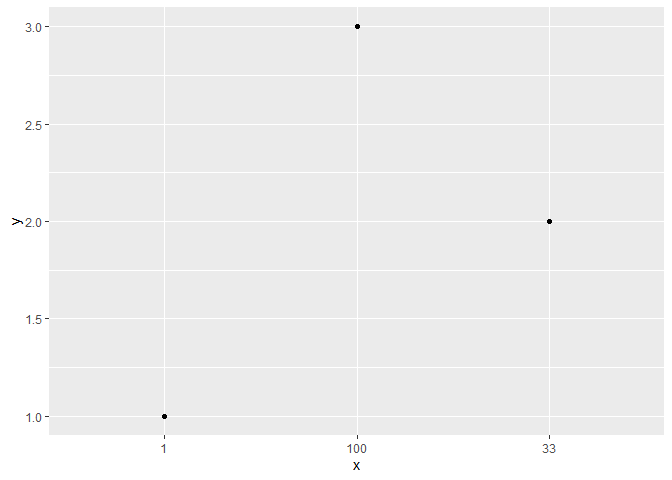
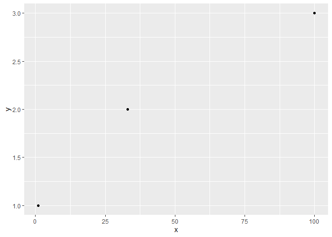
Thank you! Works perfectly, with one little hick-up: in my original dataset I have 24 observations, so the x-axis stacks it as 1, 10 etc. anyway I can make it stack it chronologically?

That sounds like your x axis isn't numeric, consider the below cases. Is your data correctly formatted as numeric rather than character?

library(tidyverse)

tibble(x = c("1", "33", "100"),
       y = c(1,2,3)) %>%
  ggplot(aes(x,y)) + geom_point()

tibble(x = c("1", "33", "100"),
       y = c(1,2,3)) %>%
  mutate(x = as.numeric(x)) %>%
  ggplot(aes(x,y)) + geom_point()

Created on 2022-01-26 by the reprex package (v2.0.1)

That solved it! Thank you for your generous help!

This topic was automatically closed 21 days after the last reply. New replies are no longer allowed.

If you have a query related to it or one of the replies, start a new topic and refer back with a link.