Horizontal line in ScatterPlot using ggplot

Hi!

I'm trying to build a scatterplot graph using ggplot but there are some features that i just don't know how to manage.

Actually, my graph is like this:

Code:

   d <- ggplot(dfPlot2, aes(x=(PE_WT_MED_MED), y=(PE_OD_MED_MED))) +
      geom_point() +
      geom_smooth(method=lm, se=FALSE) +
      geom_hline(yintercept = c(2,10), linetype = 'dashed') +
      labs(title="Dispersao Dimensional Fast", subtitle="Testando Dispersao", y="PE_OD_MED_MED", x="PE_WT_MED_MED", caption="Nao tem") +
      theme_classic()

    ggplotly(d)

But, I need to build something like this:

Someone know how can I insert the other lines and the box in my graph?

Hard to give you specific advice without knowing how the lines should be constructed but in general you can use geom_rect() and geom_segment() to draw figures like those.

library(ggplot2)

ggplot(iris, aes(Sepal.Length, Sepal.Width)) +
    geom_point() +
    geom_rect(xmin = 5, xmax = 7, ymin = 2.5, ymax = 4, alpha = 0, color = "red") +
    geom_segment(x = 5, y = 2, xend = 7, yend = 4, color = "blue")

Created on 2019-10-23 by the reprex package (v0.3.0.9000)

1 Like

Thanks! Exactly what I want to know.

But, If i need to plot 2 lines (the blue one), how can I code it?

I tried:

    geom_segment(x = c(5,7), y = c(2,4), xend = c(7,9), yend = c(4,6), color = "blue")

That way no line appeared

If you want to draw arbitrary lines then you have to do it one by one, there could be a better solution by mapping aesthetics to variables but without context, it is hard to give you any specific advice.

library(ggplot2)

ggplot(iris, aes(Sepal.Length, Sepal.Width)) +
    geom_point() +
    geom_rect(xmin = 5, xmax = 7, ymin = 2.5, ymax = 4, alpha = 0, color = "red") +
    geom_segment(x = 5, y = 2, xend = 7, yend = 4, color = "blue") +
    geom_segment(x = 6, y = 2, xend = 7, yend = 3, color = "green")

1 Like

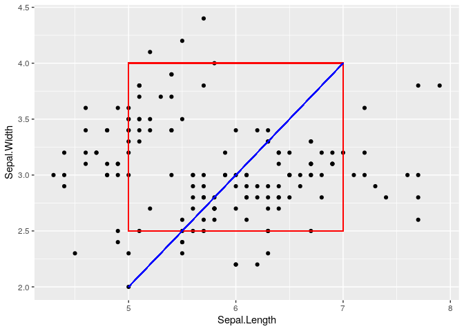
The suggested solution works in many cases, but there's a potential pitfall to watch out for if your data is large, i.e. more than a few thousand rows. In those cases, the drawing could get very slow, and alpha will not work as expected. But most of the time those are not significant problems.

The issue is that using geom_rect and geom_segment will draw one layer for every row of data, so the output of the solution has 150 rectangles, and 150 segments, drawn on top of each other. You'll note that adding alpha = 0.1 to any of these layers will look exactly the same as without it.

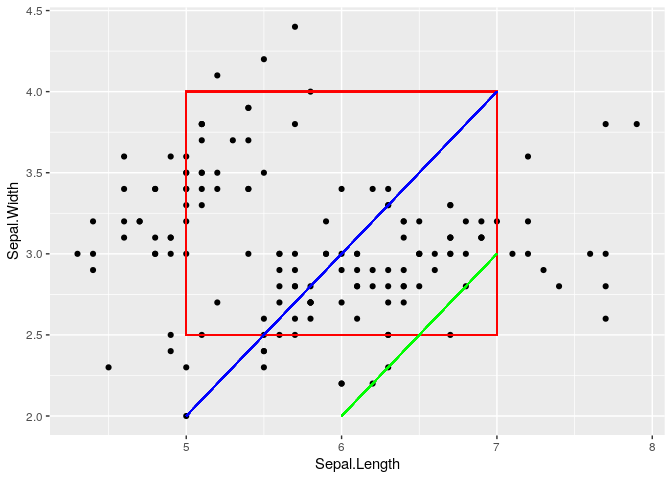
If this is a problem for your situation, the easiest solution would be to use annotate instead. Compare the output of these two:

# Iris has 150 rows, so each layer gets drawn once per row
ggplot(iris, aes(Sepal.Length, Sepal.Width)) +
  geom_point() +
  geom_rect(xmin = 5, xmax = 7, ymin = 2.5, ymax = 4, fill = NA, color = "red", alpha = 0.1) +
  geom_segment(x = 5, y = 2, xend = 7, yend = 4, color = "blue", alpha = 0.1) +
  geom_segment(x = 6, y = 2, xend = 7, yend = 3, color = "green", alpha = 0.1)

# annotate just draws one layer; geom_rect's alpha controls fill, so it doesn't look translucent here
ggplot(iris, aes(Sepal.Length, Sepal.Width)) +
  geom_point() +
  annotate("rect", xmin = 5, xmax = 7, ymin = 2.5, ymax = 4, fill = NA, color = "red", alpha = 0.1) +
  annotate("segment", x = 5, y = 2, xend = 7, yend = 4, color = "blue", alpha = 0.1) +
  annotate("segment", x = 6, y = 2, xend = 7, yend = 3, color = "green", alpha = 0.1)

This topic was automatically closed 7 days after the last reply. New replies are no longer allowed.