Histograms with loops

I am trying to create three histograms for every manager that are in the form par(mfrow=c(1,3)).
Instead of doing this for every manager, I created this loop which runs for a long time before giving me nothing of value. I have 23 managers, so I should have 69 graphs, where each manager's graph falls on one line.

Can you please let me know if I am on the right track and hints to improve it?

par(mfrow=c(1,3)) 
for(i in UD$MANAGER){
    hist(UD$ACTION_COMPLETE..decimals.[UD$MANAGER==i], main = "Completed Inspections throughout the Day", 
    xlab= "Hours of the Day", ylab = "Frequency", breaks = 24, xlim=c(0,24),ylim=c(0,300),
    border = "black", col=rgb(1,0,0,0.5), axes=F)
    axis(1, at = seq(0,24,1))
    axis(2, at = seq(0,300,50))
    box()

    hist(UD$LOAD_DATE..decimals.[UD$MANAGER==i],main = "Completed Uploads throughout the Day", 
    xlab= "Hours of the Day", ylab = "Frequency", breaks = 24, xlim=c(0,24),ylim=c(0,300),
    border = "black", col= rgb(0,0,1,0.5), at = seq(0,25,1), axes = F, add=F)
    axis(1, at = seq(0,24,1))
    axis(2, at = seq(0,300,50))
    box()

# Join Histograms

    hist(UD$ACTION_COMPLETE..decimals.[UD$MANAGER==i], main = "Completed Inspections and Uploads throughout the Day", 
    xlab= "Hours of the Day", ylab = "Frequency", breaks = 24, xlim=c(0,24),ylim=c(0,300),
    border = "black", col=rgb(1,0,0,0.5), axes=F)
    hist(UD$LOAD_DATE..decimals.[UD$MANAGER==i],main = "Inspection Load Time", 
    xlab= "Hours of the Day", ylab = "Frequency", breaks = 24, xlim=c(0,24),ylim=c(0,300),
    border = "black", col=rgb(0,0,1,0.5), at = seq(0,25,1), axes = F, add=T)
    axis(1, at = seq(0,24,1)) 
    axis(2, at = seq(0,300,50)) 
    box()  
    legend("topleft",c("Pink = Completed Inspections every Hour","Blue = Completed Uploads every Hour",
                   "Purple = Intersection every Hour"),
    lty=c(1,1,1), bty="n", cex=0.8)
}

Could you please turn this into a self-contained reprex (short for minimal reproducible example)? It will help us help you if we can be sure we're all working with/looking at the same stuff.

Right now the best way to install reprex is:

# install.packages("devtools")
devtools::install_github("tidyverse/reprex")

If you've never heard of a reprex before, you might want to start by reading the tidyverse.org help page. The reprex dos and don'ts are also useful.

If you run into problems with access to your clipboard, you can specify an outfile for the reprex, and then copy and paste the contents into the forum.

reprex::reprex(input = "fruits_stringdist.R", outfile = "fruits_stringdist.md")

For pointers specific to the community site, check out the reprex FAQ, linked to below.

1 Like

Hi @JCaesar, not sure if you have consider it, but I would recommend using ggplot2 for the plots, and possibly purrr to handle the iterations. Here's a toy example that may help:


library(purrr)
library(ggplot2)
library(dplyr)

# get your unique values (a.k.a managers)
mtcars %>%
  group_by(cyl) %>%
  summarise() %>%
  pull() %>%  
  # run map() instead of for()
  map(~{
    mtcars %>%
      # filter for each value 
      filter(cyl == .x) %>%
      # run unique histogram
      ggplot() +
      geom_histogram(aes(mpg))
  })
1 Like

You may also want to consider using a ridge plot to display all of these as stacked density plots rather than 69 separate histograms. You can check out the ggridges package for creating these with ggplot.

2 Likes

Oh yeah! I like that idea!

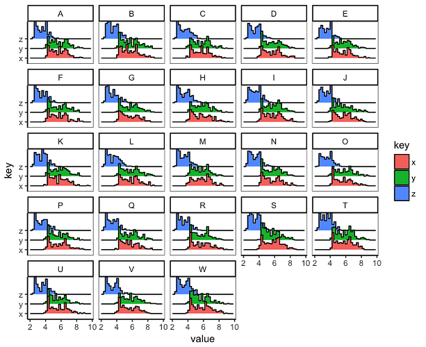
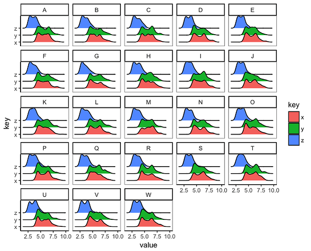
If you want to have all the graphs layed out together, you can also use faceting, rather than looping or maping. In the examples below, which use the built-in diamonds data frame and which implement @tbradley's suggestion of using ggridges, we reshape the data to "long" format so that the former x, y, and z columns in the original data are stacked into a single value column, with a new key column that marks whether value came from the original x, y, or z columns:

library(tidyverse)
library(ggridges)

# Plot data
set.seed(2)
plot.dat = diamonds %>% 
  sample_frac(0.1) %>% 
  gather(key, value, x:z) %>% 
  filter(value < 15, value > 2) %>% 
  mutate(Manager = sample(LETTERS[1:23], n(), replace=TRUE))

# Density
ggplot(plot.dat, aes(x=value, y=key, fill=key)) +
  geom_density_ridges() +
  facet_wrap(~ Manager)

# Histogram
ggplot(plot.dat, aes(x=value, y=key, fill=key)) +
  geom_density_ridges(stat="binline") +
  facet_wrap(~ Manager)

2 Likes

This toy example is super helpful!

Question, how would you add a name so that the resulting list object had names of the unique cyl in the first position instead of [[1]] (e.g. cyl [[4]])?

So this but in one pipe:

cyl <- mtcars %>%
  group_by(cyl) %>%
  summarise() %>%
  pull() 

# run map() instead of for()
cyl_plots <-   map(cyl, ~{
    mtcars %>%
      # filter for each value 
      filter(cyl == .x) %>%
      # run unique histogram
      ggplot() +
      geom_histogram(aes(mpg))
  })

## add names
names(cyl_plots) <- cyl

Cheers, Steph

Thanks @stephhazlitt, for naming, you can use the set_names() function:

library(purrr)
library(ggplot2)
library(dplyr)


cyl <- mtcars %>%
  group_by(cyl) %>%
  summarise() %>%
  pull() 

# run map() instead of for()
cyl_plots <-   map(cyl, ~{
  mtcars %>%
    # filter for each value 
    filter(cyl == .x) %>%
    # run unique histogram
    ggplot() +
    geom_histogram(aes(mpg))
}) %>%
  set_names(cyl)

cyl_plots
2 Likes

@stephhazlitt and @edgararuiz, a much shorter and nicer approach would be:

library(tidyverse)

cyl_plots <-
  mtcars %>%
  split(.$cyl) %>%
  map(~ ggplot(.) + geom_histogram(aes(mpg)))

And the naming in this case is automatic :slight_smile:

1 Like

@JCaesar: if you give us a reprex, I am happy to give it a try :slight_smile:

If you are up to jumping into functional programming, @edgararuiz is right with the approach to use purrr instead of a for loop :slight_smile: Have a look at this: 21 Iteration | R for Data Science. And if you also want to follow his advice to use ggplot2, you can read this: 3 Data visualisation | R for Data Science.

After a bit of reading, the code I wrote above

should make more sense and you should be able to adapt it to your case.

Your case is a bit more complicated, since you want 3 histograms per manager. Without any data, I can't help further. If you only wanted one plot per manager, it could look like something like this:

 histograms <-
  data %>%
  split(.$manager) %>%
  map(~ ggplot(.) + geom_histogram(aes(some_variable)))
1 Like

@lisaprosser & @edgararuiz Thanks both, I am trying to learn purrr and I learned a couple of new functions and approaches from you both today. Very much appreciated. :pray:

1 Like

@edgararuiz @prosoitos

Another approach to this is to leverage tidyr as well as ggplot2 and purrr so that you can keep everything in a dataframe. Though not always the best approach if does help when you may have need to further filter down your plots after creating them. For example:

library(tidyverse)
cyl_plots <-
  mtcars %>%
  group_by(cyl) %>%
  nest() %>%
  mutate(plot = map(data, ~ggplot(.x) + geom_histogram(aes(mpg))))

Which then follows to:

filter(cyl_plots, cyl > 4)
2 Likes

True. The advantage of lists, on the other hand, is that you can stay in the purrr world, so to speak, and then use walk2() to save or print your plots. So I guess it depends what you want to do on the next step :slight_smile:

I guess you could still do that with data frames. It would just be a bit less direct (you could use cyl_plots$plot, which is a list). But then naming your plots gets less easy.

1 Like

@prosoitos

Indeed though you can certainly do that for my example as well:

walk2(paste0(cyl_plots$cyl, ".pdf"), cyl_plots$plot, ggsave)

It does raise the point, however, of the relative merits of each approach. A quick benchmark shows that the list example runs almost twice as fast, suggesting the nested example might not scale well.

microbenchmark(mtcars %>%
                  split(.$cyl) %>%
                  map(~ ggplot(.) + geom_histogram(aes(mpg))),
                mtcars %>%
                  group_by(cyl) %>%
                  nest() %>%
                  mutate(plot = map(data, ~ggplot(.x) + geom_histogram(aes(mpg)))),
                times = 1000
 )

Unit: milliseconds
                                                                                                          expr       min        lq      mean    median        uq       max neval
                                        mtcars %>% split(.$cyl) %>% map(~ggplot(.) + geom_histogram(aes(mpg)))  7.323703  7.661118  8.612203  7.855645  8.305318 267.94025  1000
 mtcars %>% group_by(cyl) %>% nest() %>% mutate(plot = map(data,      ~ggplot(.x) + geom_histogram(aes(mpg)))) 11.727097 12.342110 13.273024 12.715608 13.571654  21.90471  1000
2 Likes

Nice one with cyl_plots$cyl to get the names back :slight_smile:

Hello everyone,

Thank you very much for helping. I created a reprex.
Please tell me if it doesn't work.

library(reprex)

MAN<-c("a","b","c","d")
MANAGER<-sample(MAN,300, replace = TRUE)

COMPLETED <-rnorm(300,14.41,1)

UPLOADED <-rnorm(300,16.1,1)

df<-data.frame(MANAGER,COMPLETED,UPLOADED)

View(df)
# Here is an example of what I want my graph to look like for everyone of my 4 area managers.

par(mfrow=c(1,3)) 
hist(df$COMPLETED[df$MANAGER=="b"], main = "Completed Inspections throughout the Day", 
     xlab= "Hours of the Day", ylab = "Frequency", breaks = 12, xlim=c(0,24),ylim=c(0,20),
     border = "black", col=rgb(1,0,0,0.5), axes=F)
axis(1, at = seq(0,24,1))
axis(2, at = seq(0,20,5))
box()

hist(df$UPLOADED[df$MANAGER=="b"],main = "Completed Uploads throughout the Day", 
     xlab= "Hours of the Day", ylab = "Frequency", breaks = 12, xlim=c(0,24),ylim=c(0,20),
     border = "black", col= rgb(0,0,1,0.5), at = seq(0,25,1), axes = F, add=F)
#> Warning in plot.window(xlim, ylim, "", ...): "at" is not a graphical
#> parameter
#> Warning in title(main = main, sub = sub, xlab = xlab, ylab = ylab, ...):
#> "at" is not a graphical parameter
axis(1, at = seq(0,24,1))
axis(2, at = seq(0,20,5))
box()

# Join Histograms

hist(df$COMPLETED[df$MANAGER=="b"], main = "Completed Inspections and Uploads throughout the Day", 
     xlab= "Hours of the Day", ylab = "Frequency", breaks = 12, xlim=c(0,24),ylim=c(0,20),
     border = "black", col=rgb(1,0,0,0.5), axes=F)
hist(df$UPLOADED[df$MANAGER=="a"],main = "Inspection Load Time", 
     xlab= "Hours of the Day", ylab = "Frequency", breaks = 12, xlim=c(0,24),ylim=c(0,20),
     border = "black", col=rgb(0,0,1,0.5), at = seq(0,25,1), axes = F, add=T)
axis(1, at = seq(0,24,1))  
axis(2, at = seq(0,20,5)) 
box() 

legend("topleft",c("Pink = Completed Inspections every Hour","Blue = Completed Uploads every Hour",
                   "Purple = Intersection every Hour"),
       lty=c(1,1,1), bty="n", cex=0.75)  
mtext("Inspections and Uploads Distributions for manager (a)", outer=TRUE,  cex=1, line=-1) # title for manager A


#Instead of doing this for each manager, I want to: 
# 1) Create a pdf and put the graphs of each area manager on a separate page
# 2) Do this in an efficient way. So, here is what is not working from below:
# 3) Add a title to every manager as shown from the mtext function above.

pdf(paste("work.pdf"))

# Histogram 1
par(mfrow=c(3,1))
for(i in unique(df$MANAGER)){

  dev.new()
  hist(df$COMPLETED[unique(df$MANAGER==i)], main = "Completed Inspections throughout the Day for", 
       xlab= "Hours of the Day", ylab = "Frequency", breaks = 24, xlim=c(0,24),ylim=c(0,25),
       border = "black", col=rgb(1,0,0,0.5), axes=F)
  axis(1, at = seq(0,24,1))
  axis(2, at = seq(0,25,5))
  box()
dev.new()
#Histogram 2  

  hist(df$UPLOADED[unique(df$MANAGER==i)],main = "Completed Uploads throughout the Day", 
           xlab= "Hours of the Day", ylab = "Frequency", breaks = 24, xlim=c(0,24),ylim=c(0,25),
           border = "black", col= rgb(0,0,1,0.5), at = seq(0,25,1), axes = F, add=F)
axis(1, at = seq(0,24,1))
axis(2, at = seq(0,25,5))
box()


# Joint Histogram 
dev.new()
hist(df$COMPLETED[unique(df$MANAGER==i)], main = "Completed Inspections and Uploads throughout the Day", 
     xlab= "Hours of the Day", ylab = "Frequency", breaks = 24, xlim=c(0,24),ylim=c(0,25),
     border = "black", col=rgb(1,0,0,0.5), axes=F)
hist(df$UPLOADED[df$MANAGER==i],main = "Inspection Load Time", 
     xlab= "Hours of the Day", ylab = "Frequency", breaks = 24, xlim=c(0,24),ylim=c(0,25),
     border = "black", col=rgb(0,0,1,0.5), at = seq(0,25,1), axes = F, add=T)
axis(1, at = seq(0,24,1))  #value of 1 means x-axis
axis(2, at = seq(0,25,5)) # value of 2 means y-axis
box()  ## box puts the graph in a confined box. 
legend("topleft",c("Pink = Completed Inspections every Hour","Blue = Completed Uploads every Hour",
                   "Purple = Intersection every Hour"),
       lty=c(1,1,1), bty="n", cex=0.8)  
mtext("Inspections and Uploads Distributions manager", outer=TRUE,  cex=1, line=-1) ## to add the name of the manager which is also a variable
}
dev.off()
My clickboard wouldn't work. so I used

reprex::reprex(input = "fruits_stringdist.R", outfile = "fruits_stringdist.md")

Not sure if my code copied right.
Thanks.