This should not occur with continuous data. And, as far as I understand, histogram is not appropriate for discrete data.
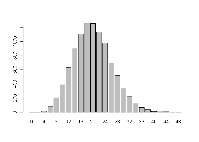
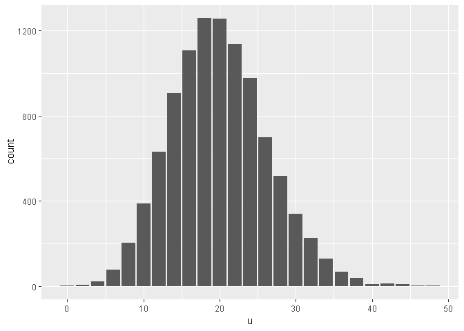
For these type of data, usually people use Bar Chart (using graphics::barplot or ggplot2::geom_bar).
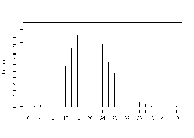
My personal preference is to use a column diagram (I'm not sure whether this is a standard term or not), as widths of the bars make no sense to me.
You can see the illustration below. Here, I've used a smaller value of \lambda, only to make the plots less cluttered.
# for reproducibility
set.seed(seed = 29842)

# dummy data
u <- rpois(n = 1e+4,
           lambda = 10) * 2

# graphics:;barplot
barplot(height = table(u))

# ggplot2::geom_bar
library(ggplot2)
#> Registered S3 methods overwritten by 'ggplot2':
#>   method         from
#>   [.quosures     rlang
#>   c.quosures     rlang
#>   print.quosures rlang
ggplot2::ggplot(data = data.frame(x = u),
                mapping = aes(x = u)) +
  geom_bar()
# my personal preference
plot(x = table(u),
     type = "h")
Created on 2019-05-02 by the reprex package (v0.2.1)