Hello,
I have a sample data:
Summary
> cat(wrapr::draw_frame(head(cust_city_distribution,30)))
build_frame(
   "CUST_CITY"       , "frequency", "Percentage_Frequency" |
   "Aberdeen        ",  6L        , 0.01167                |
   "ABERDEEN        ",  2L        , 0.003889               |
   "ABILENE         ", 16L        , 0.03111                |
   "Abingdon        ",  1L        , 0.001944               |
   "ABINGDON        ",  6L        , 0.01167                |
   "ACTON           ", 16L        , 0.03111                |
   "Acworth         ",  2L        , 0.003889               |
   "Ada             ",  9L        , 0.0175                 |
   "ADA             ", 10L        , 0.01944                |
   "ADAIRSVILLE     ",  8L        , 0.01555                |
   "ADRIAN          ", 10L        , 0.01944                |
   "AIEA            ",  4L        , 0.007777               |
   "Aiken           ",  7L        , 0.01361                |
   "AIKEN           ", 43L        , 0.0836                 |
   "AKRON"           , 18L        , 0.035                  |
   "Akron           ",  1L        , 0.001944               |
   "AKRON           ",  5L        , 0.009721               |
   "Alabaster       ",  1L        , 0.001944               |
   "ALABASTER       ",  1L        , 0.001944               |
   "Alamogordo      ",  9L        , 0.0175                 |
   "Albany          ", 16L        , 0.03111                |
   "ALBANY          ", 48L        , 0.09333                |
   "ALBERTVILLE     ", 19L        , 0.03694                |
   "Albion          ",  2L        , 0.003889               |
   "Albuquerque     ", 32L        , 0.06222                |
   "ALBUQUERQUE     ", 14L        , 0.02722                |
   "ALEXANDER CITY  ", 17L        , 0.03305                |
   "Alexandria      ",  2L        , 0.003889               |
   "ALEXANDRIA      ", 19L        , 0.03694                |
   "ALGONQUIN       ",  1L        , 0.001944               )
I am trying to produce a histogram which basically tells me which the cities' frequency distribution so I can drop some cities which have low frequencies.
The reason I am doing this is because I need to run a decision tree analysis and one of the dead blocks I am running into is that the factor "city" has 3764 or something levels.
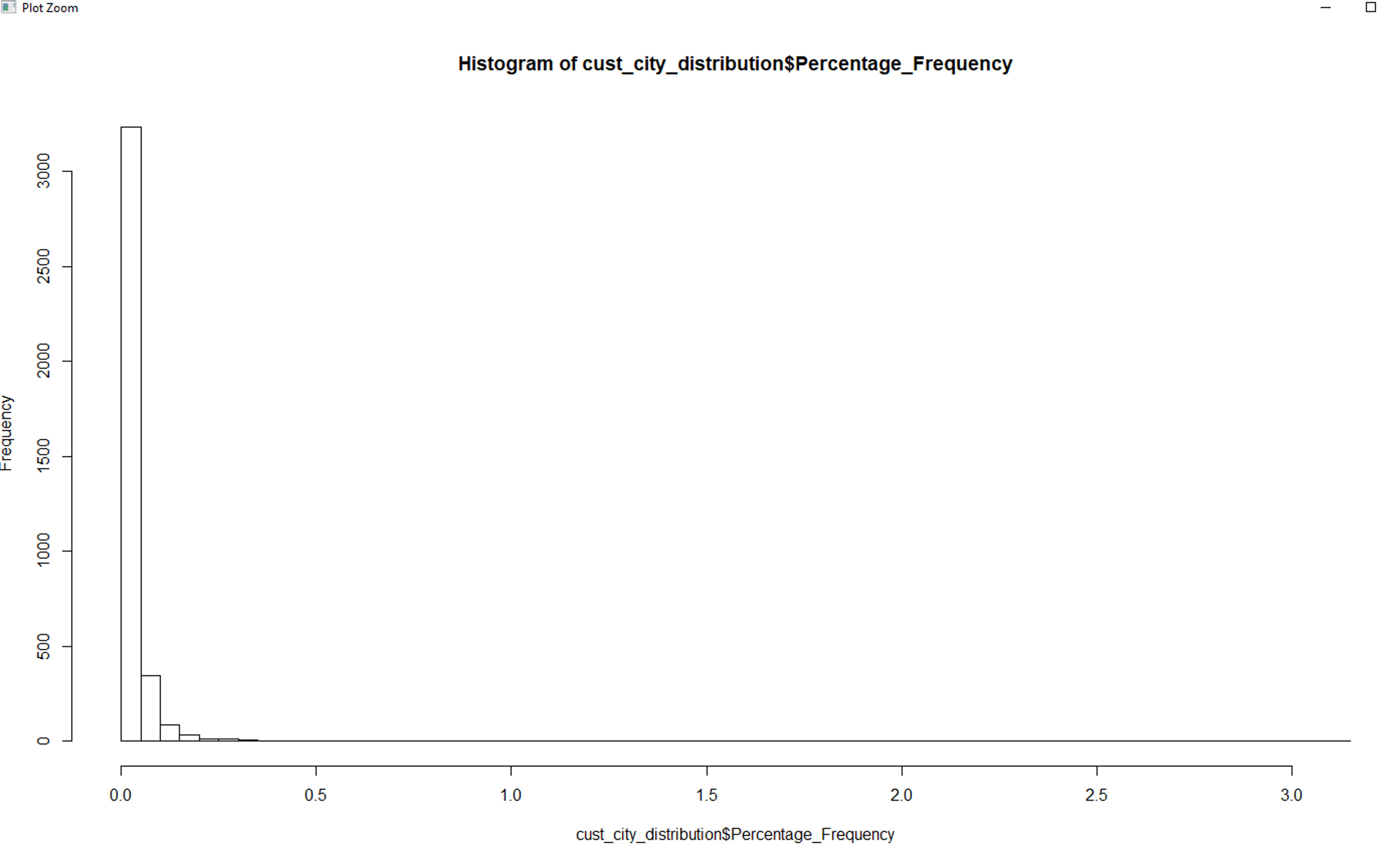
I can produce a history but since the x-axis has so many small values (I think the percentage can go as low as 0.001 or lower), I cannot visualize the plot well enough to make a decision which city to keep in my analysis and which city to drop.
Thanks!