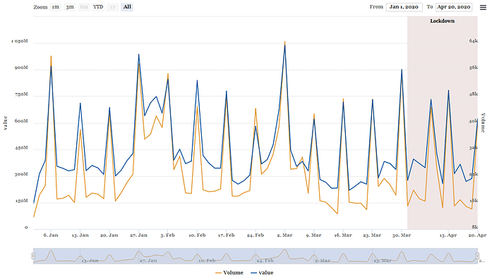
I am doing a visualisation on health data set available here
By using this code i
df1 <- xts(df[,-1], order.by=as.Date(df$date))
#highchart() %>%
highcharter::highchart(type = "stock") %>%
  hc_yAxis_multiples(
    list(title = list(text = "Volume ")),
    list(title = list(text = "value "),
         opposite = FALSE)
  ) %>%
  hc_add_series(data = df1$Volume,
                name = "Volume ",
                type = "line",
                color = "#e3972f",
                yAxis = 0) %>%
  hc_add_series(data = df1$Amount,
                name = "value ",
                type = "line",
                color = "#0b539d",
                yAxis = 1) %>%
  hc_xAxis(categories = df1$date,
  plotBands = list(
    list(
      label = list(text = "Lockdown"),
      color = "rgba(100, 0, 0, 0.1)",
      from = datetime_to_timestamp(as.Date('2020-03-31', tz = 'UTC')),
      to = datetime_to_timestamp(as.Date(Sys.Date(), tz = 'UTC'))
    )
  )) %>%
  #hc_colors(cols) %>%
  hc_chart(style = list(fontFamily = "Georgia",
                        fontWeight = "bold"))%>%
 hc_scrollbar(enabled = FALSE) %>%
  #hc_add_theme(hc_theme_gridlight()) %>%
  hc_exporting(enabled = TRUE)%>%
  highcharter::hc_legend(enabled = TRUE)
I m getting this out plot.
But when you check on these two line they like the same, which is wrong. Can someone help me to check the error in my code please?
