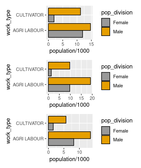
Hey! wanting to convert x axis categorical labels in a bar graph into a smaller string and displaying the legend

Here is my data:

structure(list(`DT Name` = c("Surat", "Surat", "Surat", "Surat", 
"Surat", "Surat", "Surat", "Surat", "Surat", "Surat", "Surat", 
"Surat", "Surat", "Surat", "Surat", "Surat"), Name = c("Olpad", 
"Mangrol", "Umarpada", "Mandvi", "Kamrej", "Chorasi", "Palsana", 
"Bardoli", "Mahuva", "Olpad", "Mangrol", "Umarpada", "Mandvi", 
"Kamrej", "Chorasi", "Palsana", "Bardoli", "Mahuva", "Olpad", 
"Mangrol", "Umarpada", "Mandvi", "Kamrej", "Chorasi", "Palsana", 
"Bardoli", "Mahuva", "Olpad", "Mangrol", "Umarpada"), Level = c("CD BLOCK", 
"CD BLOCK", "CD BLOCK", "CD BLOCK", "CD BLOCK", "CD BLOCK", "CD BLOCK", 
"CD BLOCK", "CD BLOCK", "CD BLOCK", "CD BLOCK", "CD BLOCK"), 
    TRU = c("Total", "Total", "Total", "Total", "Total", "Total", 
    "Total", "Total", "Total", "Total", "Total", "Total", "Total", 
    "Total", "Total", "Total", "Total", "Total", "Total", "Total", 
    "Total", "Total", "Total", "Total", "Total", "Total", "Total", 
    "Total", "Total", "Total"), work_type_by_gender = structure(c(1L, 
    1L, 1L, 1L, 1L, 1L, 1L, 1L, 1L, 2L, 2L, 2L, 2L, 2L, 2L, 2L, 
    2L, 2L, 4L, 4L, 4L, 4L, 4L, 4L, 4L, 4L, 4L, 5L, 5L, 5L), levels = c("MAIN_CL_M", 
    "MAIN_CL_F", "MAIN_AL_P", "MAIN_AL_M", "MAIN_AL_F", "MAIN_HH_P", 
    "MAIN_HH_M", "MAIN_HH_F", "MAIN_OT_P", "MAIN_OT_M", "MAIN_OT_F"
    ), class = "factor"), population = c(11209, 9770, 5685, 20705, 
    7408, 3883, 3831, 6329, 11563, 1960, 1312, 1569, 4186, 480, 
    776, 417, 895, 1585, 14695, 19208, 13591, 20419, 18062, 6021, 
    11750, 23894, 21389, 11936, 9771, 8178), work_type = c("CULTIVATOR", 
    "CULTIVATOR", "CULTIVATOR", "CULTIVATOR", "CULTIVATOR", "CULTIVATOR", 
    "CULTIVATOR", "CULTIVATOR", "CULTIVATOR", "CULTIVATOR", "CULTIVATOR", 
    "CULTIVATOR", "CULTIVATOR", "CULTIVATOR", "CULTIVATOR", "CULTIVATOR", 
    "CULTIVATOR", "CULTIVATOR", "AGRI LABOUR", "AGRI LABOUR", 
    "AGRI LABOUR", "AGRI LABOUR", "AGRI LABOUR", "AGRI LABOUR", 
    "AGRI LABOUR", "AGRI LABOUR", "AGRI LABOUR", "AGRI LABOUR", 
    "AGRI LABOUR", "AGRI LABOUR"), pop_division = c("Male", "Male", 
    "Male", "Male", "Male", "Male", "Male", "Male", "Male", "Female", 
    "Female", "Female", "Female", "Female", "Female", "Female", 
    "Female", "Female", "Male", "Male", "Male", "Male", "Male", 
    "Male", "Male", "Male", "Male", "Female", "Female", "Female"
    )), row.names = c(NA, -30L), class = c("tbl_df", "tbl", "data.frame"
))

I have plotted a graph which goes like this:

  
  ggplot(data,aes(reorder(work_type, population/1000), population/1000, fill = pop_division,group = Name))+geom_bar( stat='identity',position = position_dodge(),color='black')+
    scale_fill_manual(values=c('#999999','#e69F00'))+theme_bw()+labs(x='Work Type', y='Population ( in thousands)',title = 'Distribution of worker type by gender by block in Porbandar dist.',
                                                                     fill='Gender' )+facet_grid(.~Name)

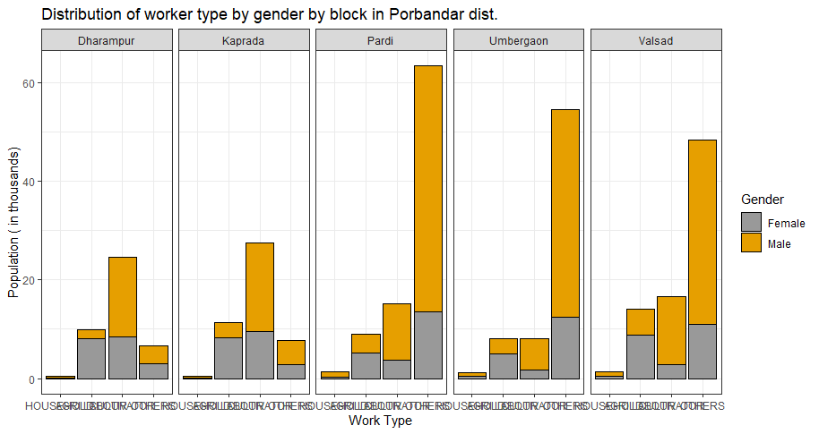
Now the number of different categorical observations in the 'Name' column in the original large dataset are so many that when different facets are plotted the x axis ticks/labels overlap.
How can I convert the x axis tick labels into something smaller so that they do not overlap and provide a legend for it? Any other possible solutions to this?

1 Like

Try changing your theme_bw() to

theme(axis.text.x = element_text(angle = 45))
1 Like

Nice! but my college professor is asking us to make a graph so easily readable so that the intended audience does not have to tilt their neck to read the labels. Would you offer other solutions please.

Well, I can sit looking at the screen and read the labels without twisting my head.

More seriously, I don't see anything obvious that one can do. I tried a coord_flip() but it won't give a decent result because of the facet().

I also considered plotting each "block" separately and putting them together using {pachwork}. It might work but it is going to mean a huge amount of work. See crude 3 element example.

We would need to resize all the plots to a standard y-axis dimension, strip out all the existing y-axis scales, get rid of all but one of the legends and move the remaining one, and annotate each plot. Most of this can be but in one or two functions but it still is a lot of fiddly work. Unless this is your PD.D dissertation or a paper for Nature I'm not sure it's worth it

Let's hope someone else is more inspired than I am. Anyway, I'll keep thinking about it.

1 Like

It just occurred to me a brute force & stupidity approach might work. What if we just reduce the size of the x-axis labels?

Because I was messing around I moved to data.table for data manipulation (personal preference), chopped up and renamed your data, etc., etc., . Your original data set is dat1.csv here. I'm reading it in from disc.

Anyway will this help?

suppressMessages(library(data.table)); suppressMessages(library(tidyverse))

# Read and clean up data ---------------------------------------------------------------

DT <- fread("dat1.csv")
DT1 <- DT[, .(name, population, work_type, pop_division)]
names(DT1) <- c("name", "pop", "work", "sex")
DT1[, work := tolower(work)] ## reduce size of labels

# Plot One ----------------------------------------------------------------

ggplot(DT1, aes(work, pop, fill = sex, group = name)) + 
   geom_bar( stat='identity',position = position_dodge(),color='black')+ 
  theme(axis.title.x = element_text(size = 12)) +
  scale_fill_manual(values=c('#999999','#e69F00')) +
      facet_grid(. ~ name) 


1 Like

Actually let's make a couple of small changes to make the labels look a bit better

suppressMessages(library(data.table)); suppressMessages(library(tidyverse))

# Read and clean up data ---------------------------------------------------------------

DT <- fread("dat1.csv")
DT1 <- DT[, .(name, population, work_type, pop_division)]
names(DT1) <- c("name", "pop", "work", "sex")
## DT1[, work := tolower(work)] ## reduce size of labels

DT1[ , work := fcase(
  work  == "CULTIVATOR", "Culitivator", 
  work == "AGRI LABOUR", "Agri Labour",
  default = ''
)]

# Plot One ----------------------------------------------------------------

ggplot(DT1, aes(work, pop, fill = sex, group = name)) + 
   geom_bar( stat='identity',position = position_dodge(),color='black')+ 
  theme(axis.title.x = element_text(size = 16)) +
  scale_fill_manual(values=c('#999999','#e69F00')) +
      facet_grid(. ~ name) 


1 Like

Broooo!! Thanks for taking your time out, and you going out of your way to do the complex patchwork thing for me, I appreciate a lot. Thanks.
I think mistakenly instead of using the argument axis.text.x you used axis.title.x whch just reduces the size of the title. I have replaced that in the code.

One more thing lets say in the name column instead of meaningful words i had ag(for agri labour), cl , hh and so on. How can i manually plot a legend which would display their meaning. Do you know how to do this?

You are right. It worked for the labels and I was not paying any attention to the axis.title. Very careless of me. :face_with_hand_over_mouth:

I think what you want to do is pretty straight- forward. See ggplot2 axis ticks : A guide to customize tick marks and labels Tools and scroll down to Change tick mark labels.

1 Like

This topic was automatically closed 7 days after the last reply. New replies are no longer allowed.

If you have a query related to it or one of the replies, start a new topic and refer back with a link.