Hi,
I've asked a similar question on stack overflow, sorry if cross-posting is discouraged.
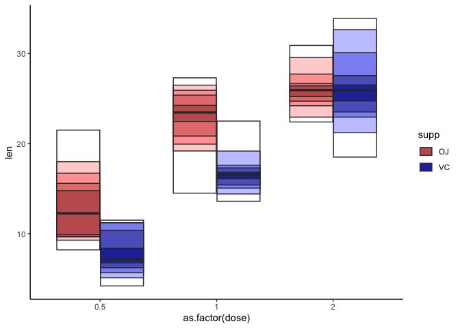
I've been working on a ggplot2 extension package facilitating an alternative to box plots to judge the distribution of data. I called it 'quantile plot' and the idea is that you visualize different quantiles in your data using progressively lighter shades of the same color.
I've it work in principle (essentially creating a new Stat to calculate the quantiles and a new Geom based on GeomBoxplot) but am struggling with making the legend informative.
Plot that I have (plot itself looks sensible but without legend, plot is hard to interpret)
Plot that I want (currently with very hacky solution) under this link (can only embed one image): ggquantileplot/README_files/figure-gfm/unnamed-chunk-4-1.png at main · karchern/ggquantileplot · GitHub
In a regular grouped boxplot using the fill aesthetic, you see one legend key per group and this is sufficient. But in this quantile plot, you need to have one legend key per group and quantile.
I'd like to know if it's possible to plot more than one legend key per group without resorting to dirty, external hacks (which I did now but I find it very unsatisfying).
I'm quite excited about the idea of writing clean ggplot2 extensions and would love if someone could point me in the right direction. Thanks!