Help with Visualising This data

still fairly new to R and have stepped away for a while, so please bear with me. I have a set of data which describes the degree of mobility (categorical data) after an operation across 3 days. I have been looking for a way to demonstrate the flow across those 3 days.

I've tried using geom_jitter with x and y being Day 1 and 2, and aes(colour) being Day 3 but this doesn't really convey what I want to show. I've done some reading around Sankey Diagram and Parallel Coordinates but have not got the understanding to quite fit the samples posed by others to fit my data.

This is what I've tried:

test %>% filter(!is.na(Mob_D1.factor) & !is.na(Mob_D2.factor) & !is.na(Mob_D3.factor)) %>%
  ggplot(aes(x = Mob_D1.factor, y = Mob_D2.factor, colour = Mob_D3.factor)) + 
  geom_jitter(size = 5, alpha = 0.25, height = 0.25, width = 0.2) +
  scale_colour_brewer(palette = "Dark2", name = "Mobilisation on Day 3") +
  xlab("Mobilisation on Day 1") +
  ylab("Mobilisation on Day 2") + theme_minimal()

As I said, not quite what I want.

This is a sample of the data:

structure(list(Mob_D1.factor = structure(c(2L, 2L, 2L, 2L, 4L, 
1L, 2L, 2L, 1L, 4L, 2L, 4L, 2L, 1L, 2L, 4L, 4L, 2L, 4L, 4L, 2L, 
4L, 2L, 2L, 4L, 2L, 1L, 4L, 4L, 3L, 4L, 2L, 3L, 2L, 2L, 2L, 2L, 
2L, 4L, 4L, 2L, 4L, 4L, 2L, 2L, 4L, 2L, 4L, 4L, 4L), .Label = c("None", 
"Bed", "Stand", "Assisted Walk"), class = "factor"), Mob_D2.factor = structure(c(2L, 
3L, 2L, 4L, 4L, 1L, 3L, 4L, 4L, 4L, 3L, 4L, 2L, 2L, 2L, 4L, 4L, 
4L, 4L, 4L, 1L, 4L, 2L, 2L, 4L, 2L, 1L, 4L, 4L, 4L, 4L, 2L, 3L, 
2L, 2L, 2L, 4L, 4L, 2L, 4L, 3L, 4L, 4L, 2L, 2L, 4L, 4L, 4L, 4L, 
4L), .Label = c("None", "Bed", "Stand", "Assisted Walk"), class = "factor"), 
    Mob_D3.factor = structure(c(2L, 3L, 2L, 4L, 4L, 1L, 4L, 4L, 
    4L, 4L, 4L, 4L, 4L, 2L, 4L, 4L, 4L, 4L, 4L, 4L, 2L, 4L, 2L, 
    2L, 4L, 4L, 1L, 4L, 4L, 4L, 4L, 2L, 4L, 4L, 2L, 2L, 4L, 4L, 
    3L, 4L, 4L, 4L, 4L, 2L, 4L, 4L, 4L, 4L, 4L, 4L), .Label = c("None", 
    "Bed", "Stand", "Assisted Walk"), class = "factor")), row.names = c(NA, 
-50L), class = c("tbl_df", "tbl", "data.frame"))

Thanks in advance to anyone who takes the time to reply. Any extended explanation would be appreciated as I am still learning.

Larry
Hi,

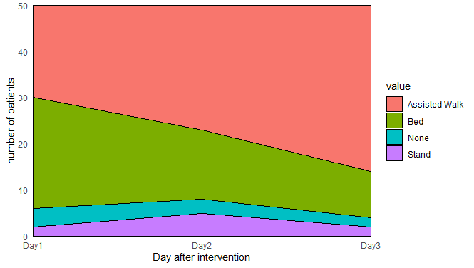
How about using a stacked chart like this:

library(ggplot2)
library(dplyr)
library(tidyr)

test %>% gather("day") %>% group_by(day, value) %>% summarise(n = n()) %>% 
  ggplot(aes(x = as.numeric(as.factor(day)), y = n, fill = value)) + 
  geom_area(color = "black") +
  scale_x_continuous(breaks = c(1:3), labels = paste0("Day", 1:3), expand = c(0, 0)) + 
  scale_y_continuous(expand = c(0, 0)) + 
  geom_vline(xintercept = 2) +
  theme_minimal() + labs(x = "Day after intervention", y = "number of patients")

image

  • I first gathered the the data into two columns, one with the day, the other with the type of mobility, then grouped them by day and mobility and counted the number of patients.
  • Then I applied a geom_area, but in order to make the flow appear continuous, I converted the day to a number.
  • The scale_x_continuous and scale_y_continuous ensure I can put in the labels I want and setting expand to 0 helps the full plot being filled by the area
  • Finally I added a vertical line at day 2 to help visibility between the days

Of course there are tons of other ggplot setting you can tweak to customise this plot. A great website for help and plot inspiration is the following one:

Hope this helps,
PJ

2 Likes

That does look pretty good. Can I ask how you isolated the "day" from the test data I provided in the first place?

Edit: Apologies for this stupid question, I've not had to use gather much but having read around it now, I can see what you've done. Thanks.

I think this is what I want to do, having now read around the alluvial package

test <- test %>%
  mutate(number = 1)
  
test2 <- aggregate(number ~ Mob_D1.factor + Mob_D2.factor + Mob_D3.factor, data = test, sum)

alluvial(test2[, 1:3], freq = test2$number)

Any comment or suggestion on how to improve the code would be appreciated.

Hi,

Yea the alluvium plot is a very nice one!
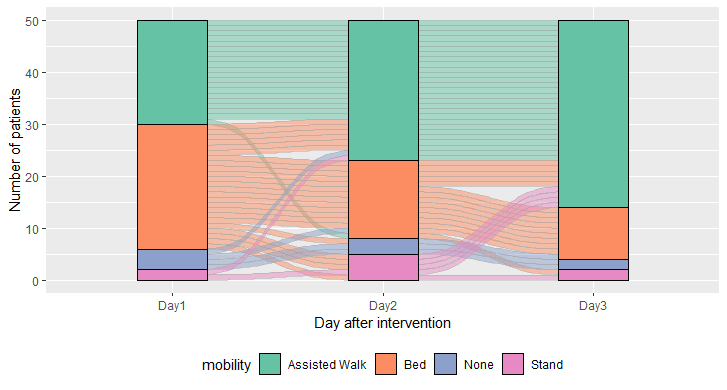
Here is my implementation:

library(ggplot2)
library(dplyr)
library(tidyr)
library(ggalluvial)

test = test %>% mutate(patient = 1:n()) %>%  gather("day", "mobility", -patient) %>% 
  mutate(mobility = as.factor(mobility), day = as.factor(day)) 

test %>% ggplot(aes(x = day, stratum = mobility, alluvium = patient, fill = mobility)) + 
  scale_x_discrete(labels = paste0("Day", 1:3)) +
  scale_fill_brewer(type = "qual", palette = "Set2") +
  geom_flow(stat = "alluvium", color = "darkgray") +
  geom_stratum() +
  labs(x = "Day after intervention", y = "Number of patients") +
  theme(legend.position = "bottom")

It took me a while to figure this out, but I got the inspiration here:
https://cran.r-project.org/web/packages/ggalluvial/vignettes/ggalluvial.html

This setup allows you to track a single patient over the course of the three days, you can also generate this plot without the individual tracks if you're only interested in the general trends or there are too many patients (it's in the link)

Hope this helps,
PJ

2 Likes

Hi,
I have not had a chance to open my laptop but this looks spot on and the formatting looks great. All within ggplot as well! Thanks a lot. I will have to dissect what each bit of the code means!

This topic was automatically closed 7 days after the last reply. New replies are no longer allowed.