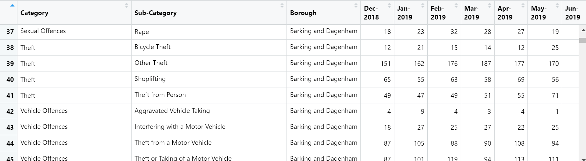
Hello, I am new to R and have not come across this format in CSV files before. So I am stuck when producing ggplot2 visualisations.
Usually, if I want to create a line graph using dates I will select the x and y axis chosen from the column headers. However, with this structure of the CSV file I am using, all of the dates are situated in the columns and not in the rows. How can I still create this graph?
You are correct that your current form is not convenient for plotting.
tidyverse provides tools to change the shape. see https://tidyr.tidyverse.org/reference/pivot_longer.html
There are examples to work through to help you understand.