Hello, I've been trying to generate a plot in R.
Basically, I have a dataset that includes the depth at which certain organism was collected. What I want to do is to graph the depth against the number of individuals. I've tried with histograms and barplots but none seems to work (I'm also a newbie with R).
Plus, I'd like to add a cummulative frequency graph over it just to show how it varies.
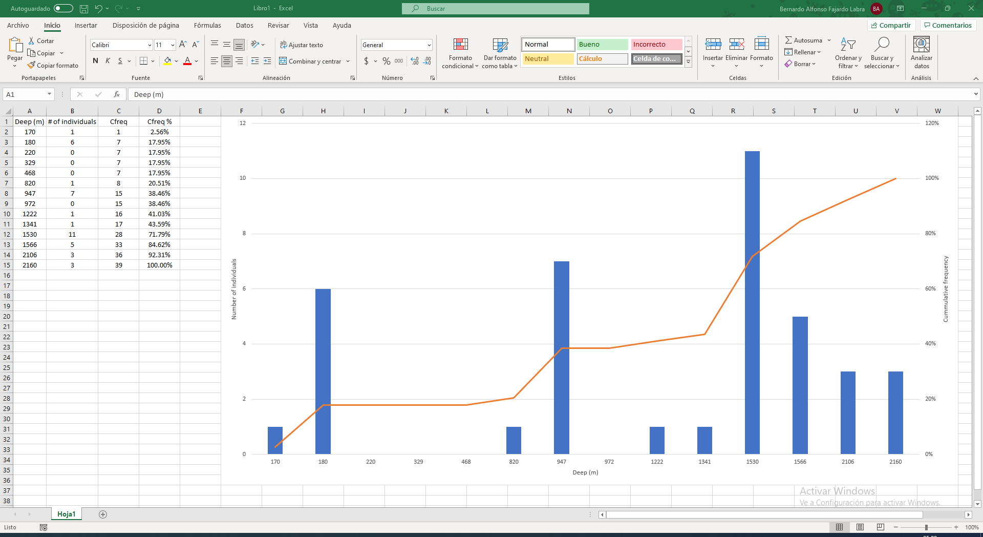
I already could do it in Excel, in less than 5 minutes, but as in the rest of my graphs for that work I've used R, I wouldn't like this to be the exception. I didn't do the x-axis numeric in Excel, but it's something else I want in my plot.
Thanks in advance!
UPDATE:
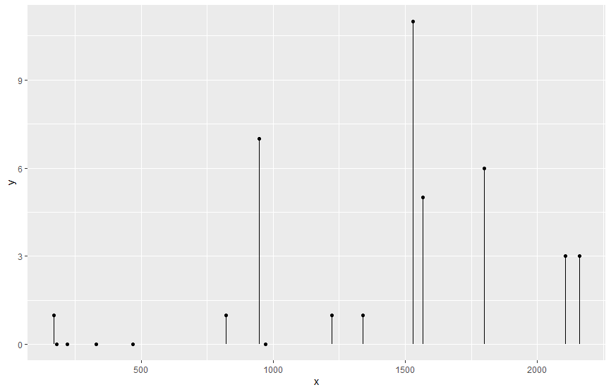
So far I've been able to make the plot as I wanted, I had to use a lollipop plot.
This is my data:
      x  y
1   180  0
2   329  0
3   170  1
4  1530 11
5  1341  1
6   820  1
7  2106  3
8   972  0
9  1222  1
10  947  7
11 1566  5
12  468  0
13 2160  3
14 1800  6
15  220  0
Where 'x' is depth (m) and 'y' is the number of individuals. Then I found a gg plot to make it
h
ggplot(h,
       aes(x = x,
           y = y)) +
  geom_point() +
  geom_segment(aes(x = x,
                   xend = x,
                   y = 0,
                   yend = y))
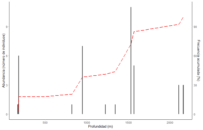
UPDATE:
I finally could do it!
Here's my code and I'm replying with the plot:
a1 <- c(170, 180, 220, 329, 468, 820, 947, 972, 1222, 1341, 1530, 1566, 2106, 2160)
a2 <- c(1, 6, 0, 0, 0, 1, 7, 0, 1, 1, 11, 5, 3, 3)
a3 <- c(2.56, 17.95, 17.95, 17.95, 17.95, 20.51, 38.46, 38.46, 41.03, 43.59, 71.79, 84.62, 92.31, 100)
Ca <- data.frame(a1, a2, a3)
Ca

ggplot(Ca) +
  geom_col(aes(x = a1, y = a2), size = 1) +
  geom_line(aes(x = a1, y = 0.1*a3), size = 1, color="red", group = 1, lty = 5) +
  scale_y_continuous(sec.axis = sec_axis(~./0.1, name = "Frecuencia acumulada (%)")) +
  theme_light() +
  theme(
    panel.grid = element_blank(),
    panel.border = element_blank(),
    axis.line = element_line()
    ) +
  xlab("Profundidad (m)") +
  ylab("Abundancia (número de individuos)")
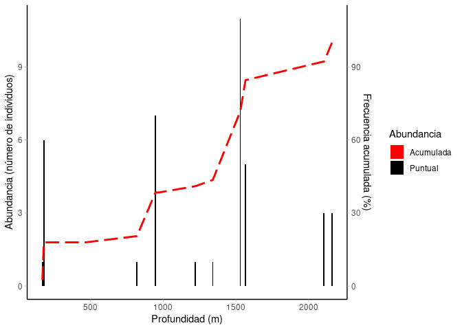
Lastly, I'd like to know if I can add a legend to make it clearer.