Hello
I'm beggining with ggplot and I need to make a line plot using this data
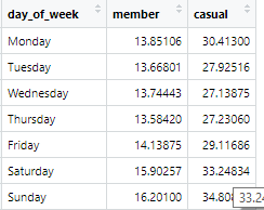
I want a line chart for the average duration for every week day, one line for members, and other for casual riders. This is the code I have so far:
geom_path: Each group consists of only one observation. Do you need to adjust the
group aesthetic?
geom_path: Each group consists of only one observation. Do you need to adjust the
group aesthetic?
The tidyverse prefers that your data be structured a certain way, and the data you have isn't quite there, but it's an easy fix. You have three variables (weekday, user type, and duration) and you should have one column holding each. This is easy to do with pivot_longer - I'll use a subset of your data to illustrate.
Once you have that, a line plot will group observations into separate lines using the group aesthetic. In the code below, using type as the group means that all the observations with type "member" make up one line, and similarly with "casual".