Hi RStudio community.
I'm stumped on a labeling issue with my stacked bar plot.
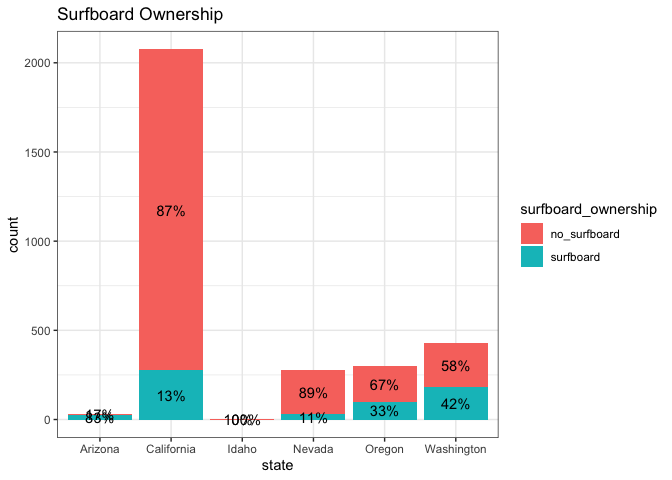
The labels in my stacked bar plot are squished for categories that are very small.
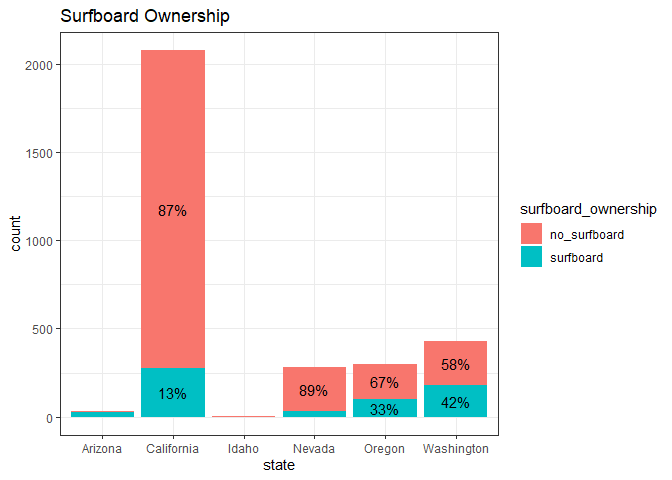
I would like to omit the labels for categories that are too small.
Important note:
My labels are based on percentages, and those percentages are grouped calculations, whereas the counts on the y-axis are the sum of all state counts combined.
Silly Reprex Example:
library(tidyverse)
library(scales)
#>
#> Attaching package: 'scales'
#> The following object is masked from 'package:purrr':
#>
#>     discard
#> The following object is masked from 'package:readr':
#>
#>     col_factor

tribble(
  ~state, ~surfboard_ownership, ~count,
  "Arizona","surfboard", 25,
  "Arizona", "no_surfboard", 5,
  "Idaho", "surfboard", 0,
  "Idaho", "no_surfboard", 2,
  "Washington", "surfboard", 180,
  "Washington", "no_surfboard", 250,
  "Oregon","surfboard", 100,
  "Oregon", "no_surfboard", 200,
  "California","surfboard", 275,
  "California", "no_surfboard", 1800,
  "Nevada","surfboard", 30,
  "Nevada", "no_surfboard", 250
)%>%
  group_by(state) %>%
  mutate(percent = count/sum(count)) %>%
  mutate(surfboard_ownership = factor(surfboard_ownership,
         levels = c("no_surfboard", "surfboard"))) %>%
  ggplot(aes(x = state,
             y = count,
             fill = surfboard_ownership)) +
  geom_bar(stat = "identity") +
  theme_bw() +
  geom_text(aes(label = scales::percent(percent, accuracy = 1)),
            position = position_stack(vjust = .5)) +
  labs(title = "Surfboard Ownership")

Created on 2022-06-05 by the reprex package (v2.0.1)
Additional Remarks:
As you can see, the percentage labels for Arizona, Idaho and Nevada are squished together because the bars aren't big enough. It does not make sense to have labels for these states.
Goal:
I'd like to preserve the labels for bars that are big enough to accommodate them, and omit them when the bars are too small.
I've spent a ton of time trying to fix this, but my numerous efforts thus far have been fruitless.
I'm very grateful for any help or guidance!
