Hi All
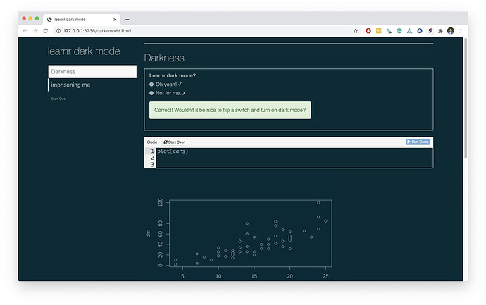
Can any css experts help me out here with customising the darkly theme for learnr tutorials? I have a couple of students with severe dyslexia and they have asked me to generate tutorials for them with pale text on a dark background. I can do this by setting theme: darkly but it could be a lot nicer. The menu on the left hand side is a mess with the highlighted section in white with white text, and in main body the code blocks, output blocks and exercises are all dark text on pale which doesn't work well. I'm not a great css expert and can't work out how to fix these — I can manage the inline code but trying to work out which elements of the css refer to the other bits is beyond me.
Thanks for any help
