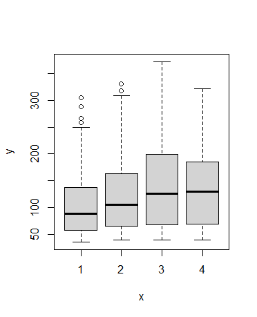
I used this data("ChickWeight") and got this. 1,2,3,4 are diets.
It was auto generated, how do i add color?
how would i plot a scatter or line chart with same data.
how would i plot just one dirt type?
I used this data("ChickWeight") and got this. 1,2,3,4 are diets.
It was auto generated, how do i add color?
how would i plot a scatter or line chart with same data.
how would i plot just one dirt type?
To answer your direct questions:
Adding a fill color to the box plot
boxplot(weight ~ Diet, data = ChickWeight, col = "skyblue")
Plotting weight vs. Time as a scatter plot
plot(weight ~ Time, data = ChickWeight, type = "p")
Plotting a single Diet
Diet1 <- ChickWeight[ChickWeight$Diet == 1,]
plot(weight ~ Time, data = Diet1, type = "p")
Are you limited to using the basic R plotting functions like boxplot() and plot() or can you use other tools like the ggplot2 and dplyr packages? If you can use other tools, I recommend this book
I am starting to learn code. I would like the basics first. but i do have ggplot3 and dplr
install.packages('ggplot2') # for install
install.packages('dplyr')

library(ggplot2) # for load
library(dplyr)

data(diamonds) # ggplot2 has this data for test.

ggplot(diamonds, aes(x = clarity, y = price)) +
  geom_boxplot() +
  labs(x = "Clarity", y = "Price") +
  ggtitle("Box Diagram - Diamond Prices by Clarity")
This topic was automatically closed 42 days after the last reply. New replies are no longer allowed.
If you have a query related to it or one of the replies, start a new topic and refer back with a link.