Help with a regression line (I am sure it is simple, and I am missing something)

Hello all,

I am new to RStudio, and just trying to figure stuff out. I am trying to create a scatterplot with a regression line. I imported a data set of coordinates and was able to plot my data, however I am unable to get a regression line with the basic abline(lm(x ~y, data = datasetname), col = 'red') command. Here is my code.

plot(FSData$x, FSData$y, main = 'Almost made it work', xlab = 'xcoordinates', ylab = 'ycoordinates')
abline(lm(x~y, data = FSData))
abline(lm(x~y, data = FSData), col = 'red')

(on a side note, in videos I have watched the 'red' in col = 'red' shows up as a different color (green) and it does not do that in my console, could that be related to the problem?)

I am not getting any errors, but it is also not drawing the line.

Image of my console

https://drive.google.com/file/d/1fHPVKLWGxc8IHsEz5I4gnrCE4eVFfNZj/view?usp=sharing

Thanks for any help

-Chip
Welcome to the community!

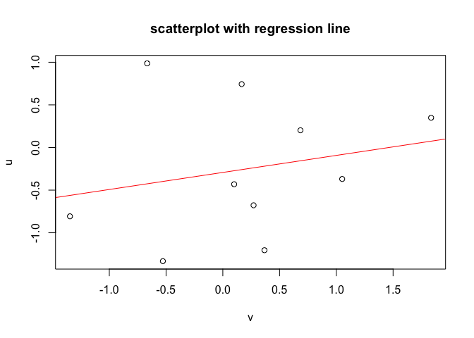
You've plotted FSData$x along x-axis, and FSData$y along y-axis. However, while creating the linear model, you're using FSData$x as the dependent variable and FSData$y as the independent variable, and that's why the linear regression is not in the previously produced scatterplot.

Also, where have you seen "red" creates "green" line? That seems weird, and I don't face it.

set.seed(seed = 42379)

u <- rnorm(n = 10)
v <- rnorm(n = 10)

df <- data.frame(u, v)
rm(u, v)

plot(formula = (u ~ v),
     data = df,
     main = "scatterplot with regression line")

abline(reg = lm(formula = (u ~ v),
                data = df),
       col = "red")

Created on 2019-10-16 by the reprex package (v0.3.0)

Hope this helps.

1 Like

Hello Yarnabrina,

Wow, thank you so much! That was super helpful, and I got it to work. Thanks for such a quick response as well, I didn't expect being able to solve this tonight.

About the red green thing; it was not changing the line color green, I was just noticing the word red turned green in the console of demo I was watching.

I was able to switch some things around from your example and made it work with this code:

x <- c(173, 169, 176, 166, 161, 164, 160, 158, 180, 187)
y <- c(80, 68, 72, 75, 70, 65, 62, 60, 85, 92)
df <- data.frame(x, y)
rm(x, y)
plot(formula = (x ~ y), data = df, main = "scatterplot with regression line")
abline(reg = lm(formula = (x ~ y), data = df), col = "red")

Your example really helped. Thanks a bunch. I am taking an online forecasting class and there is very little instruction on the R program in the online class or the book. We are mostly using Excel, which I have a pretty good understanding of. We were introduced to R and I think it is a pretty awesome tool so I want to learn as much about it as I can. I will definitely be using this forum to help myself along.

Thanks again for the very quick and informative help. Enjoy your day or night.

-Chip

I noticed it flipped my x and y for some reason, so I just switched them in my code to get it to work correctly.

plot(formula = (y ~ x), data = df, main = "scatterplot with regression line")
abline(reg = lm(formula = (y ~ x), data = df), col = "red")

Thanks again.

-Chip

This topic was automatically closed 21 days after the last reply. New replies are no longer allowed.