I have a variable that represents the wage difference between 2000 and 2021 for all occupations and I have the sector for these occupations. I would like to make a graph that shows this wage variation in relation to the sector.
Hi, have a look at ggplot2.
Also a reproducible example would help.
Sorry, i will give an example
library(ggplot2)
Sectors <- c('Industry', 'Agriculture','Services')
Change <- c(-20, 10, 50)
df <- data.frame(Sectors, Change)
df
ggplot(df, aes(x = reorder(Sectors, Change), y = Change)) +
geom_bar(stat = "identity") +
coord_flip() +
xlab("Sector") + ylab("Change")
But I don't know if this is the correct and if is, I would like some help to make it better, like color and these things
Use geom_col() instead of geom_bar().
Fill colors can be simply added by one more parameter aes(fill =x)
What else do you want?
If you have a target visual somewhere perhaps post it here..we can help you with the tips.
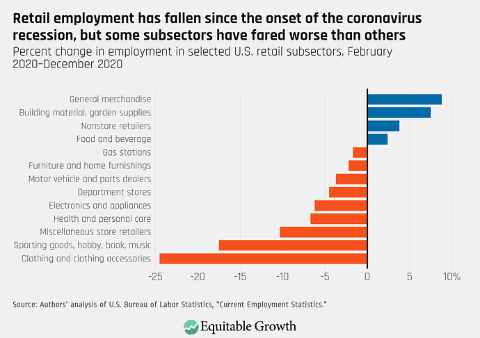
I would like first something like this:
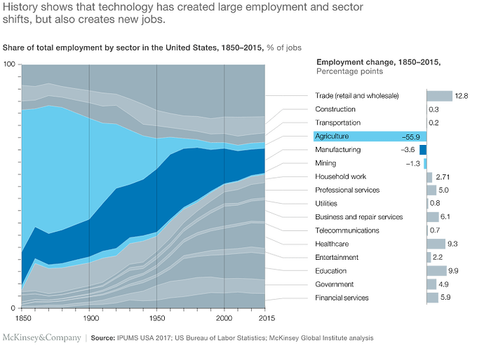
and then later when aggregating the share of total employment by sector I would like to do this:
Maybe this for the first one:
library(tidyverse)
library(scales)

df2 <- df %>%
  mutate(Direction = if_else(Change > 0, "pos", "neg"),
         Change = Change /100)

ggplot(df2, aes(x = reorder(Sectors, Change), y = Change, fill = Direction)) +
  geom_col() +
  labs(title = "Something",
       x = NULL,
       y = "Change",
       caption = "Something else") +
  scale_fill_manual(values = c(neg = "red", pos = "blue")) +
  scale_y_continuous(labels = percent_format()) +
  theme(legend.position = "none") +
  coord_flip()
And this for the second:
This topic was automatically closed 21 days after the last reply. New replies are no longer allowed.
If you have a query related to it or one of the replies, start a new topic and refer back with a link.

