Hi!
I'm currently studying how to use ggplot2,
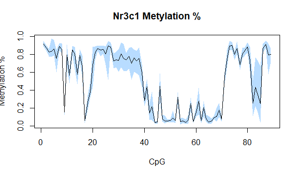
I'm struggling to build a polygon with ranges around the mean, as in the following picture:
I'm working with a df made of 89 columns and 46 rows.
I would like that to x-axis will be made of the 89 columns (as in the picture)...
To help us help you, could you please prepare a reproducible example (reprex) illustrating your issue? Please have a look at this guide, to see how to create one: