Hi all,
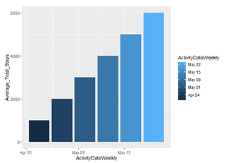
I am trying to create a bar chart for the pubic dataset Bellabeat. I want each bar to have a different color. My code is the following:
ggplot(data=daily_activity_summary)+
geom_col(mapping = aes(x=ActivityDateWeekly, y=Average_Total_Steps,fill=ActivityDateWeekly))
The issue is that it is produced a bar chart with different shades of blue (i.e. dark blue,light blue etc). However I want each bar chart to have different color. Could someone help with this issue please?
Many thanks in advance
Panos
Hi @Panagiotis_Emmanouil , you could put the colors by this way: with fill way.
# Define the color palette for the bars
my_colors <- c("#E69F00", "#56B4E9", "#009E73", "#F0E442", "#0072B2", "#D55E00", "#CC79A7") # Is necesary put the number of colors according bars.

# Create the bar chart with custom fill colors
ggplot(data = daily_activity_summary) +
  geom_col(mapping = aes(x = ActivityDateWeekly, y = Average_Total_Steps, fill = ActivityDateWeekly)) +
  scale_fill_manual(values = my_colors)
Try to put the data for better help us all the R community.
check
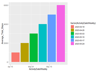
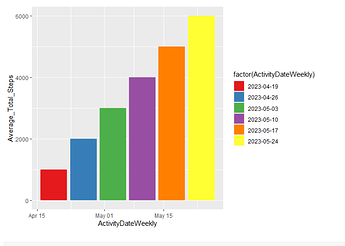
Welcome to the community @Panagiotis_Emmanouil. Below are a couple examples for changing the color of the bars (using sample data). By specifying fill = factor(ActivityDateWeekly), ggplot will color each bar uniquely. There are numerous color palettes to explore, so the final example looks at using a defined palette from ColorBrewer.
library(tidyverse)

# sample data
daily_activity_summary = data.frame(
  ActivityDateWeekly = seq.Date(as.Date(today()), as.Date(today() + weeks(5)), by = 'weeks'),
  Average_Total_Steps = seq(1000, 6000, 1000)
  )

# original plot
ggplot(data=daily_activity_summary)+
  geom_col(mapping = aes(x=ActivityDateWeekly,
                         y=Average_Total_Steps,
                         fill=ActivityDateWeekly))
# wrap the fill in factor()
ggplot(data=daily_activity_summary)+
  geom_col(mapping = aes(x=ActivityDateWeekly,
                         y=Average_Total_Steps,
                         fill=factor(ActivityDateWeekly)))
# plot with ColorBrewer palette
ggplot(data=daily_activity_summary)+
  geom_col(mapping = aes(x=ActivityDateWeekly,
                         y=Average_Total_Steps,
                         fill=factor(ActivityDateWeekly))) +
  scale_fill_brewer(palette = 'Set1')
Created on 2023-04-19 with reprex v2.0.2
scottyd22,
many thanks for your help! Much appreciated
This topic was automatically closed 21 days after the last reply. New replies are no longer allowed.
If you have a query related to it or one of the replies, start a new topic and refer back with a link.


