Help adding percentatges to a barplot with ggplot2 (Error: `mapping` must be created by `aes()`)

I had a problem adding percentatges to a barplot with ggplot2
I was trying this code:
ggplot(TFM, aes(x=EmbryoQuality, y=prop.table(stat(count)), fill=Group, label=scales::percent(prop.table(stat(count))))) + geom_bar(position=position_dodge2()) + theme(legend.position="bottom") + geom_text(stat_count, position = position_dodge2(.9), vjust=1.6, color="white", size=3.5) + scale_y_continuous(label= scales::percent) + labs(x=EmbryoQuality, y=Percentatges, fill = Group)

And this one:
ggplot(TFMqb, aes(label=EmbryoQuality, fill=Group)) + geom_bar(stat_identity, position=position_dodge2()) + theme(legend.position="bottom") + geom_text(aes(label=EmbryoQuality), vjust=1.6, color="white", size=3.5)

And I was receiving either one of this messages:

  • Error: mapping must be created by aes(),

  • geom_text requires the following missing aesthetics: y,

  • stat_count() can only have an x or y aesthetic.

THE CORRECT CODE IS THIS ONE:

ggplot(TFMqe, aes(x= EmbryoQuality,  group=Group)) + 
geom_bar(aes(y = ..prop.., fill = factor(..x..)), stat="count", alpha=0.7, position = position_dodge2()) +
geom_text(aes(label = scales::percent(..prop..), 
           y= ..prop.. ), position = position_dodge2(.9), color = "white", size = 3.5, vjust = 1.6, stat= "count") +
         labs(y = "Percent", fill="EmbryoQuality") +
         facet_grid(~Group) +
                      scale_y_continuous(labels = scales::percent) +
                      theme(legend.position = "none")

And the final result is this barplot (the quality in pdf or jpeg is much better!):
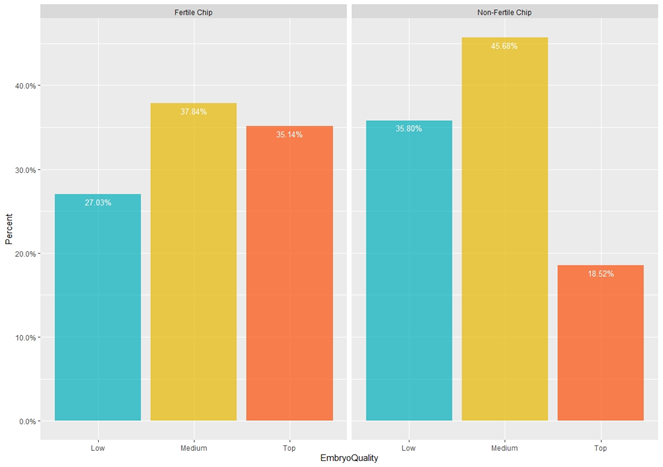
image

Hi!

To help us help you, could you please prepare a reproducible example (reprex) illustrating your issue? Please have a look at this guide, to see how to create one:

Hi, sure!

Group: "Non-Fertile Chip", "Fertile Chip"
Top quality embryos: "Yes", "No"

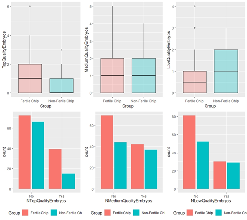
And I have: 15 Yes and 66 No for Non-Fertile Chip, and 39 Yes and 72 No for Fertile Chip.

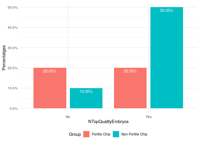
This is how it looks now:
image

And I would like it to have the percentatges 18.52% (yes) and 81.48 (no) for Non-Fertile Chip, and 35.14% (yes) and 64.86 (no) for Fertile Chip.

Thanks!

That is not reproducible, please read the guide on the link I gave you and try to make a proper reproducible example.

I'm sorry, it will only let me show the first 10 rows.

data.frame(
    stringsAsFactors = FALSE,
               Group = c("Non-Fertile Chip",
                         "Non-Fertile Chip","Fertile Chip","Fertile Chip",
                         "Non-Fertile Chip","Fertile Chip","Non-Fertile Chip",
                         "Non-Fertile Chip","Fertile Chip","Non-Fertile Chip"),
  NTopQualityEmbryos = c("Yes","Yes","Yes","Yes",
                         "Yes","No","Yes","Yes","No","No")
)

And this are the codes I've trying:

g4 <- ggplot(TFMqe, mapping=aes(x=NTopQualityEmbryos, y=prop.table(stat(count)), fill=Group, label=scales::percent(prop.table(stat(count))))) + geom_bar(position=position_dodge2()) + theme(legend.position="bottom") + geom_text(stat_count, position = position_dodge2(.9), vjust=1.6, color="white", size=3.5) + theme_minimal() + scale_y_continuous(label= scales::percent) + labs(x=NTopQualityEmbryos, y=Percentatges, fill = Group)

And:

g5 <- ggplot(TFMqe, aes(label=NMediumQualityEmbryos, fill=Group)) +  geom_bar(stat_identity, position=position_dodge2()) + theme(legend.position="bottom") + geom_text(aes(label=NMediumQualityEmbryos), vjust=1.6, color="white", size=3.5) + theme_minimal()

Thanks!

library(ggplot2)

TFMqe <- data.frame(
    stringsAsFactors = FALSE,
    Group = c("Non-Fertile Chip",
              "Non-Fertile Chip","Fertile Chip","Fertile Chip",
              "Non-Fertile Chip","Fertile Chip","Non-Fertile Chip",
              "Non-Fertile Chip","Fertile Chip","Non-Fertile Chip"),
    NTopQualityEmbryos = c("Yes","Yes","Yes","Yes",
                           "Yes","No","Yes","Yes","No","No")
)

ggplot(TFMqe, aes(x = NTopQualityEmbryos,
                  y = stat(count/sum(count)),
                  fill = Group)) +
    geom_bar(position = position_dodge2()) +
    geom_text(aes(label = scales::percent(stat(count/sum(count)),
                                          accuracy = 0.01)),
                position = position_dodge2(.9),
                vjust = 1.6,
                color = "white",
                size = 3.5,
              stat = "count") +
    scale_y_continuous(label = scales::label_percent()) +
    labs(x = "NTopQualityEmbryos",
         y = "Percentatges",
         fill = "Group") +
    theme_minimal() +
    theme(legend.position = "bottom")

Created on 2020-11-04 by the reprex package (v0.3.0.9001)

1 Like

If your question's been answered (even by you!), would you mind choosing a solution? It helps other people see which questions still need help, or find solutions if they have similar problems. Here’s how to do it:

I've just realized, that the percentatges sume altogether 100%, whilst ideally I'd like it to be 100% in de No group, and 100% in the yes group. So as to see the % of embryos that had top quality in the No group vs the % in the Yes group.
Do you know how to change it?
Thanks!

This topic was automatically closed 21 days after the last reply. New replies are no longer allowed.

If you have a query related to it or one of the replies, start a new topic and refer back with a link.