Hi friends!!! @nirgrahamuk
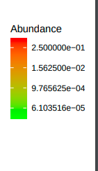
I have generated microbial relative abundance heatmap with phyloseq package. I have used the same code for several datasets. But when the heatmap generated, I am seeing two types of scales appear in the heatmap. One scale ranges between 6.103516e−05 and 2.500000e−01. And another one with range 0.0002441406 to 0.0625000000.
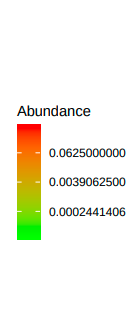
I am using similar datasets from similar environment so relative abundance are not supposed to vary greatly between the datasets. Still why such differences are coming?
Thanks and Regards,
DC7