Having trouble with legend gradients for multiple maps

Hi, this is my first time posting on here so please excuse any mistakes I might make.
I am currently writing my final code for my dissertation and I wanted to make my maps look neat together, So I need to make their legends universal.


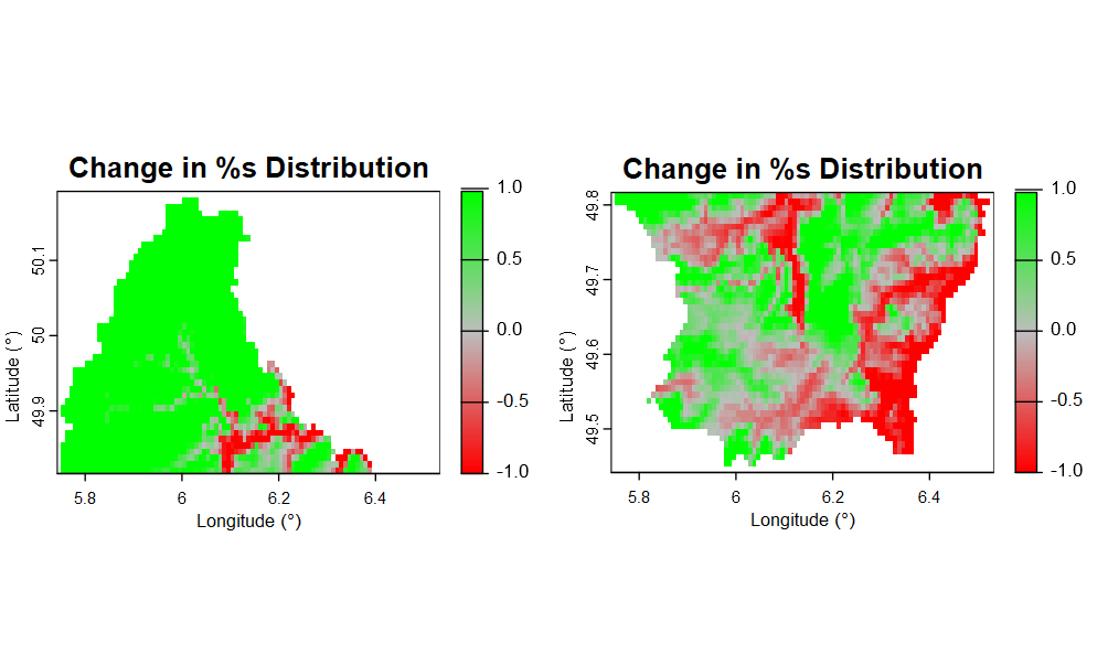
As you can see in the image, none of the legends align up with each other. I aim to have grey represent 0, the greenest 1 and the redest -1, but it hasnt worked well for my maps.
And if it would be possible, how could I add a legend title next to the gradient to desribe what it is?

My code for the maps:
(I do have more code for the species downloading, cleaning etc)

    # Calculate the difference in predicted suitability
suitability_change <- forecast_presence - glm_predict

# Mask values outside the range [-1, 1]
suitability_change_limited <- mask(suitability_change, suitability_change >= -1 & suitability_change <= 1)

# Number of breaks
n_breaks <- 100

# Assuming your breaks are correctly set for the range [-1, 1]
breaks <- seq(-1, 1, length.out = n_breaks + 1)  # Recalculate breaks for the limited range
classified <- classify(suitability_change_limited, rcl = cbind(breaks, 1:length(breaks)))

# Generate a color gradient for the limited range
colors <- colorRampPalette(c("red", "grey", "green"))(n_breaks)

# Proceed with plotting
base_map_filename <- sprintf("output/Change in %s Distribution.png", species_common_name)
png(base_map_filename, width = 720, height = 720)
plot(classified, 
     axes=TRUE,
     col=colors,
     xlab = "Longitude (°)",
     ylab = "Latitude (°)",
     main= sprintf("Change in %s Distribution", species_common_name))
plot(my_map, add = TRUE, border = "grey5")
dev.off()

Thanks for providing code. Could you kindly take further steps to make it easier for other forum users to help you? Share some representative data that will enable your code to run and show the problematic behaviour.
Its also important to list what libraries you depend on.
In your example classify would seem to be doing a lot of heavy lifting, what provides that for you ?

How do I share data for a reprex?

You might use tools such as the library datapasta, or the base function dput() to share a portion of data in code form, i.e. that can be copied from forum and pasted to R session.

Reprex Guide

Thank you for your quick reply. Unfortunately, it would be hard for me to provide my data as suitability_change is a spatraster, just like forecast_presence and glm_predict, and I don't think reprex works for spatrasters. And if I wanted to include a reprex of my data, I would have to change around most of my code so I could provide it. I only wanted to ask this question if it had a simple answer and I didn't want to include too much code.
I just thought there could be a simple work around by just changing some of the line of code.

Anyways my libaries are:
library(terra)
library(geodata)
library(predicts)
library(rgbif)
library(dplyr)
library(countrycode)
library(CoordinateCleaner)
library(readxl)
library(raster)

I further edited my code to maintain the origiinal legend appearance rather than map to 0:100 values.

I overcame your reproducibilty of some map data, by using built in raster provided in the terra package. To generate a worthwhile example I cut this into north and south regions.

I believe the key step, that I do that makes the difference is using clamp rather than mask. but perhaps thats wrong, you may wish to review that.

I also suspect that the way rcl was constructed could be incorrect, as it seemed to be a two column mapping, rather than a 3, so as the input data was not integer I believed it wouldnt be correct, therefore I transitioned to the 3 form.

# Load the terra package
library(terra)

# Read raster data representing elevation
pathraster <- system.file("ex/elev.tif", package = "terra")
r <- (rast(pathraster) /60)-5

# Plot the raster
par(mfcol=c(1,1))
plot(r)

# Get the extent of the original raster
ext <- ext(r)
# Convert the extent to a vector
ext_vector <- as.vector(ext)

# Calculate the mid-point of the y-coordinates
mid_y <- (ext_vector[4] + ext_vector[3]) / 2

top_ext <- c(ext_vector[1], ext_vector[2], mid_y, ext_vector[4])
bottom_ext <- c(ext_vector[1], ext_vector[2], ext_vector[3], mid_y)

# Crop the original raster to create the top and bottom halves
top_half <- crop(r, ext(top_ext))
bottom_half <- crop(r, ext(bottom_ext))

# Crop the original raster to create the top and bottom halves
top_half <- crop(r, ext(top_ext))
bottom_half <- crop(r, ext(bottom_ext))

# top is going from -1.75 to 4.1
# bottom is going from -2.6 to 3.2
par(mfcol=c(1,2))
plot(top_half)
plot(bottom_half)

################


# rather than mask, perhaps we want to clamp values outside the range [-1, 1]
top_half_lim <- clamp(top_half,-1 , 1)
bottom_half_lim <- clamp(bottom_half,-1 , 1)
plot(top_half_lim)
plot(bottom_half_lim)
# Number of breaks
n_breaks <- 100

# Assuming your breaks are correctly set for the range [-1, 1]
breaks <- seq(-1, 1, length.out = n_breaks + 1)  # Recalculate breaks for the limited range
classified_top <- classify(top_half_lim, rcl =cbind(breaks,na.omit(c(dplyr::lead(breaks),Inf)),breaks))
classified_bottom <- classify(bottom_half_lim, rcl =cbind(breaks,na.omit(c(dplyr::lead(breaks),Inf)),breaks))

# Generate a color gradient for the limited range
colors <- colorRampPalette(c("red", "grey", "green"))(n_breaks)
# Proceed with plotting
# base_map_filename <- sprintf("output/Change in %s Distribution.png", species_common_name)
# png(base_map_filename, width = 720, height = 720)
plot(classified_top, 
     axes=TRUE,
     plg=list(at=c(-1,-.5,0,.5,1)),
     col=colors,
     xlab = "Longitude (°)",
     ylab = "Latitude (°)",
     main= "Change in %s Distribution")

plot(classified_bottom, 
     axes=TRUE,
     plg=list(at=c(-1,-.5,0,.5,1)),
     col=colors,
     xlab = "Longitude (°)",
     ylab = "Latitude (°)",
     main= "Change in %s Distribution")
 

I appreciate your hard work, and I am greatful that there are people out their willing to help. But I decided to work on my map from another direction, so I ended up using ggplot2 instead. This has resulted in a perfect map for me, which looks better than the previous one:

my code for the new map:

    library(ggplot2)
library(rnaturalearth)  # For country borders
library(rnaturalearthdata)
library(terra)  # For raster operations

# Assuming glm_predict and forecast_presence are your current and future suitability rasters respectively
suitability_change <- forecast_presence - glm_predict  # Compute the change in suitability

# Convert the suitability change raster to a data frame for plotting
change_df <- terra::as.data.frame(suitability_change, xy = TRUE, na.rm = TRUE)
names(change_df) <- c("longitude", "latitude", "change")

# Load country borders
world <- ne_countries(scale = "medium", returnclass = "sf")

# Create the map
p <- ggplot() +
  geom_sf(data = world, fill = "white", color = "black") +  # Add country borders
  geom_tile(data = change_df, aes(x = longitude, y = latitude, fill = change)) +
  scale_fill_gradient2(low = "darkred", mid = "lightgrey", high = "darkgreen", midpoint = 0, limit = c(-1, 1), name = "Change in\nsuitability") +
  coord_sf(xlim = c(-12, 45), ylim = c(33, 72), expand = FALSE) +  # Limit the map to European extent
  labs(title = "Change in Suitability for Betula pendula",
       x = "Longitude", y = "Latitude") +
  theme_minimal(base_size = 16) +
  theme(axis.text.x = element_text(angle = 45, hjust = 1),
        plot.title = element_text(hjust = 0.5, face = "bold", size = 20),  # Ensure title is centered and bold
        panel.background = element_rect(fill = "white", colour = "white"),  # Set background to white
        plot.background = element_rect(fill = "white", colour = "white"),  # Ensure surrounding background is also white
        legend.background = element_rect(fill = "white"))  # Ensure legend background is white

# Define the file name using sprintf
file_name <- sprintf("output/Change_in_Suitability_Betula_pendula_%s.png", Sys.Date())

# Save the plot with the dynamically created file name
ggsave(file_name, plot = p, width = 10, height = 10, dpi = 72)

I'm glad for your success, I too typically prefer ggplot2 to base plotting.
I'm curious though that your example of success, seems to involve only one map, where I thought your issue related to standardising across multiple maps which may have differing scales.

My main issue was that my maps all had different legends, and I thought there were two ways to solve this issue; either by forcing each map to adapt to a scale of 1 to -1 individually or try and force a universal gradient on all of them at once in rstudio (which I had no idea how to even start with). So now I got to force one map to have the correct scales, then I don't see no issue why it couldn't work on the others.

This topic was automatically closed 42 days after the last reply. New replies are no longer allowed.

If you have a query related to it or one of the replies, start a new topic and refer back with a link.