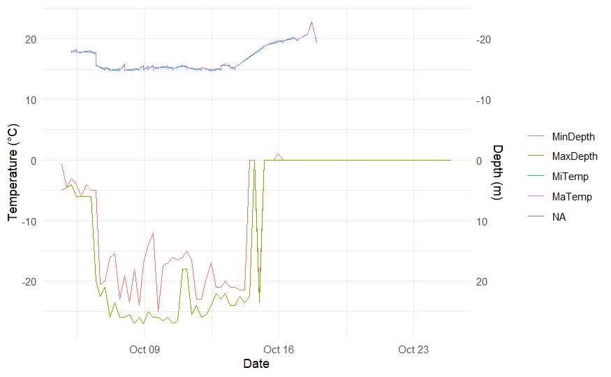
I am trying to create a 2 y axis graphs, corresponding to the Maximum and Minimum depth and temperature that a marine organism did during one time
period
This is the best graph that I managed to do so far, but I have trouble into rescaling the Y axes for both for better visualization. For the Temperature axis I am trying to make it to10 to 20, instead of the -20, -10, 0, 10, 20 and for the Depth axis to 0 to 30.
ggplot(Sharks1, aes(x = Date)) +
 geom_line(aes(y = Depth, color = Min_Max.x)) +
 geom_line(aes(y = Temp, color = Min_Max.y)) +
 scale_y_continuous(
   sec.axis = sec_axis(~ -., name = "Depth (m)")
 ) +
 labs(y = "Temperature (°C)", color = NULL) +
 theme_minimal()
This is currently my code, any help would be appreciated
Hi @Argyris_Venidis , try to put a reproducible example of data.
A minimal reproducible example consists of the following items:
A minimal dataset, necessary to reproduce the issue
The minimal runnable code necessary to reproduce the issue, which can be run
on the given dataset, and including the necessary information on the used packages.
Let's quickly go over each one of these with examples:
So, see this information avoiding-the-dual-axis-chart
Maybe is better make 2 plot because de values of Temperature are all positives and Depth are < 0, for avoiding confusion in the interpretation.
I second M_AcostaCH suggestion not to use a dual y-axis chart. They are very hard to interpret.
Here is a really quick and dirty example of using two plots and putting them together with the {patchwork} package.
set.seed(1913)
dat1  <- data.frame(date1 = seq(as.Date("2023/10/01"), as.Date("2023/10/31"), by = "day"),
                  aa = rnorm(31, mean = 0, sd = 1), bb = rnorm(31, mean = 5, sd = 2))


p1 <- ggplot(dat1, aes(date1, aa)) + geom_point(colour = "red") +
       geom_line(colour = "blue")
p2 <- ggplot(dat1, aes(date1, bb)) + geom_point(colour = "blue") +
        geom_line(colour = "red")

p1 / p2

# or
 p1 + p2
1 Like
system
May 4, 2024, 3:22pm
4
This topic was automatically closed 45 days after the last reply. New replies are no longer allowed.
