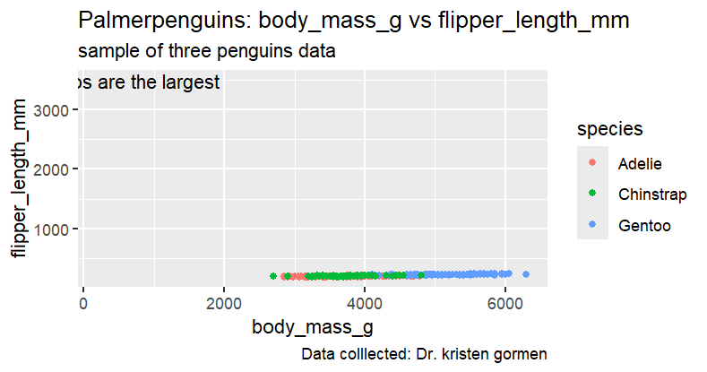
geom_point(mapping = aes(x = body_mass_g, y = flipper_length_mm, colour = species))+
labs(title = "Palmerpenguins: body_mass_g vs flipper_length_mm", subtitle = "sample of three penguins data", caption = " Data colllected: Dr. kristen gormen")+
annotate("text",x=220,y=3500,label="The Gentoos are the largest")
Swapping the x and y values of the annotation makes a much prettier plot. Try this
library(tidyverse)
library(palmerpenguins)
ggplot(data = penguins)+
geom_point(mapping = aes(x = body_mass_g, y = flipper_length_mm, colour = species))+
  labs(title = "Palmerpenguins: body_mass_g vs flipper_length_mm",
       subtitle = "sample of three penguins data",
       caption = " Data colllected: Dr. kristen gormen")+
  annotate("text",y=220,x=3500,label="The Gentoos are the largest")