Thank you. There is another thing. In the long/wide legend, the text is size 80. If height is in pixels width should be 50 * 9 = 450 or 6.25 in @ 72dpi (worse case). Is something else making the plot big?
The gt::ggplot_image() function uses the code below internally, which ends up with a 3000 x 500 plot at 100 DPI with an aspect ratio of 6 (30 wide by 5 high).
ggplot2::ggsave(
  filename = "temp_ggplot.png",
  plot = plot_object,
  device = "png",
  dpi = 100,
  width = 5 * aspect_ratio,
  height = 5
)
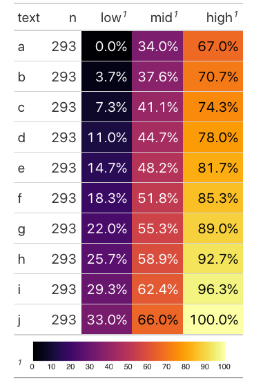
We can show an example of the embedded "legend" in the footnotes like so:
library(gt)
library(dplyr)
library(tidyr)
library(ggplot2)
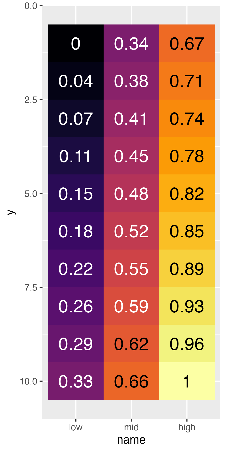
fake_data <- tibble(
text = letters[1:10],
n = 293,
low = seq(0, 0.33, length.out = 10),
mid = seq(0.34, 0.66, length.out = 10), #%>% rev(),
high = seq(0.67, 1, length.out = 10)
)
wide_legend <- tibble(
n = 1:100
) %>%
ggplot(aes(x = n, y = "", fill = n)) +
geom_tile() +
viridis::scale_fill_viridis(option = "B") +
theme_void() +
theme(legend.position = "none", axis.text.y = element_blank(),
axis.text.x = element_text(size = 90)) +
scale_x_continuous(breaks = seq(0, 100, by = 10))
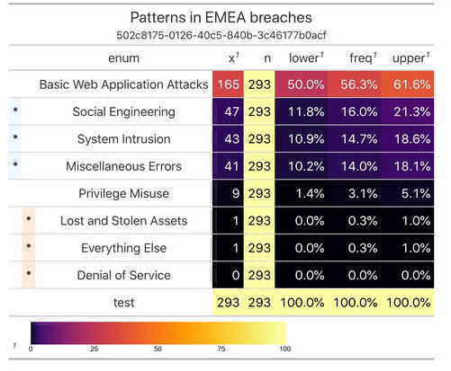
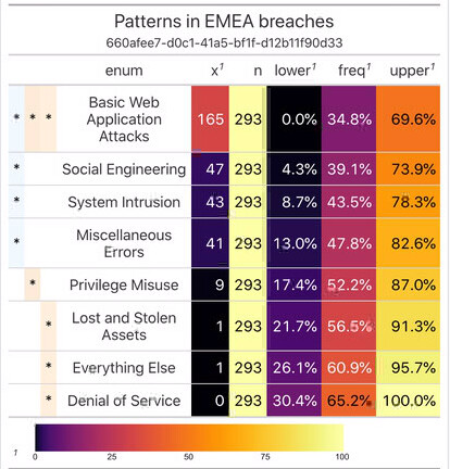
gt_out <- fake_data %>%
gt() %>%
fmt_percent(columns = low:high, decimals = 1) %>%
data_color(
columns = low:high,
colors = scales::col_numeric(
palette = paletteer::paletteer_c("viridis::inferno", n = 201) %>% as.character(),
domain = c(0,1)
)
) %>%
tab_footnote(
footnote = gt::html(gt::ggplot_image(wide_legend, aspect_ratio = 7, height = px(35))),
locations = cells_column_labels(low:high)
)
gt_out
To see just the ggplot using the output defaults from the gt package:
ggsave("test-img.png", wide_legend, dpi = 100, height = 5, width = 30)