Grouped barplot/boxplot with individual data points

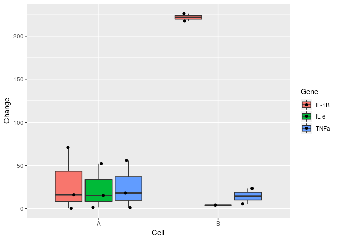
Hi there, in my dataset I have two cell types that had three genes tested on each.
I want to obtain a grouped barplot/boxplot, importantly, I want to be able to visualise individual data points on the bar/box.

cell <- c(1,1,1,1,1,1,1,1,1,2,2,2,2,2,2)
Gene <- c("IL-6","IL-6","IL-6","IL-1B","IL-1B","IL-1B","TNFa","TNFa","TNFa","IL-6","IL-6","IL-1B","IL-1B","TNFa","TNFa")
Change <- c(52.1204352,15.0980129,1.2306710,70.9649383,15.8489764,0.1797975,55.8863164,17.9731222,0.8732369,3.7435065,3.9501774,217.7251295,226.2724972,23.2779805,5.3588277)

Where I got so far:

ggplot(df, aes(y = Change,
                x = cell,
                group = Gene)) +
     geom_bar(stat = "identity", position = "dodge", aes(fill = Gene))

so I got this
image

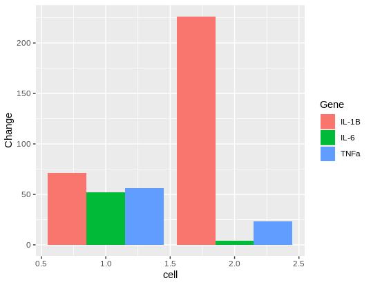
Could someone guide me in plotting the individual data points on top?
And, ideally, I would have Cell A and Cell B on x axis instead of numerical values, but that I can tweak later on Photoshop if I get the individual data points to come through.

Thank you so much!

To fix the x axis define cell as a factor, e.g. x = factor (cell) in the ggplot() function..

Regarding your data it's not clear what you are trying to plot. You have three Change values per cell/Gene combination, so stat = "identity" doesn't seem correct.

Once you have resolved that you can add text like this:

1 Like

Thanks,

Regarding stat = "identity" I don't know what this bit of code represents (I just copied the entire code from someone's help with grouped-plots some website), so I'm not sure what to substitute it with.

I want to add jitter of data points, rather than labels (I want to visualise where the individual values per Gene for Cell 1 and the individual values per Gene for Cell 2 lie on the y-axis)

stat = "identity" means that the height of the bars are given by the values provided. Alternatives includes stacked bars.

Sorry, I misread your original post. I thought you had wanted to show the numerical values, but given that you want to show the individual points, then this shows some examples using a box plot:

In this case I don't think it makes sense to use a bar plot.

Maybe this is what you are looking for?

df <- data.frame(stringsAsFactors = FALSE,
                 cell = c(1,1,1,1,1,1,1,1,1,2,2,2,2,2,2),
                 Gene = c("IL-6","IL-6","IL-6","IL-1B","IL-1B","IL-1B",
                          "TNFa","TNFa","TNFa","IL-6","IL-6","IL-1B",
                          "IL-1B","TNFa","TNFa"),
                 Change = c(52.1204352,15.0980129,1.2306710,70.9649383,15.8489764,
                            0.1797975,55.8863164,17.9731222,0.8732369,3.7435065,
                            3.9501774,217.7251295,226.2724972,23.2779805,5.3588277)
)
library(ggplot2)
ggplot(df, aes(x = factor(cell, labels = c("A", "B")), y = Change, fill = Gene)) +
    geom_boxplot(outlier.size = 0) + 
    geom_point(position = position_jitterdodge(jitter.width = 0.1)) +
    labs(x = "Cell")

Created on 2019-03-14 by the reprex package (v0.2.1)

3 Likes

yay, that's exactly what i needed. thank you!

If your question's been answered (even by you!), would you mind choosing a solution? It helps other people see which questions still need help, or find solutions if they have similar problems. Here’s how to do it:

This topic was automatically closed 21 days after the last reply. New replies are no longer allowed.

If you have a query related to it or one of the replies, start a new topic and refer back with a link.