Group bar charts

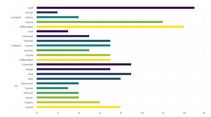
I am trying to plot a group bar chart in R. As of now I am using the package highcharterbut if this can be done in any other library that would be fine. This is what I am trying to get to :

enter image description here
Below is the code

spend_opt_tv <-tibble::tribble(
  ~Channel,   ~Network,                 ~Daypart,        ~Lower,     ~Current,          ~Upper, ~Optimized.Budget,        ~CPM,
    "TV 1",      "NBC",                  "Other",  "$13,790.50",    "$27,581",    "$41,371.50",         "$41,372", "$4,555.00",
    "TV 2",      "NBC",      "Weekday Afternoon",  "$97,680.00",   "$195,360",   "$293,040.00",        "$237,904", "$3,964.00",
    "TV 3",      "NBC",   "Weekday Early Fringe", "$160,129.50",   "$320,259",   "$480,388.50",        "$160,132", "$4,190.00",
    "TV 4",      "NBC",    "Weekday Late Fringe", "$110,546.00",   "$221,092",   "$331,638.00",        "$185,136", "$4,491.00",
    "TV 5",      "NBC",        "Weekday Morning", "$226,253.00",   "$452,506",   "$678,759.00",        "$354,960", "$6,206.00",
    "TV 6",      "NBC",               "Weekends",  "$35,880.00",    "$71,760",   "$107,640.00",        "$107,640", "$4,147.00",
    "TV 7",      "CBS",                  "Other",  "$95,873.50",   "$191,747",   "$287,620.50",        "$238,774", "$5,145.00",
    "TV 8",      "CBS",             "Prime Time",  "$57,645.00",   "$115,290",   "$172,935.00",         "$57,647", "$3,951.00",
    "TV 9",      "CBS",               "Weekends",  "$18,915.00",    "$37,830",    "$56,745.00",         "$56,747", "$3,531.00"
  )

network_grouped <- spend_opt_tv %>% 
  group_by(name = Network) %>% 
  do(categories = .$Daypart) %>% 
  list_parse()

highchart() %>% 
 hc_xAxis(categories = network_grouped) %>% 
  hc_add_series(data = spend_opt_tv, type = "bar" , hcaes(y = Current, color = Daypart),
                showInLegend = FALSE)
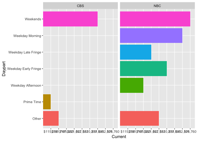
I don't know the highcharter package fluently, but here is a beginner version in ggplot2:

library(tidyverse)
#> Warning: package 'tibble' was built under R version 3.5.2
#> Warning: package 'purrr' was built under R version 3.5.2

spend_opt_tv <-tibble::tribble(
  ~Channel,   ~Network,                 ~Daypart,        ~Lower,     ~Current,          ~Upper, ~Optimized.Budget,        ~CPM,
  "TV 1",      "NBC",                  "Other",  "$13,790.50",    "$27,581",    "$41,371.50",         "$41,372", "$4,555.00",
  "TV 2",      "NBC",      "Weekday Afternoon",  "$97,680.00",   "$195,360",   "$293,040.00",        "$237,904", "$3,964.00",
  "TV 3",      "NBC",   "Weekday Early Fringe", "$160,129.50",   "$320,259",   "$480,388.50",        "$160,132", "$4,190.00",
  "TV 4",      "NBC",    "Weekday Late Fringe", "$110,546.00",   "$221,092",   "$331,638.00",        "$185,136", "$4,491.00",
  "TV 5",      "NBC",        "Weekday Morning", "$226,253.00",   "$452,506",   "$678,759.00",        "$354,960", "$6,206.00",
  "TV 6",      "NBC",               "Weekends",  "$35,880.00",    "$71,760",   "$107,640.00",        "$107,640", "$4,147.00",
  "TV 7",      "CBS",                  "Other",  "$95,873.50",   "$191,747",   "$287,620.50",        "$238,774", "$5,145.00",
  "TV 8",      "CBS",             "Prime Time",  "$57,645.00",   "$115,290",   "$172,935.00",         "$57,647", "$3,951.00",
  "TV 9",      "CBS",               "Weekends",  "$18,915.00",    "$37,830",    "$56,745.00",         "$56,747", "$3,531.00"
)

ggplot(spend_opt_tv, aes(x = Daypart, y = Current, fill = Daypart)) +
  geom_col(show.legend = FALSE) +
  facet_wrap(~Network) +
  coord_flip()

Created on 2019-01-31 by the reprex package (v0.2.1)

Needs some tweaking of the x-axis labels and potentially some ordering of the Daypart categories.

1 Like

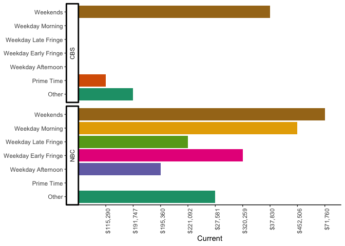
Building on @apreshill's work, one extra step to take would be to change the direction of the faceting:

ggplot(spend_opt_tv, aes(x = Daypart, y = Current, fill = Daypart)) +
  geom_col(show.legend = FALSE) +
  facet_grid(Network ~ ., switch = "y") +
  coord_flip()

This is the closest I can get to what you want. But that's not quite the outcome desired: I know because I was looking to solve the same problem. I very much like the hierarchical axes, and ggplot doesn't quite get us there in terms of good looks.

1 Like

I took @taras and did a little formatting on it to make it more appealing (at least to me):

library(tidyverse)

ggplot(spend_opt_tv, aes(x = Daypart, y = Current, fill = Daypart)) +
  geom_col(show.legend = FALSE) +
  facet_grid(Network ~ ., switch = "y") +
  coord_flip() +
  theme_classic() + 
  scale_fill_brewer(palette="Dark2") +
  theme(axis.text.x = element_text(angle = 90, hjust = 1)) +
  theme(axis.title.y = element_blank())

Created on 2019-01-31 by the reprex package (v0.2.1)

Note that your source data is treating the Current field as a text value, not as a number. So you get weird things like the x axis above not having rounding to even dollars and not starting at zero. From R's point of view these are just character strings. If you want them to behave like numbers, you'll need to convert them explicitly.

4 Likes

My main problem with this is that I want the higher level hierarchy to show up to the left of the x (or y, now that the axes are flipped) values, like in the OP's screenshot.
It's especially pleasing on an x axis when x axis is dates, and so you can display dates and add and extra level of, say, month below, and intuitively it makes more sense as month should be below date, hierarchically.

I'm probably not making sense right now, as I'm trying to do 3 things at once, but I"ll try to revise this post later, LOL

yeah to get that nested effect, you'd likely need to use a table package like gt and put each group inside a grid cell.

On the other hand you could just quit trying to make your junk look like Tableau, @taras :slight_smile:

1 Like

Thank you.

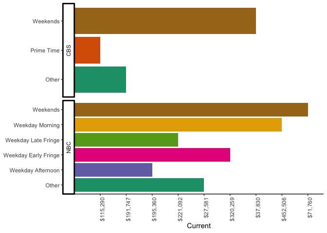
How can you remove y axis labels for the ones there is no data. That ways when there are more channels it would be less clustering.

scales = "free" is the secret:

ggplot(spend_opt_tv, aes(x = Daypart, y = Current, fill = Daypart)) +
  geom_col(show.legend = FALSE) +
  facet_grid(Network ~ ., switch = "y", scales="free") +
  coord_flip() +
  theme_classic() + 
  scale_fill_brewer(palette="Dark2") +
  theme(axis.text.x = element_text(angle = 90, hjust = 1)) +
  theme(axis.title.y = element_blank())

Created on 2019-01-31 by the reprex package (v0.2.1)

2 Likes

Thank you. This was very helpful.

This topic was automatically closed 7 days after the last reply. New replies are no longer allowed.

If you have a query related to it or one of the replies, start a new topic and refer back with a link.