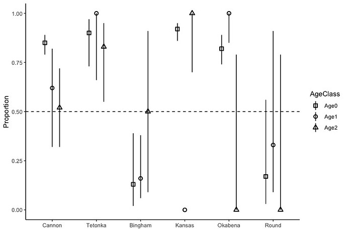
I am writing this to if it is possible or not to visualize CI for population proportion using ggplot2 directly from data without creating a data frame.
I compared survival of two Walleye strains in southern Minnesota lakes stocked at a 1:1 ratio. Later, we captured fish and estimated the proportion of each strain for each lake accounting for age. The graph and code I created was attached below. I was wondering if it is possible to create similar graphs from raw data without creating a new data frame for each year.
I know you must be very busy but I truly appreciate your feedback.
# Create a graph for LMS proportion with 95% confidence intervals

Stocked2018LMSCI<-data.frame(Strain=rep(c("LMS"), each=1),
                             AgeClass=rep(c("Age0", "Age1", "Age2"), each=6),
                             Populations=rep(c("Bingham", "Kansas", "Okabena", "Round", "Cannon", "Tetonka"), each=1),
                             LowerCI=c(0.02, 0.86, 0.74, 0.03, 0.79, 0.73, 0.06, 0.00, 0.85, 0.09, 0.32, 0.66, 0.09, 0.70, 0.00, 0.00, 0.32, 0.55),
                             UpperCI=c(0.39, 0.95, 0.89, 0.56, 0.89, 0.97, 0.38, 0.00, 1.00, 0.91, 0.82, 1.00, 0.91, 1.00, 0.79, 0.79, 0.72, 0.95),
                             Proportion=c(0.13, 0.92, 0.82, 0.17, 0.85, 0.90, 0.16, 0.00, 1.00, 0.33, 0.62, 1.00, 0.5, 1.00, 0.00, 0.00, 0.52, 0.83))
Stocked2018LMSCI


ggplot(Stocked2018LMSCI, aes(x=Populations, y=Proportion))+
  xlab(NULL)+
  geom_pointrange(aes(ymin=LowerCI, ymax=UpperCI, color=AgeClass),
                  width=0.2,
                  position=position_dodge(width = 0.1), size=0.5)+
  geom_hline(aes(yintercept=0.5), linetype="dashed")+
  theme_classic()+
  scale_x_discrete(limits=c("Cannon", "Tetonka", "Bingham", "Kansas", "Okabena", "Round"))

# Shape
ggplot(Stocked2018LMSCI, aes(x=Populations, y=Proportion))+
  xlab(NULL)+
  geom_pointrange(aes(ymin=LowerCI, ymax=UpperCI, shape=AgeClass),
                  width=0.2,
                  position=position_dodge(width = 0.5), size=0.5)+
  geom_hline(aes(yintercept=0.5), linetype="dashed")+
  scale_shape_manual(values = c(0:2)) + scale_fill_grey() + theme_classic()+
  scale_x_discrete(limits=c("Cannon", "Tetonka", "Bingham", "Kansas", "Okabena", "Round"))

