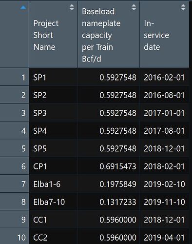
I am trying to create a very simple stacked line graph in R. My question is whether this can be done without creating new rows in the dataframe to capture the monthly time series to construct the graph. The attached picture is the best way to visualize the issue. Is it possible to create a stacked line graph using the "In Service date" as the x axis monthly through time and the "nameplate baseload capacity Bcf/d" as the y axis without having to create a monthly time series for the x and y variables? Thanks in advance.
Could you please turn this into a self-contained reprex (short for reproducible example)? It will help us help you if we can be sure we're all working with/looking at the same stuff.
install.packages("reprex")
If you've never heard of a reprex before, you might want to start by reading the tidyverse.org help page. The reprex dos and don'ts are also useful.
What to do if you run into clipboard problems
If you run into problems with access to your clipboard, you can specify an outfile for the reprex, and then copy and paste the contents into the forum.
reprex::reprex(input = "fruits_stringdist.R", outfile = "fruits_stringdist.md")
For pointers specific to the community site, check out the reprex FAQ.
Here is the reprex. I hope I did this correctly. I created a data_frame with sample data from my original data file. I am trying to create a stacked line graph by month with the x-axis as Start, y-axis as Capacity, and fill by Project. Is there a way to graph the Capacity data through time (ie, monthly) without creating a new dataframe with monthly time series data for each x and y variable?
library(tidyverse)
library(tibble)
library(ggthemes)
library(lubridate)


eia_lng <- data_frame(
  Project=c("SP1", "SP2", "SP3", "CP1", "CP2"),
  Start=c(ymd(20170501,20180601, 20190201,20190901,20200101)),
  Capacity=c(0.8,1.2,0.6,0.4,0.8))

ggplot(eia_lng)+
  geom_area(aes(x=Start, y= Capacity, fill=Project)) +
  labs(y="Bcf/d", x="", title="LNG Growth",
       caption="Source: EIA") +
  theme_bw()+
  scale_y_continuous(labels=comma) +
  theme(axis.title.x = element_text(size=8,face="bold"),
        axis.title.y = element_text(size=8,face="bold"),
        legend.text = element_text(size=8, face="bold"),
        legend.title = element_blank(),
        plot.title = element_text(size=10, face="bold"),
        plot.caption = element_text(size=7, face="bold"),
        panel.background = element_rect(colour = "grey", size = 0.5),
        plot.background = element_rect(colour = "black", size = 0.75 ))
Thanks for the example! That’s helpful. I think it might also help if you could show an example of the output you have in mind (even if it’s just a sketch, or a plot from somewhere else). I’m not quite sure I understand what you mean by this part:
Do you just want an x axis scale that only shows months? Or do you want to aggregate your data by month? If you want to aggregate, is there a particular reason you are trying to do so without creating a separate data frame?
How about adding this into your ggplot?.
scale_x_date(date_breaks = "1 month")
In your example you are not getting the area plot because you only have 1 value per Project and you can't get area under a point, also there is no "comma" variable in eia_lng dataframe so this fails scale_y_continuous(labels=comma) +.
That's scales::comma.
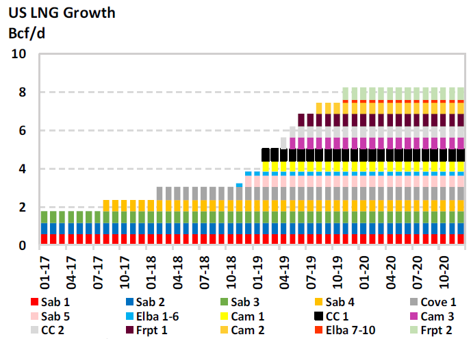
Sorry for the slow response. I was looking for the x-axis to be a monthly series. X axis monthly dates, y axis is capacity, grouped by project.
There were some subsequent posts that suggested scale_x_date(date_breaks…). I will give that a shot.
Tks for responding.
Here's the output I had in mind. I was hoping there was a easy way to create the graph without having to create a separate dataframe with monthly data series. Any suggestions would be helpful 
This topic was automatically closed 21 days after the last reply. New replies are no longer allowed.
If you have a query related to it or one of the replies, start a new topic and refer back with a link.
