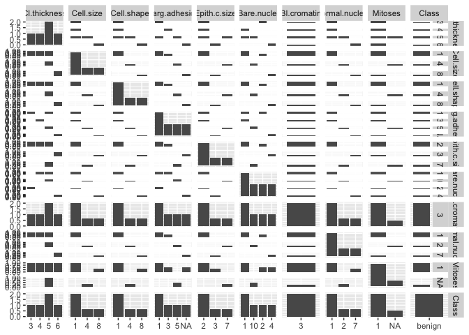
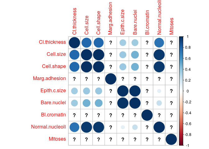
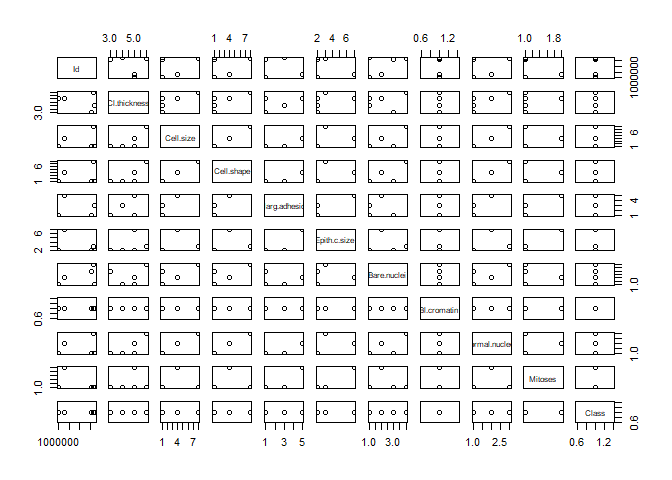
I am trying to plot the below data which contains 683 samples. I cannot find a suitable graph that can plot all the data at once to get insights between the variables. A part from doing individual graph for each variables is there any other ways anyone can suggest please?
CancerData=data.frame(stringsAsFactors=FALSE,
                Id = c("1000025", "1002945", "1015425", "1016277", "1017023"),
      Cl.thickness = c("5", "5", "3", "6", "4"),
         Cell.size = c("1", "4", "1", "8", "1"),
        Cell.shape = c("1", "4", "1", "8", "1"),
     Marg.adhesion = c("1", "5", "1", "NA", "3"),
      Epith.c.size = c("2", "7", "2", "3", "2"),
       Bare.nuclei = as.factor(c("1", "10", "2", "4", "1")),
       Bl.cromatin = as.factor(c("3", "3", "3", "3", "3")),
   Normal.nucleoli = as.factor(c("1", "2", "1", "7", "1")),
           Mitoses = as.factor(c("1", "NA", "1", "1", "1")),
             Class = as.factor(c("benign", "benign", "benign", "benign",
                                 "benign"))
)


plot(CancerData)
#> Warning in data.matrix(x): NAs introduced by coercion
Created on 2019-11-21 by the reprex package (v0.3.0)