Greetings,
I am having trouble identifying where my issue is with my code. When I create a graph, the y axis displays the correct label, however the increments are showing as really small numbers, 0e+00 through 4e+05. Yet, when I run the same code without the ggplot2 graph, the results appear correct, as in numbers greater than 0. I apologize, I tried to create a reprex but my RStudio got stuck in a restart cycle. I hope the text will suffice.
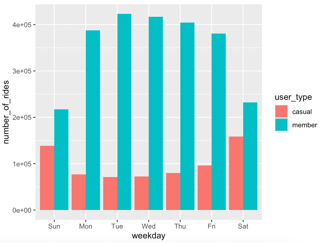
The y axis should (or at least I want it to) display the number_of_rides data, with
results 138280, 76785 and so on.
Yet, notice when graphed, the y axis displays the correct label but I have no idea
what numbers are being displayed.
This is the code chunk
total_trips %>%
mutate(weekday=wday(start_date,label=TRUE)) %>%
group_by(user_type,weekday) %>%
summarise(number_of_rides=n()
,average_duration=mean(length_of_ride)) %>%
arrange(user_type,weekday)
This is the result
(bolded values are what I was expected to be on the Y axis. dashes added for clarity).
user_type weekday number_of_rides average_duration
<chr <ord <int <dbl
1 casual - Sun - 138280 - 2378.
2 casual - Mon - 76785 - 2245.
3 casual - Tue - 71460 - 2151.
4 casual - Wed - 72259 - 2119.
5 casual - Thu - 80015 - 2165.
6 casual - Fri - 96079 - 2201.
7 casual - Sat - 158229 - 2390.
8 member - Sun - 217103 - 841.
9 member - Mon - 387643 - 736.
10 member - Tue - 422730 - 738.
11 member - Wed - 416505 - 740.
12 member - Thu - 404354 - 740.
13 member - Fri - 380518 - 735.
14 member - Sat - 232350 - 842.
This is the code chunk with ggplot
total_trips %>%
mutate(weekday=wday(start_date,label=TRUE)) %>%
group_by(user_type,weekday) %>%
summarise(number_of_rides=n()
,average_duration=mean(length_of_ride)) %>%
arrange(user_type,weekday) %>%
ggplot(aes(x=weekday,y=number_of_rides,fill=user_type)) +
geom_col(position = "dodge")
This is the resulting graph
I appreciate anyone's time and help, thank you.