Bom dia!!!!
Meus códigos não apresentam nenhum erro, porém a imagem dos gráficos é gerado em branco. Alguém sabe me dizer o porquê?
Obrigadaaaa
Bom dia!!!!
Meus códigos não apresentam nenhum erro, porém a imagem dos gráficos é gerado em branco. Alguém sabe me dizer o porquê?
Obrigadaaaa
Please show us your code.
rm(list = ls())
install.packages("MultivariateAnalysis")
library(MultivariateAnalysis)
install.packages("tidyverse")
library(tidyverse)
install.packages("cowplot")
library(cowplot)
install.packages("distancia")
setwd("T:/Usuários/Rafaela")
dados<-read.table("sedimentosagrupamento.csv",
header = TRUE, sep = ";", dec = ",");dados
names(dados)
str(dados)
dados1 <- dados%>% column_to_rownames("Trat")%>% na.omit(dados1)
view(dados1)
Dist<-Distancia(Dados=dados1,Metodo=4,Cov=NULL)
jpeg(filename = "sedimentosExp.tiff", width = 20, height = 12,
units = "cm",pointsize = 12, "lzw",res = 1200)
Dendo<-Dendrograma(Dissimilaridade=Dist,
Metodo=3,
nperm=999,
Titulo="",
corte="Mojena1")
#I5<-plot_grid(Dend, De,labels = NA)
?Dissimilaridade
HeatPlot(Dendo)
jpeg(filename = "sedimentosExp.tiff", width = 20, height = 12,
units = "cm",pointsize = 12, "lzw",res = 1200)
Dendo
dev.off()
I do not see any problem with your code that would explain getting a blank plot. Please run the following version of your code. I cleaned the code and changed na.omit(dados1) to na.omit().
Before you run the code, close RStudio and restart it.
rm(list = ls())
library(MultivariateAnalysis)
library(tidyverse)

setwd("T:/Usuários/Rafaela")
dados<-read.table("sedimentosagrupamento.csv",
                  header = TRUE, sep = ";", dec = ",");dados

dados1 <- dados%>% column_to_rownames("Trat")%>% na.omit()

Dist<-Distancia(Dados=dados1,Metodo=4,Cov=NULL)

jpeg(filename = "sedimentosExp.tiff", width = 20, height = 12,
     units = "cm",pointsize = 12, "lzw",res = 1200)
Dendo<-Dendrograma(Dissimilaridade=Dist,
                   Metodo=3,
                   nperm=999,
                   Titulo="",
                   corte="Mojena1")


HeatPlot(Dendo)
dev.off()
Obrigada por responder!!!!!!
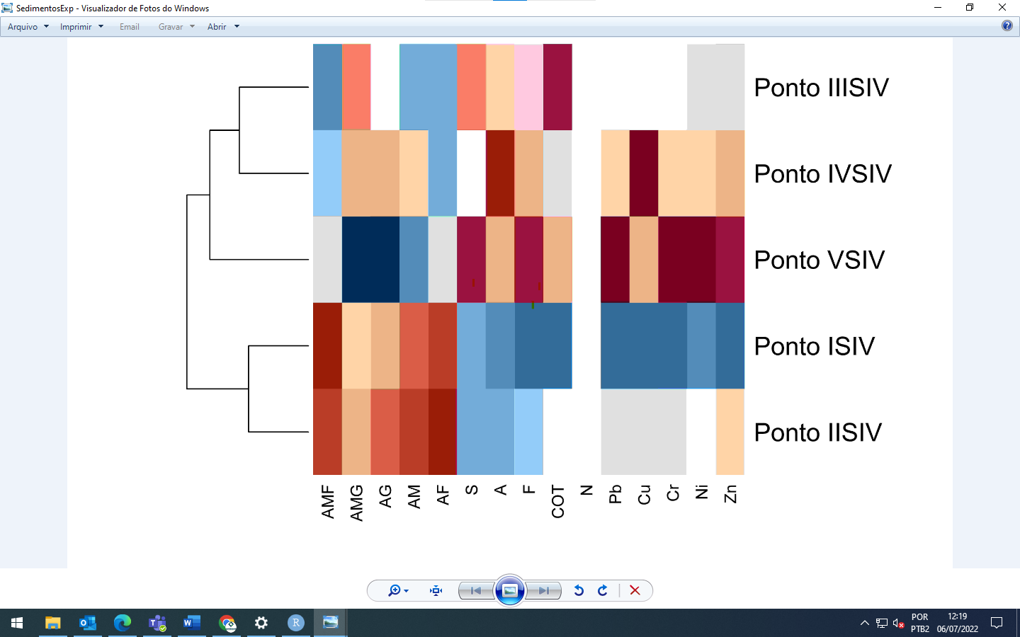
Mas, ele gera aquele gráfico todo estranho. Precisava que ele ficasse como um dendrograma, usando esse código:
rm(list = ls())
library(factoextra)
library(magrittr)
library(ggplot2)
library(cowplot)
library(ggfortify)
library(autoplot)
install.packages("factoextra")
install.packages("magrittr")
install.packages("ggplot2")
install.packages("cowplot")
install.packages("ggfortify")
install.packages("autoplot")
setwd("T:/Usuários/Rafaela/PCA")
dados<-read.table("aguaPCA.csv",
header = TRUE, sep = ";", dec = ",");dados
str(dados)
View(dados)
dados1<-dados[5:14]
na.omit(dados1)
View(dados1)
str(dados1)
dados.pca<-prcomp(dados1[5:10,], center = T, scale=T)
dados.pca
summary(dados.pca)
fviz_eig(dados.pca, addlabels = T, barfill = "orange",barcolor="darkblue",
linecolor="black")+ylim(0,85)+
theme_classic()+
labs(title="Variabilidade Explicada PCs",
x="Componentes Principais (PCs)", y="% da Variância")
Trimestre<-ggplot(dados.pca,Trimestre=dados1, colour="Trimestre",
loadings=T, loadings.colour="black",
loadings.label=T,
loadings.label.size=3,
loadings.label.colour="black",
frame.type="norm")+theme_bw()
Ano<-ggplot(dados.pca,Ano=dados1, colour="Ano",
loadings=T, loadings.colour="black",
loadings.label=T,
loadings.label.size=3,
loadings.label.colour="black",
frame.type="norm")+theme_bw()
Profundidade<-ggplot(dados.pca, Profundidade=dados1, colour="Profundidade",
loadings=T, loadings.colour="black",
loadings.label=T,
loadings.label.size=3,
loadings.label.colour="black",
frame.type="norm")+theme_bw()
o gráfico é gerado só com as bordas....sabe me dizer por que?
Let's try to get one good plot before discussing all of your code.
Your code has four plotting functions, fviz_eig() and three uses of ggplot(). Only the fviz_eig will display a plot, so I assume the plot you are seeing that only has a border comes from that. I do not have your data, so I can only guess at a solution. I have two suggestions.
na.omit(dados1) does not do anything useful because you do not store the result. Change that todados1 <- na.omit(dados1)
fviz_eig(dados.pca, addlabels = T, barfill = "orange",barcolor="darkblue",
linecolor="black")+
theme_classic()+
labs(title="Variabilidade Explicada PCs",
x="Componentes Principais (PCs)", y="% da Variância")
If that does not fix the problem, please post the output of
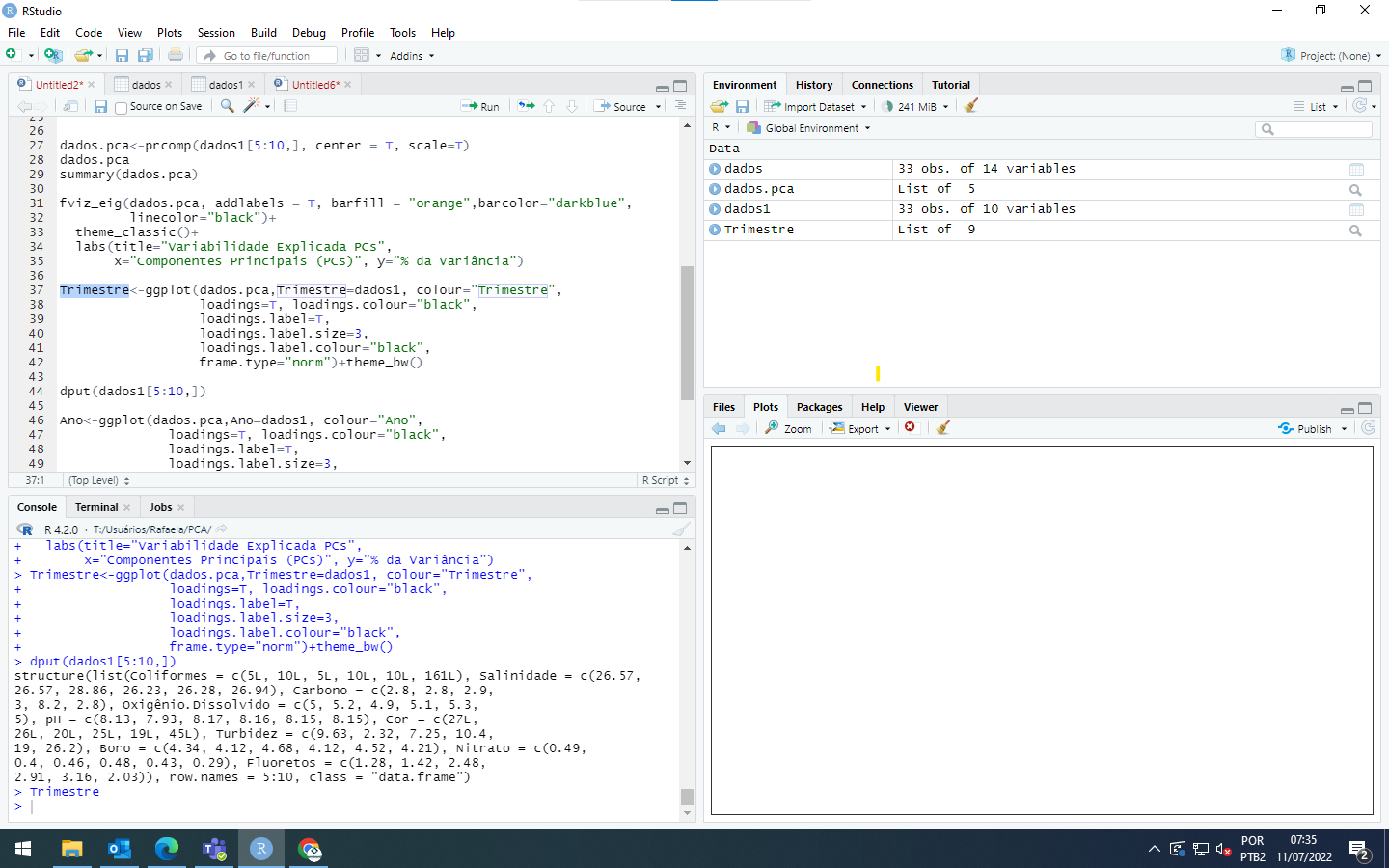
dput(dados1[5:10,])
In your reply, place a line with three back ticks just before and just after the output of dput(), like this:
```
Paste the output here
```
Bom dia!!! Sua ajuda tem sido muito importante, consegui emitir o gráfico do primeiro código que te mandei.
Mas, o segundo continua dando erro mesmo assim, apenas a borda do gráfico aparece.
Existe mais alguma coisa que posso fazer?
26.57, 28.86, 26.23, 26.28, 26.94), Carbono = c(2.8, 2.8, 2.9,
3, 8.2, 2.8), Oxigênio.Dissolvido = c(5, 5.2, 4.9, 5.1, 5.3,
5), pH = c(8.13, 7.93, 8.17, 8.16, 8.15, 8.15), Cor = c(27L,
26L, 20L, 25L, 19L, 45L), Turbidez = c(9.63, 2.32, 7.25, 10.4,
19, 26.2), Boro = c(4.34, 4.12, 4.68, 4.12, 4.52, 4.21), Nitrato = c(0.49,
0.4, 0.46, 0.48, 0.43, 0.29), Fluoretos = c(1.28, 1.42, 2.48,
2.91, 3.16, 2.03)), row.names = 5:10, class = "data.frame")
structure(list(Coliformes = c(5L, 10L, 5L, 10L, 10L, 161L), Salinidade = c(26.57,
26.57, 28.86, 26.23, 26.28, 26.94), Carbono = c(2.8, 2.8, 2.9,
3, 8.2, 2.8), Oxigênio.Dissolvido = c(5, 5.2, 4.9, 5.1, 5.3,
5), pH = c(8.13, 7.93, 8.17, 8.16, 8.15, 8.15), Cor = c(27L,
26L, 20L, 25L, 19L, 45L), Turbidez = c(9.63, 2.32, 7.25, 10.4,
19, 26.2), Boro = c(4.34, 4.12, 4.68, 4.12, 4.52, 4.21), Nitrato = c(0.49,
0.4, 0.46, 0.48, 0.43, 0.29), Fluoretos = c(1.28, 1.42, 2.48,
2.91, 3.16, 2.03)), row.names = 5:10, class = "data.frame")
>structure(list(Coliformes = c(5L, 10L, 5L, 10L, 10L, 161L), Salinidade = c(26.57,
26.57, 28.86, 26.23, 26.28, 26.94), Carbono = c(2.8, 2.8, 2.9,
3, 8.2, 2.8), Oxigênio.Dissolvido = c(5, 5.2, 4.9, 5.1, 5.3,
5), pH = c(8.13, 7.93, 8.17, 8.16, 8.15, 8.15), Cor = c(27L,
26L, 20L, 25L, 19L, 45L), Turbidez = c(9.63, 2.32, 7.25, 10.4,
19, 26.2), Boro = c(4.34, 4.12, 4.68, 4.12, 4.52, 4.21), Nitrato = c(0.49,
0.4, 0.46, 0.48, 0.43, 0.29), Fluoretos = c(1.28, 1.42, 2.48,
2.91, 3.16, 2.03)), row.names = 5:10, class = "data.frame")```
>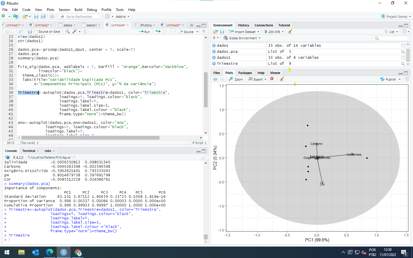
[/quote]Thank you for posting the data. It was very helpful.
This part of your code
Trimestre<-ggplot(dados.pca,Trimestre=dados1, colour="Trimestre",
loadings=T, loadings.colour="black",
loadings.label=T,
loadings.label.size=3,
loadings.label.colour="black",
frame.type="norm")+theme_bw()
Is not a correct use of the ggplot() function. The object dados.pca is not a data frame and ggplot() requires a data frame, as far as I know. I have never used the package ggfortify, but I think you want to use
autoplot(dados.pca, data = dados1, colour="Trimestre",
loadings=T, loadings.colour="black",
loadings.label=T,
loadings.label.size=3,
loadings.label.colour="black",
frame.type="norm")+theme_bw()
However, the part of dados1 that you posted using dput() does not contain a column named Trimestre, so I cannot run that code. If I remove the reference to dados1 and Trimestre, I get the following. Is that close to what you want?
dados1_dput <- structure(list(Coliformes = c(5L, 10L, 5L, 10L, 10L, 161L),
               Salinidade = c(26.57, 26.57, 28.86, 26.23, 26.28, 26.94),
               Carbono = c(2.8, 2.8, 2.9, 3, 8.2, 2.8),
               Oxigênio.Dissolvido = c(5, 5.2, 4.9, 5.1, 5.3, 5),
               pH = c(8.13, 7.93, 8.17, 8.16, 8.15, 8.15),
               Cor = c(27L, 26L, 20L, 25L, 19L, 45L),
               Turbidez = c(9.63, 2.32, 7.25, 10.4, 19, 26.2),
               Boro = c(4.34, 4.12, 4.68, 4.12, 4.52, 4.21),
               Nitrato = c(0.49, 0.4, 0.46, 0.48, 0.43, 0.29),
               Fluoretos = c(1.28, 1.42, 2.48, 2.91, 3.16, 2.03)),
          row.names = 5:10, class = "data.frame")

dados.pca<-prcomp(dados1_dput, center = T, scale=T)

library(ggfortify)
#> Warning: package 'ggfortify' was built under R version 4.1.3
#> Loading required package: ggplot2
autoplot(dados.pca,#Trimestre=dados1, colour="Trimestre",
                  loadings=T, loadings.colour="black",
                  loadings.label=T,
                  loadings.label.size=3,
                  loadings.label.colour="black",
                  frame.type="norm")+theme_bw()
Created on 2022-07-11 by the reprex package (v2.0.1)
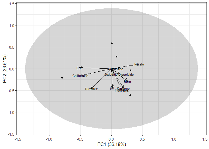
Obrigada por me responder!!
É este gráfico que preciso mesmo, mas o meu não se apresenta da mesma forma que o seu. Você poderia me mandar o código inteiro que usou?
If you copy the following code, which is exactly what I ran, you should get the same plot as I did.
dados1_dput <- structure(list(Coliformes = c(5L, 10L, 5L, 10L, 10L, 161L),
               Salinidade = c(26.57, 26.57, 28.86, 26.23, 26.28, 26.94),
               Carbono = c(2.8, 2.8, 2.9, 3, 8.2, 2.8),
               Oxigênio.Dissolvido = c(5, 5.2, 4.9, 5.1, 5.3, 5),
               pH = c(8.13, 7.93, 8.17, 8.16, 8.15, 8.15),
               Cor = c(27L, 26L, 20L, 25L, 19L, 45L),
               Turbidez = c(9.63, 2.32, 7.25, 10.4, 19, 26.2),
               Boro = c(4.34, 4.12, 4.68, 4.12, 4.52, 4.21),
               Nitrato = c(0.49, 0.4, 0.46, 0.48, 0.43, 0.29),
               Fluoretos = c(1.28, 1.42, 2.48, 2.91, 3.16, 2.03)),
          row.names = 5:10, class = "data.frame")

dados.pca<-prcomp(dados1_dput, center = T, scale=T)

library(ggfortify)
#> Warning: package 'ggfortify' was built under R version 4.1.3
#> Loading required package: ggplot2
autoplot(dados.pca,#Trimestre=dados1, colour="Trimestre",
                  loadings=T, loadings.colour="black",
                  loadings.label=T,
                  loadings.label.size=3,
                  loadings.label.colour="black",
                  frame.type="norm")+theme_bw()
e este também:

I do not think you are running the code that I posted. Notice the difference in the two calls to autoplot below.
dados1_dput <- structure(list(Coliformes = c(5L, 10L, 5L, 10L, 10L, 161L),
                              Salinidade = c(26.57, 26.57, 28.86, 26.23, 26.28, 26.94),
                              Carbono = c(2.8, 2.8, 2.9, 3, 8.2, 2.8),
                              Oxigênio.Dissolvido = c(5, 5.2, 4.9, 5.1, 5.3, 5),
                              pH = c(8.13, 7.93, 8.17, 8.16, 8.15, 8.15),
                              Cor = c(27L, 26L, 20L, 25L, 19L, 45L),
                              Turbidez = c(9.63, 2.32, 7.25, 10.4, 19, 26.2),
                              Boro = c(4.34, 4.12, 4.68, 4.12, 4.52, 4.21),
                              Nitrato = c(0.49, 0.4, 0.46, 0.48, 0.43, 0.29),
                              Fluoretos = c(1.28, 1.42, 2.48, 2.91, 3.16, 2.03)),
                         row.names = 5:10, class = "data.frame")

dados.pca<-prcomp(dados1_dput, center = T, scale=T)

library(ggfortify)
#> Warning: package 'ggfortify' was built under R version 4.1.3
#> Loading required package: ggplot2

#This code causes the errrors you are seeing
autoplot(dados.pca, Trimestre=dados1, colour="Trimestre",
         loadings=T, loadings.colour="black",
         loadings.label=T,
         loadings.label.size=3,
         loadings.label.colour="black",
         frame.type="norm")+theme_bw()
#Don't know how to automatically pick scale for object of type gg/ggplot. Defaulting to continuous.
#> Error in FUN(X[[i]], ...): object 'Trimestre' not found

#This code works
autoplot(dados.pca, #Trimestre=dados1, colour="Trimestre",
         loadings=T, loadings.colour="black",
         loadings.label=T,
         loadings.label.size=3,
         loadings.label.colour="black",
         frame.type="norm")+theme_bw()
Created on 2022-07-11 by the reprex package (v2.0.1)
In the second one, I removed the reference to Trimestre by making it a comment with the # character.
Im run the code and run well, maybe is necesary that @Rafaela clean the all objects in environment and run this code.
This code show this:
Muito obrigada pela ajuda de vocês!!! Aprendi muito para quem nunca mexeu com um software. Que bom que essa comunidade existe.
Até mais!
Este gráfico é dos bons. Branco não está legendado e as fatias não estão bem dimensionadas.
Occasionally, OpticsViewer's on-screen rendering may be incompatible with one of your graphics settings. This may cause analysis windows to display as empty black or white fields. Usually, this results when the computer trying to run OpticsViewer does not have an advanced graphics card, or if the card is configured incorrectly. This article will discuss and list fixes and workarounds to those problems.