Google Analytics Dashboard (thatdatatho.com)
Authors: Pascal Schmidt
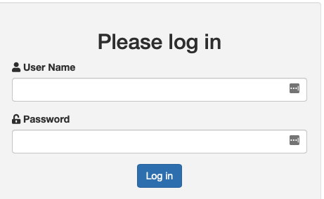
Abstract: The application requires login credentials. The login credentials are stored in a MongoDB database. The default login credentials are user1 for the username and pass1 for the password.
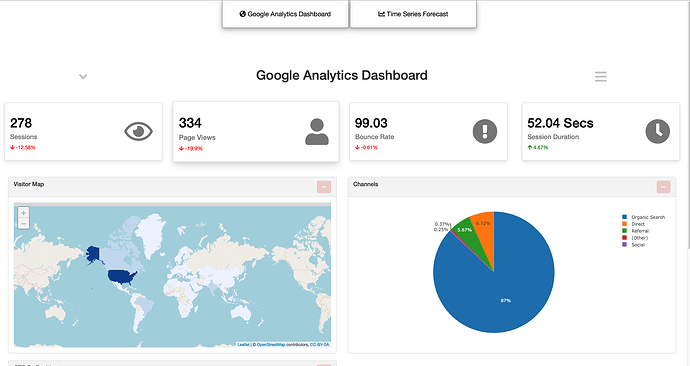
The first page is for visualizations and the second tab shows a time series forecast for page views for my blog.
Full Description: # GoogleAnalyticsDashboard
The application pulls data from Google Analytics and Google Search Console APIs and analyzes some metrics about my personal blog thatdatatho. I started my blog in my third year as an undergraduate student in 2018 and I have been blogging mainly about R since then. I have learned a lot about R, statistics, and programming since then and started my R Shiny journey in April 2020.
I dived deep into Shiny and learned so many new things during that year.
App Description
The application uses a mongodb database for the back-end to store user credentials and also to store information about what visualizations are currently active. Therefore, every single user who has their own credentials can create their own unique dashboard.
Upon login, users see a GIF, in google colours, until the app has been fully loaded. At first, value cards appear with basic metrics about my blog and show how numbers compare from the current day to the previous day. After that, all the visualizations will be loading with the renderUI function.
On the right side there is an action button that shows a sidebar menu when users click on the hamburger icon. Users can then select their choice of visualizations by clicking on the text, which are action links. The text will disappear from the sidebar and the visualization is shown. I used jQuery to add and remove visualizations in order to avoid calling renderUI every single time a user adds or removes a visualization. Same goes for the sidebar. jquery adds and removes action links.
The visualizations that are currently active are saved in the mongodb database and every single time a user logs back in, they will see the visualizations that they have selected previously.
On the left side above the value cards, there is a down-arrow which let's user select the date range. The maximum date range is 30 days. I used shinyjs to toggle down the date input widget. When a user selects a new date range, jquery removes all current visualizations and now the renderUI function will plot every single visualization again with new data.
I also implemented shiny.router. When clicking on the "Time Series Forecast" button, users will see a time series forecast about the page views. I used an elastic net model and a tree based model to make predictions about page views for 2 months in advance. I used timetk and modeltime, and the tidymodels package for this.
In order to run the application, users need their own mongodb and Google search Console and Google Analytics credentials.
On my GitHub, I created an R package with some unit testing functions.
Keywords: mongodb, tidymodels, API, googleAuthR, shinyauthr, modeltime, shiny.router, shiny testing, package
Shiny app: https://pascal-schmidt.shinyapps.io/thatdatatho_dashboard
Repo: GitHub - Pascal-Schmidt/GoogleAnalyticsDashboard
RStudio Cloud: Posit Cloud
Thumbnail:

Full image:
