I am generating a graph as follows:
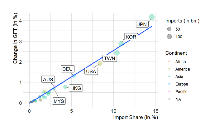
chn_1 <- ggplot(gft_k_im[country == "CHN"], aes(x=imp_sha_2007, y=c_gft_k_2007)) +
    geom_point(alpha=0.3, aes(size=imports_2007, color=continentb)) +
    theme_ipsum(axis_title_size = 12) +
    labs(x="Import Share (in %)", y = "Change in GFT (in %)") +
    labs(size = "Imports (in bn.)", color = "Continent") +
    geom_smooth(method=lm,se=FALSE) +
    geom_label_repel(aes(label = partner),
                  max.overlaps = 70,
                  min.segment.length = 0,
                  box.padding   = 0.5,
                  point.padding = 0.1,
                  segment.color = 'grey50')
The output looks as follows (which is what I want):
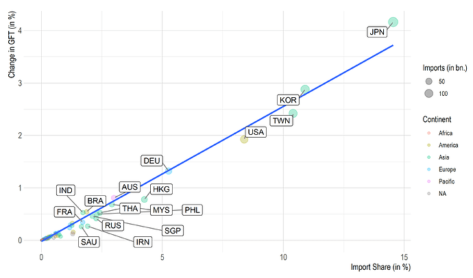
But when exporting the graph using ggsave the graph looks like this with more labels than I want:
ggsave("processed/graphs/chn_1.pdf", plot = chn_1,
       device = cairo_pdf,
       width = 10, height = 6, dpi = 150)
Any idea why that happens? Sorry for not providing reprex. I'm not sure how to recreate that problem with toy data. Thanks!

