Hi,
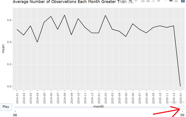
I have a question for you, unfortunately without a graphic example. I prepared a heatmap that changes according to the year. I made it in ggplot and then overlaid it with ggplotly to make it interactive. This way I got a slider with the years at the bottom of the graph. Due to the fact that the heatmap has quite long labels, they fall on this slider and it just looks ugly.
Does anyone have any idea how to put space between the graph and the slider? Possibly move it to the top of the graph?
Situation similar to the above only instead of the month caption, I have overlapping labels from the chart.

And my code looks like that:
p <- ggplot(tbl, aes(hospital, number, frame = year)) +
  geom_tile(aes(fill = value)) +
    theme_classic() +
    theme(axis.text.x = element_text(angle = 90)) +
    scale_fill_gradient('%', low = "#ffe9e7", high = "#a70d00") +
    xlab("") +
    ylab("Number")

  plotly::ggplotly(p)