Please find reprex below:
library(ggplot)
library(plotly)
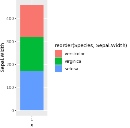
p = ggplot(iris, aes(x = "1", Sepal.Width, fill = reorder(Species,Sepal.Width),
text = paste('<br>Values: ', round(Sepal.Width,2), "%"))) +
geom_col()
p %>% ggplotly()
Although X axis is just a constant
ggplot displays it perfectly as below
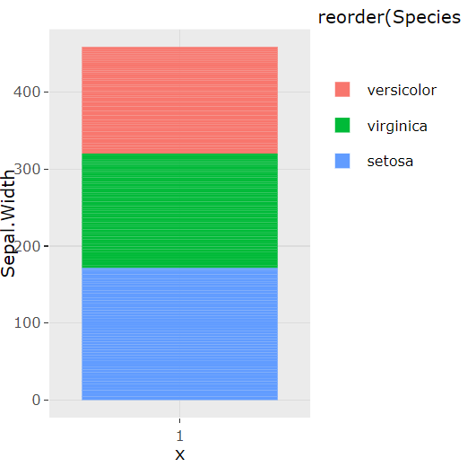
However with ggplotly
expecting the same plot with a nice functionalities : Zoom in etc
But plot itself collapses into much granularity and
hence Values when hover over is different as below: