Hi everyone,
I tried to generate a plotly graph in Rshiny, have to generate ggplot2 then convert to plotly, because plotly itself does not provide facet_wrap format like ggplot.
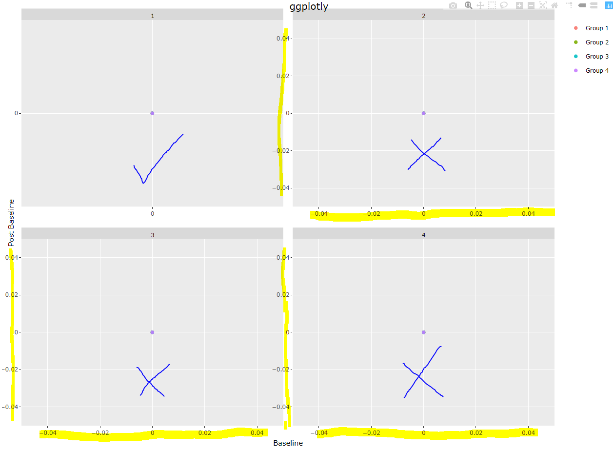
It turned out that ggplotly automatically picks negative and decimal points that ggplot2 objects does not have. I would like ggplotly generates the exact same output without decimal points and negative axis as ggplot2 object.
Basically, for all plots with only one (0,0) point, I just want to show value 0, get ride of the non-negative numbers and keep only 0 in each axis.
Anybody can help please? Thanks a lot!
sample code:
lab <- tibble(
  Group = c(rep('Group 1',4),
             rep('Group 2',4),
             rep('Group 3',4),
             rep('Group 4',4)),
  Grade = c(rep(0,16)),
  Baseline = c(rep(0,16)),
  Visit = c(rep(seq(1,4),4))
)

g <- lab %>%
  group_by(Visit) %>%
  ggplot(aes(y=Grade, x=Baseline)) +
  geom_point(aes(color=Group), alpha=0.9) +
  scale_x_continuous("Baseline",limits = c(0,max(lab$Baseline)),breaks = unique(lab$Baseline)) +
  scale_y_continuous("Post Baseline",limits = c(0,max(lab$Grade)),breaks = unique(lab$Baseline)) +
  facet_wrap(~Visit, scales = "free") +
  theme(legend.title = element_blank())

g1 <- ggplotly(g)