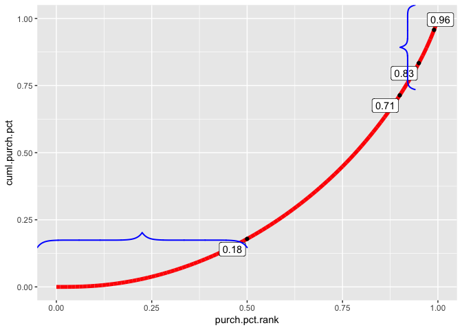
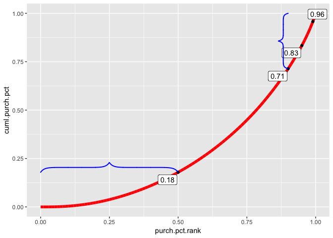
I'm having a couple of issues plotting a line graph in ggplot2. I'm plotting a very wide range of values (lowest is near zero, highest in the millions) and noticing that the line ends before touching the edge of the plot area. This is causing me problems because I need to add brackets to the plot in the positions indicated by the dots. I don't want to do this manually, so I want the brackets to be placed using quantile values that I've generated as the x,y coordinates.
The problem seems to be that there is "padding" around the plot area; the x,y coordinates of the plot do not correspond with the plotted values. The coordinates are all "off" by a bit due to the margins around the plot area. If you look at the reprex, the bottom left bracket goes too far to the left(past the plotted line) and the upper right bracket goes too far up.
How can I fix this? My ideal solution would be to have the line touch the edges of the plot area and have the quantile values usable as x,y coordinates.
library(ggplot2)
library(ggrepel)
library(pBrackets)

bracketsGrob <- function(...){
  l <- list(...)
  e <- new.env()
  e$l <- l
  grid:::recordGrob(  {
    do.call(grid.brackets, l)
  }, e)
}

 set.seed(1)

purchased <- rnorm(10000, mean=5000, sd=2500)
purchased <- purchased^2

customer.num <- 1:10000

test_df <- data.frame(customer.num,purchased)

test_df$purchased <- sort(test_df$purchased, decreasing = FALSE)

test_df$cuml.purchased <- cumsum(test_df$purchased)
test_df$purch.pct.rank <- percent_rank(test_df$purchased)
test_df$cuml.purch.pct <- cumsum(test_df$purchased) / sum(test_df$purchased)


quants.x <- quantile(test_df$purch.pct.rank, probs = c(0.5,0.9,0.95,0.99), na.rm=FALSE, names=TRUE, 3)
quants.y <- quantile(test_df$cuml.purch.pct, probs = c(0.5,0.9,0.95,0.99), na.rm=FALSE, names=TRUE, 3)

curve <- ggplot(test_df, aes(x=purch.pct.rank, y=cuml.purch.pct, label=sprintf("%0.2f", round(cuml.purch.pct, digits = 2))))+geom_line(size=2, color="red")

curve <- curve+geom_point(data=test_df[test_df$cuml.purch.pct %in% quants.y,],
                          aes(x=purch.pct.rank, y=cuml.purch.pct))+

  geom_label_repel(data=test_df[test_df$cuml.purch.pct %in% quants.y,],
                   aes(label=sprintf("%0.2f", round(cuml.purch.pct,digits=2), hjust=0, vjust=0.5)))

test.y <- test_df[test_df$cuml.purch.pct %in% quants.y,]
test.x <- test_df[test_df$purch.pct.rank %in% quants.x,]


br1 <- bracketsGrob(0, quants.y[1], quants.x[1], quants.y[1], h=0.05,  lwd=2, col="blue")
br2 <- bracketsGrob(quants.x[2], quants.y[2], quants.x[2], 1, h=0.05,  lwd=2, col="blue")

curve+annotation_custom(br1)+annotation_custom(br2)

