hi there,
I am trying to make a bar chart with two grouping variables, only one of the grouping variables act as the predictor on a continuous y. I would like to put info of the two grouping variables within a single bar chart. Could you teach me how to do that please?
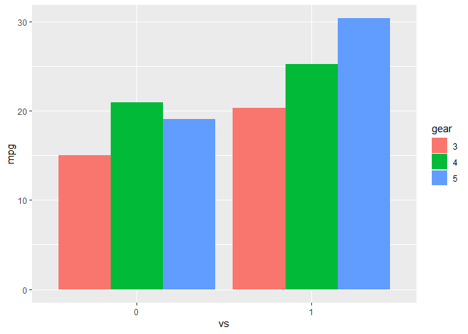
Using the mtcars dataset in R, I can do it in the following way,
a=tapply(mtcars$mpg,list(mtcars$vs,mtcars$gear),mean)
a
x1=as.factor(c(rep(0,3),rep(1,3)))
x2=as.factor(c(rep(c(3:5),2)))
mean=c(a[1,],a[2,])
dat=data.frame(x1,x2,mean)
ggplot(dat,aes(x=x1,y=mean,fill=x2))+geom_bar(stat='identity',position='dodge')
but instead of manually compute means before plotting, I would like to use stat_summary() to do the computing for me with the raw data. I tried the following code, didnt work:
ggplot(mtcars,aes(y=mpg,x=as.factor(vs),fill=as.factor(gear)))+stat_summary(fun='mean',geom='bar')
Please give me some advice. Thank you very much.