ggplot2 query - facet wrapping, removal of legends and general formatting

Hi there,

I'm new to R and just need a little push in the right direction.

My code is as follows:


crickets_tidy <- 
  tidyr::gather(Weights, 
                key = stage, 
                value = time, 
                Antennate, Stridulate, Mount)

ggplot(crickets_tidy,
       aes(x = Mass, 
           y = as.numeric(time)) +
  geom_point(size = 3,
             alpha = 1/2,
             aes(colour= stage)) +
  scale_y_continuous(breaks=seq(0, 650, 100)) +
  labs( x = "Mass of female cricket(g)",
        y = "Duration of stage (s)") +
  facet_wrap(~stage,
             labeller = as_labeller(c(
               Antennate = "Antennation",
            Stridulate = "Stridulation",
              Mount = "Mounting"))) +
  theme_minimal(base_size = 15) 


crickets_tidier <- group_by(crickets_tidy, time,stage) %>% 
  summarise(meanmass = mean(Mass,na.rm = TRUE))

This comes out with this: https://imgur.com/a/sBqjBsY

Three queries here:

  • How do I swap the position of the Mounting and Stridulation sections? (So, L->R, Antennation, Stridulation, Mounting)

  • How do I remove the legend to the right detailing the colours?

  • Is there a way to make the three 'columns' more distinct from each other? Maybe seperated by thicker lines?

Many thanks! :grinning:

It would be easier to help you out if you provide some sample data on a copy/paste friendly format. Could you ask this with a minimal REPRoducible EXample (reprex)? A reprex makes it much easier for others to understand your issue and figure out how to help.

If you've never heard of a reprex before, you might want to start by reading this FAQ:

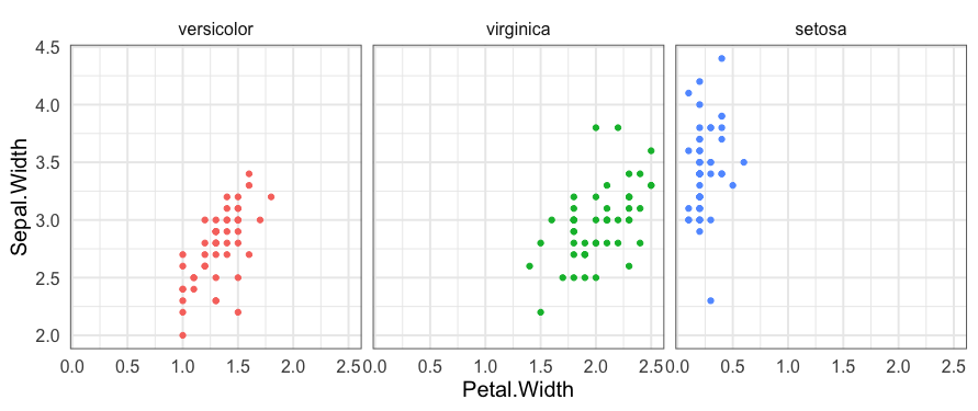
The code below demonstrates ways to do what you asked, using the built-in iris data frame for illustration. Inline comments explain what the next line of code is doing

library(tidyverse)

iris %>% 
  # Categorical variables are ordered alphabetically by default.
  # To reorder categorical variables, convert them to factor class and set 
  #  order using the levels argument.
  mutate(Species = factor(Species, levels=c("versicolor", "virginica", "setosa"))) %>% 
  ggplot(aes(Petal.Width, Sepal.Width, colour=Species)) +
    geom_point() +
    facet_wrap(~ Species) +
    theme_minimal(base_size = 15) + 
    # Add a border around each facet
    theme(panel.border=element_rect(fill=NA, colour="grey40")) + 
    # Don't include a legend
    guides(colour=FALSE) 

2 Likes

Great, thank you both. All sorted!

This topic was automatically closed 7 days after the last reply. New replies are no longer allowed.

If you have a query related to it or one of the replies, start a new topic and refer back with a link.